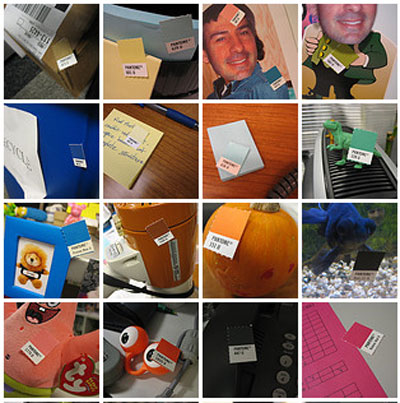
Many designers swear by Pantone color charts, saying that they give the most accurate specification on what exactly he/she wants. I still have a half-suspicious view towards Pantone charts though – secretly thinking “are we just trying to make ourselves feel more professional?”.
Anyway, that aside, this Flickr photo-set made me smile, looking at the innocuous Pantone color placed against real life items. Is that trying to say that Pantone does cover every imaginable color? Or that most, if not all, of manufactured products were specified as one of those Pantone numbers?