

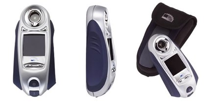
Looking like a cross between a Darth Vader (I’m serious, the first thing I saw was the face shape – maybe a frowning, angry Egyptian mummy) and a generic poorly-designed MP3 player, this device helps you identify swatches in real life by scanning it and matching it to a Pantone color.
It reminds me of a previous post where people tagged Pantone color charts to real-life objects. I used to think that these gadgets are the marks of a designer – I’d imagine someone who’d get “inspired” by the surroundings – perhaps the autumn leaves triggered a new fashion scheme or something.
But now I’m totally not sure about it. For one, “inspiration” would be pretty weak if all you can derive from it is a bunch of RGB or CMYK numbers. And also, why’d you need to match a color of a real life object – unless of course you’re simply just trying to copy it wholesale?
For those of you who do happen to use on of these, it’d be great to shed light on the how’s and why’s!