

When crop circles were first created, many speculated supernatural origins of these complex patterns that seem to magically find themselves in vast fields. With the open admission of some of the original crop circle creators, however, it has taken on a different light. Some take it as a pure art form, challenging themselves to create more and more elaborate patterns, often based on sacred geometries, fractals and mathematical proportions. It didn’t take long till crop circles were first imbued with commercial values (Google Earth sure help to motivate that!) – for instance, the Firefox crop circle that I blogged about some months back.
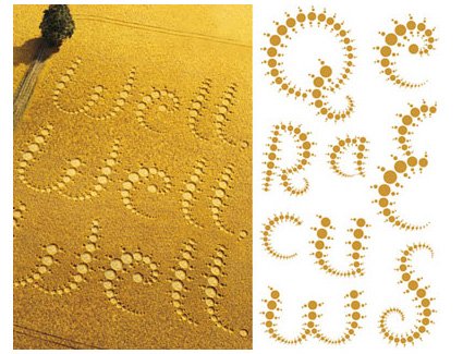
The above picture actually shows the development of a font inspired by the artform of crop-circles – what with the chain of circles of increasing radii, etc. – and it’s commissioned by the grand daddy of the artworks’ canvas: Quaker Oats. Pretty interesting I’d say – reminds me of a Flash-based game that became popular recently too – Flow.
The creators of the font here.