

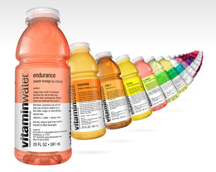
Hot on the heels of beverages that sell more of the packaging than the drink (like the previous post) – here’s a series of vitaminwater that comes from a company with as audacious a tag-line as “Hydrate Responsibly” – gulping normal water down now seems like the greatest gaffe you could commit. Of course, though, the actual fluid in the bottle is probably the last thing that matters.
People who are attracted to it are probably much more attracted to the overall product experience and presentation (I am). From the color schemes, to the packaging and design of the label – they all connote a sense of freshness and clearness that often escapes other mineral/flavored water bottles.
The label copies are great too – instead of the usual boring “raspberry flavored” or “peach-orange flavor”, they are endowed with imaginative names like “endurance”, “focus” and “balance”, with equally witty accompanying copy rather than the boring ingredient’s list, or promotion-heavy marketing text. For example, check out the teasing copy on “power-c”:
power-c
dragonfruit (c + taurine)legally, we are prohibited from making exaggerated claims about the potency of the nutrients in this bottle. therefore, legally we wouldn’t tell you that after drinking this, Eugene from Kansas started using horseshoes as a Thighmaster or that this drink gave Agnes from Delaware enough strength to bench press llamas. heck, we can’t even tell you this drink gives you the power to do a thousand pinkie pushups… just ask mike in queens.
legally, we can’t say stuff like that — ’cause that would be wrong, you know?
vitamins + water = all you need. for best results, stick it in the fridge. the inside is natural. the outside is plastic.
Or take “essential”:
essential
orange-orange (c + calcium)ah, orange juice commercials. funny stuff. mom cheerily prepares some huge breakfast while the rest of her family sleeps. sure, this could happen. but every morning? please. maybe if mom were heavily medicated, in which case, we wouldn’t condone operating a stove or any electrical appliance.
for those of us who don’t live in an orange juice commercial, there’s still a way to get your morning nutrition. this product has calcium and lots of vitamin c, so you can get your day started right, minus the whole Stepford mom thing.
vitamins + water = all you need. for best results, stick it in the fridge. the inside is natural. the outside is plastic.
Since when can you expect a hearty chuckle from a beverage packaging?
[More on their (nicely-done) website.]