

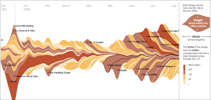
It’s the time of the year for Oscars and what-not, where critics and audience can opine on the great movies of the year, hits-and-misses etc. Of course, what the studio “suits” see as hits or misses are perhaps more centered at the basic question – did it bring in good money? The New York Times has a great interactive graphic showing the major movies all the way from 1986. You can see the impacts of the movie and how it pans out – the height being the weekly revenue, while the width represents the longevity. For instance, on the bottom left, the big slice would be the rather persistent Titanic.
Recently I’m getting quite interested in infographics or infosthetics – the art of visualizing information. Beyond the eye-candy factor (many of these are really well-done; the interactivity afforded on many of these infosthetics make it really engaging too), it’s also about making information appealing – and thus promote its usefulness. People like Hans Rosling and Jonathan Harris really earn my admiration for bringing what is usually dead-boring statistics/information into engaging, illuminative and dare I say, fun thing to play/learn?