

The US Election seasons are here, and voting comes into the spotlight once again. Here, AIGA (American Institute of Graphic Arts) attempts to redefine how ballot cards should look like – from the almost-incomprehensible version (on top) to the much clearer version below:
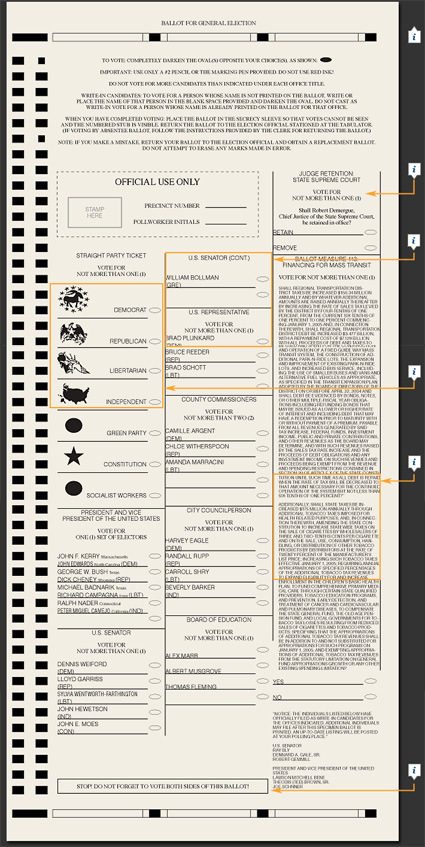
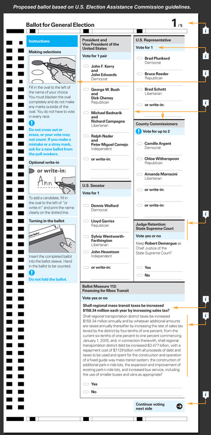
Among the improvements are clearer and more structural layouts, a direct and friendlier language as well as clearer instructions on the proper way to fill up your votes. It seems however that due to a range of difficulties these changes may not be in place for the upcoming elections, even if it is many years after the famous ‘Butterfly Ballot‘ incident in 2000.
Definitely miles better in my opinion.
[New York Times has more details on the ballot design elements]