wefunction.com had a list of 50 redesigns – from the minor nips-and-tucks to full-fledged revamping of various designs – from logos, characters to products. It’s quite interesting to put the ‘before-and-after’ side by side and see the improvements: sometimes a little tweak can go a long way. Here is the list:
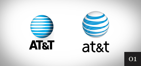
1. AT&T
The colors are the same. The graphic is now 3d and the text is made lower case so it mimics what would by typed in a browser. These small changes make a huge difference.
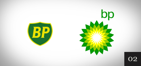
2. BP
The text was changed to lower case, again making it Web friendly. The colors were also retained. Changing the graphic to a flower was likely done to convey a “green” image.
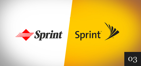
3. Sprint
New colors, new font and new image. It is a nice simple logo.
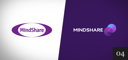
4. Mindshare
The text was changed to all caps and a new font was used. The color was retained for one of the “PacMan looking” circles.
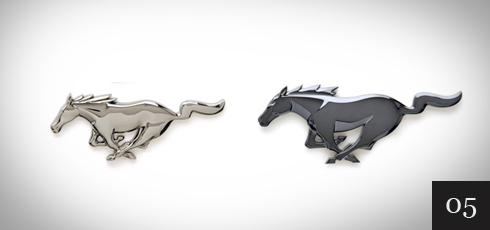
5. Mustang 2010
By changing the shading, the impact is significant.
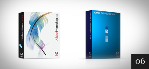
6. Adobe Photoshop CS4
In Photoshop CS4 Adobe went to a solid color packaging and one color font. No way you will mistake one version over the other.
7. Discovery Channel
Very nicely done. The font was changed and both words are now in inverse print. The graphic works well both on web site and as the graphic shown in the lower right hand corner during broadcast.

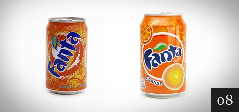
8. Fanta
The new look is brighter and fresher. The wording was also made more planar and in order to make the whole word visible from one direction, the letters were brought closer together. Very nice.
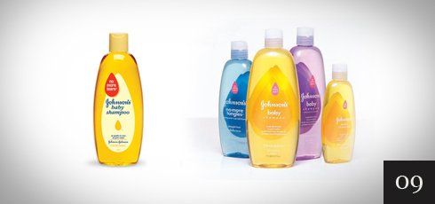
9. Johnsons Baby
Inverse print and more diffuse colors. Gentle is the theme.
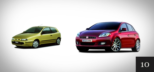
10. Fiat Bravo
The difference in these is huge. The former version would pass for an older east European model. The new version looks modern.
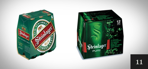
11. Steinlager
With richer coloring and effective use of shadows, the design looks modern and attractive.
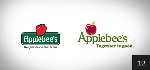
12. Applebee’s
The new font and using a slogan instead of a title is effective. The colors were also updated.
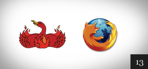
13. Firefox
The logo was changed to a round one (similar to Windows Explorer and Chrome) and the name was also changed. By including the blue globe, the colors are attractive.
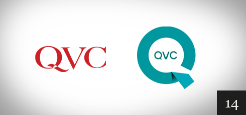
14. QVC
Major change to the color, font and new Graphic symbolizing the Q. I expect to see an update to this one soon.
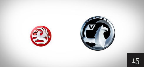
15. Vauxhall
In line with what Ford did to the Mustang logo, dark/black is used with bold shadows to give a modern look.
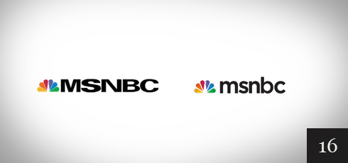
16. MSNBC
A simple change of font and as other web properties have done, going to a lower case word.
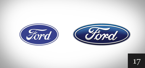
17. Ford
By bolding the font slightly and creating a shadowed background, the new logo is definitely more modern.
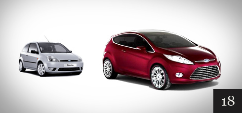
18. Ford Fiesta
The newer Ford Fiesta design is much improved and is made to look expensive even more so than the Fiat Bravo mentioned earlier.
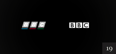
19. The BBC
New font and higher contrast. They did not go to lower case. Very clean while keeping with tradition.
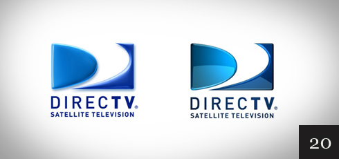
20. Direct TV
The font and design stayed the same. Only a slight color change and use of shadows makes it look much better.
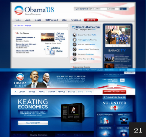
21. Barack Obama
This website redesign was very well done. The new version utilizes brighter coloring and shadows effectively.
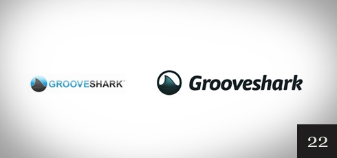
22. Grooveshark
A new larger and bolder font combined with higher contrast is a major improvement.
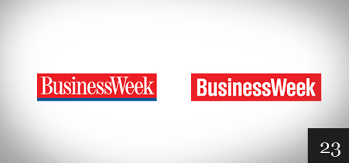
23. BusinessWeek
A new font that is bolded and the removal of the blue line at the bottom is the upgrade here. I’m not sure how effective this change was.
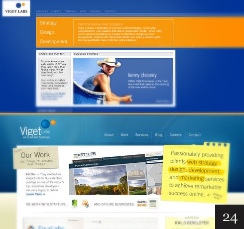
24. Viget Labs
This is another example of how many modern sites are successfully using these design concepts.
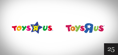
25. Toys “R” Us
By placing the star inside the R instead of outside enabled a slight enlargement of the other letters. The colors were also adjusted slightly. Very nice.
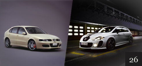
26. Seat Leon
The new model design sure speaks “Lets race”.
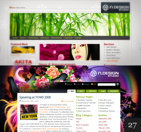
27. N Design Studio
By fully utilizing the background with colors and design, the web site shows off very nice.
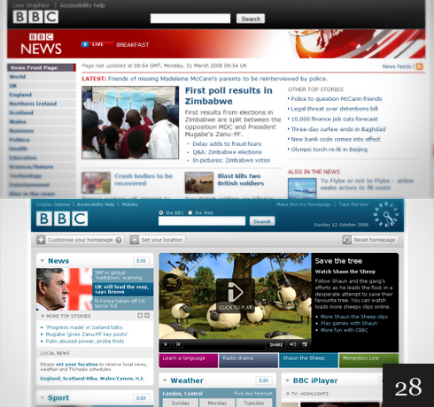
28. The BBC Website
The new design of the BBC website is a huge improvement and is geared toward more video articles.
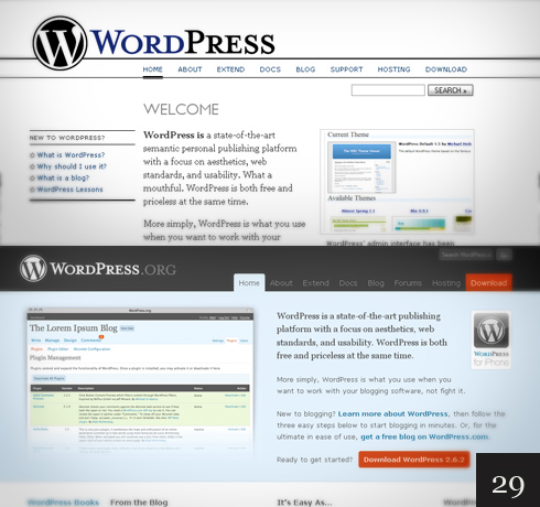
29. WordPress.org
By adding color and shadows, the upgraded site appears modern and has an attractive feel to it.
30. Microsoft
This redesign happened quite a while ago, however, as we have seen, by going to a high contrast simple logo is often very effective.
31. MailChimp
By letting us see the mascot is carrying the mail, the new logo is still cute, but gives us a bit more info.
32. CNET
CNET was already using lower case. I like the updated logo that removed the line between the letter c and n. Shadows were also added to give it a slight 3d appearance. Small but effective changes.
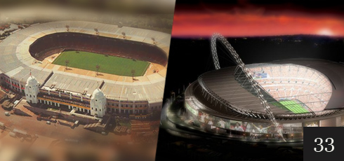
33. Wembley Stadium
A large and expensive redesign of Wembley Stadium resulting a modern looking structure.
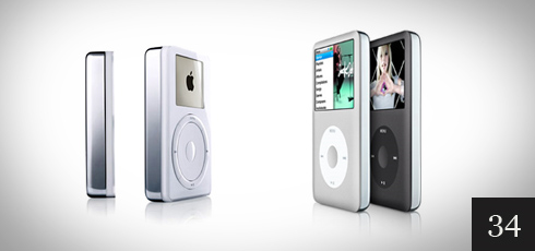
34. Apple iPod
Apple has done well with the designs they use for consumer electronics. Here they use contrast to great effect.
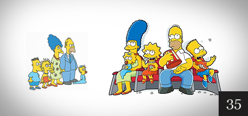
35. The Simpsons
This redesign made the characters more unique and easier to recognize. Very well done.
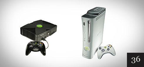
36. XBOX
The new design almost made it look like something Apple would produce. The new clean case looks good in modern entertainment centers.
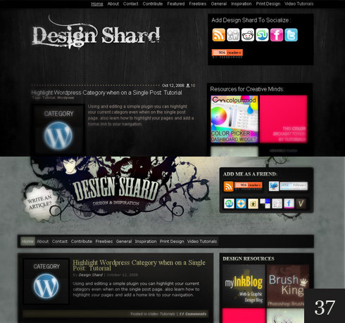
37. Design Shard
By lighting up the background a bit and a new logo, the sight continues to stay at the forefront in design.
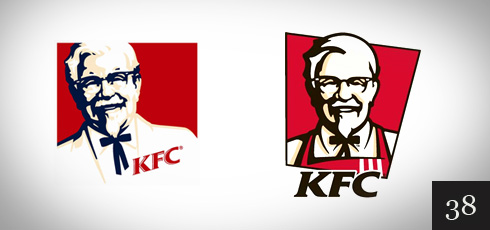
38. KFC
With cleaner lines and an apron, the colonel is also made to appear slightly younger. The letters KFC are also larger and more visible.
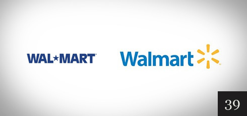
39. Walmart
New colors and a new font (almost all lower case), improves this venerable logo.
40. Envato
With this re-branding, the logo continues with the old colors, however, the font is bold and in all lower case.

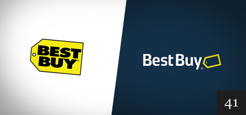
41. Best Buy
Best Buy did a good job with the original logo and few in the US will not recognize it. The new version bucks the trend to go all lower case and also uses a less bold font.
42. Macmillan
The new font using the green throughout makes this logo redesign look much improved and modern.

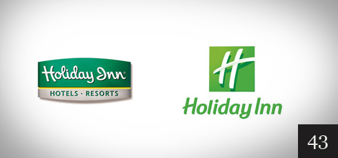
43. Holiday Inn
Going to a warmer green color with shadows, and a new font, this is a great improvement.
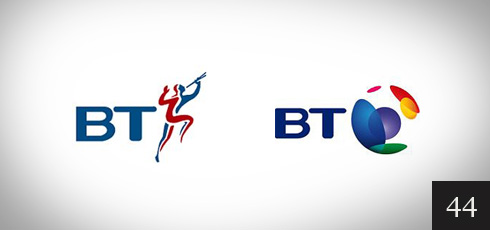
44. British Telecom
The color was given more contrast and the graphic was made more abstract with additional colors. The original graphic could be confused with sports so this is a great improvement.
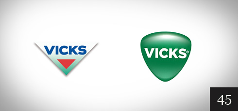
45. Vicks
Going to one color and utilizing shadows giving it a 3d look, the Vicks redesign is very effective. It also will invoke an association with the what Vicks sells. The original logo looks like something you would find on some running shoes.
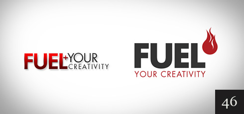
46. Fuel your Creativity
Changing to a high contrast bold font and taking the flame out of the letters was a smart move for this logo.
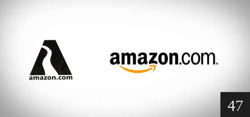
47. Amazon
The original logo was conveying the Amazon river, however, the new logo in lower case fits the company much better. The orange graphic also conveys moving fast, again reflecting the message Amazon wants to convey.
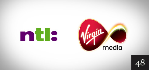
48. Virgin Media
Although this was a buyout, the new logo is a huge improvement that conveys better what the store carries.
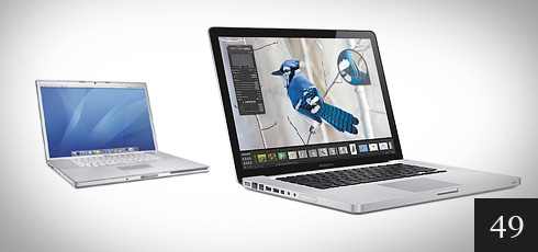
49. Macbook Pro
Made modern by a solid glass front and a solid aluminum base.
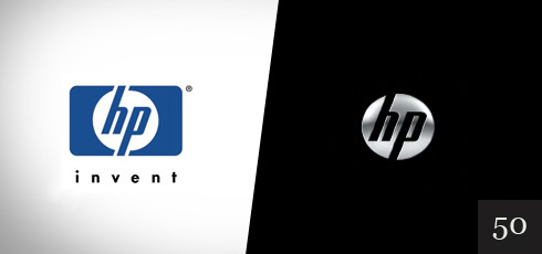
50. HP
HP added shadowing to the circle for a 3d effect while keeping the lettering and font in the circle, however they have shed the tagline and the frame. A great example of making it simple.
