

If you’ve ever wondered how they transitioned from rotary dialing to button-press on the telephone, here’s an interesting background story. Before it became a standard that every phone now follows, human factor specialists (or the equivalent in those time) actually tested 18 different possible key layouts:
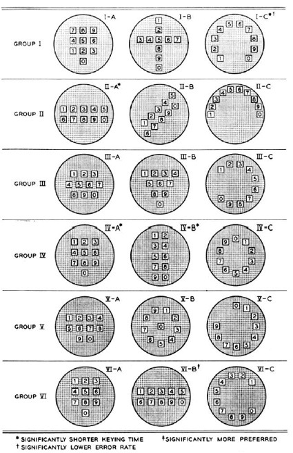
The participants were asked to key in a bunch of numbers and timed for it. Other factors like aesthetics and error rates were also computed. The five finalists were as follows:
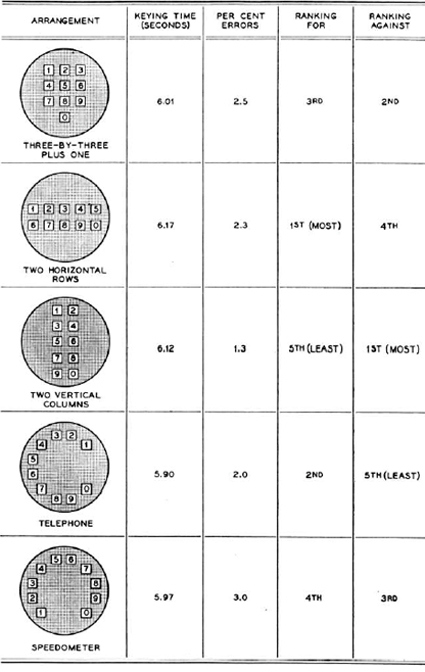
Some pretty mixed results there actually. The familiar layout of the predecessor (the 4th one – ‘Telephone’) scored the best on timing, most likely due to the inherent familiarity. To be honest though I don’t quite know how they chose the (3×3)+1 arrangement that we now have though. From the data it seems it could’ve really gone any way. Perhaps because it’s a less polarizing option?
Now, someone needs to explain why the arrangement is different on calculator numberpads.
And while we’re on the topic of key arrangements – here’s a different but similarly intriguing story about the placement of the arrow keys: how did they come to the arrangement that is standard across all keyboards today? It turns out that there were testing and studies too:
![]()
Check it out here.
[via mental floss]