

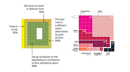
According to Anil, there seems to be an trend of using pixels and grids to represent percentages rather than the traditional pie chart. There are some speculations on why – perhaps it’s a reflection of our digitized age? Or maybe it’s simple aesthetics – a rectangular chart gives you less dead/white space around your chart than a circle, so the article looks better? Text description of each region looks more neat with rectangular matrix compared to a juxtaposition against a circle?
Well there could be really any number of answers. The important thing is, is it better? Or perhaps a better way to ask – in what scenarios would grid charts be more effective, and when are they less so?