Archive for the ‘ads’ Category
RONA Hitchhikes on Apple’s Billboard

RONA, Canada’s largest distributor of hardware relating to home renovation and garderning, puts up an ad banner right under Apple’s iPod nano dripping paint, proclaiming “We recycle paint”. Mighty opportunistically creative, aye?
[via dominicarpin]
Scrabble Advertisments
Here’s a series of TV advertisements for scrabble – featuring (fantastically) quirky creative & art direction. The concept is quite cool too:
Different words accidentally encounter during a Scrabble game, giving by chance birth to a world as unexpected as enchanting. Picture a board of Scrabble at the end of a game: words that have nothing to do with each other are crossing and overlapping, to the point that they sometimes tell a crazy story ! Our creative idea is to turn this fabulous potential into images. Everything will be executed by different illustrators, in order to come out with the best diversity in the possibilities offered by SCRABBLE.
by Ogilvy and Mather Paris.
[via advertolog]
“Let it Shine” by Honda
Honda’s been building a reputation of making ads requiring intense, meticulous coordination and touching hearts one way or another – I’ve covered quite a few of them in this blog. Their latest ‘Let It Shine’ brings together a whole lot of (obviously Honda) cars on a field, using their headlights as little pixels that animate to the tune of a ‘Let it Shine’.
Not exactly breathtaking, but fresh nonetheless! By Wieden + Kennedy.
Samsung’s Screen for little Furries
Cuddly animals doing their cute little expressions never fail – and that’s where Samsung’s advertisement angle comes from I suppose. To promote their Ultra Touch handphone (which boasts large colorful screen), they began to imagine how phones may be creatively leveraged if they were in the hands of our intelligent, furry friends – hamsters, guinea pigs, hedgehogs, etc.
Creativity + Cute: LOLcats tweaked for mainstream promotion.
MINI Augmented Reality Ad
It’s quite a bit of user involvement before he/she can ‘get’ the ad – but the concept is an interesting one. The steps are as follows:
- User sees the ad on magazine, follows instruction to the MINI website.
- User holds the magazine in front of his own webcam.
- MINI website detects the orientation of the magazine, super-imposes a 3D model of the MINI car on the magazine on the monitor.
- User plays around, taken by the interactivity of this augmented reality.
- ???
- Profit!
[via designboom]
Car Design by Evolution
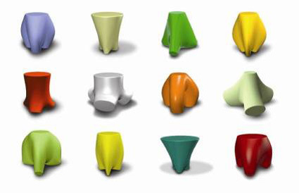
Back in school I used to have a professor who taught us about design+genetics (and called it Genometrics). The central thesis was for designers to move away from the role of designing the object to designing the paramaters/rules in which the object can exist. In a one-semester exposure this was nothing much more than programming parametric CAD software to churn out hundreds of designs based on a series of randomly varying dimensions (within reasonable bounds).
So we were supposed to find an object, program a range for a core set of dimensions, and let it be randomized within these bounds. Due to the ‘law’ within the programming, the outcome is bound to be varied and yet have identifiable ‘genes’. For instance, here are some stool designs (not necessarily valid) that were executed by the computer:

I remember the majority of the class balked at the idea. Some of the reasons include:
“So what does that make me? I’m here to learn design – if the computer does everything, then what’s the point?” – the same was said for a lot of other things that are taken-for-granted design tools for designers nowadays too.
“How can the computer make good designs – it has no brains/intelligence?” – Well maybe not in 100 iterations – but what about in 1000? 1 million? 1 billion?
I was somewhat sceptical too, but the idea of ‘genes’ captured my imagination. The idea that you can boil a cacophonic, complex external object (or even systems), and distill it into its essence with just a few variables. However, the shortcomings of the above exercise lied in the fact that at the end of the day, the judgement for ‘good design’ is subjective and human. This readily makes the computer seem incompetent.
A contrasting case-in-point:
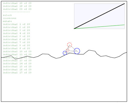
This is a Flash program by Matthew where a primitive car design is iterated by computer. The (objective) aim of the car (that defines whether it’s a good design or not) is the length of treacherous terrain it can go pass before crashing. The variables are the size and initial positions of the 4 circles, the length, spring constant and damping of the 8 springs.
If you let it run, you’d see that as it crashes, it reboots and tries to refine the design again, and through time, the design gets improved without further manual input.
Here is the difference – with a quantifiable, objective feedback to the success of a design, computers can automate and rapidly refine designs (very likely) better than a human can. If the evaluation is subjective, however, the process becomes ineffective or slows down by orders of magnitude.
In a landscape where we are increasingly talking about user-generated content, democratic design and increased semantics intelligence for computers, this may become more relevant. There are already web-advertisements that modify its own designs (font size, colors, images, etc.) on-the-fly based on real time feedback on click-through-rates.
How/where else can this be applied?
Thai Commercial
Thais are well-known in the region for their creativity in advertising – I’ve covered some of the funny and touching ads, and they’re also no stranger to ads that play more like a short movie. So here’s yet another:
The ad itself while generally well-produced isn’t too spectacular or inspirational – taking 4 minutes of air time to tell the story of a deaf-mute girl who learnt to play violin. What choked me though, was the last 5 seconds when the ad finally unveiled which product is for.
Pause the commercial at just about 3:55 and see if you can guess before the ad ends?
Celebrity Font Arts


Some interesting portraits of celebrities (Marilyn Monroe, Marlon Brando, James Dean) constructed entirely from fonts and glyphs (well, except the facial features).
Carling iPhone Ad
Carling’s clever use of the medium’s inherent (additional) dimension to give a more engaging experience for its advertisement. If you tilt it too much, beer actually get ‘spilled’ out, and the realistic looking foam marks clinging on to the glass also gives it a touch of realism confined behind the glass.
Which also brings to my mind – just how good does your ad have to be when you know it’s no longer spoon-fed and streamed into people’s faces (ala TV/radio/newspapers/magazines)? If you think about ads that people have to proactively download onto their medium, it really has to be THAT great.
Cool Ad
It isn’t the kinds of ad that will blow you away, but I thought this was quite a clever ad. Without spoiling it too much: you’d probably start to get the commercial maybe somewhere in the middle of the ad, and that’s when everything suddenly make sense. And you’d still want to re-watch it, just to revisit the little nuances and hints that was lightly sprinkled within the video.
I also like how switched tacks and turned a usually dry, boring and perhaps ‘too-rational’ topic into something much more poetic. Something from those typical corporate-y and ‘o-big-industry!’ tone to communicating at a much more personal level.
Catch my drift?
Comments (2)