Jim Denevan Sand Art

jim-denevan-sand-art

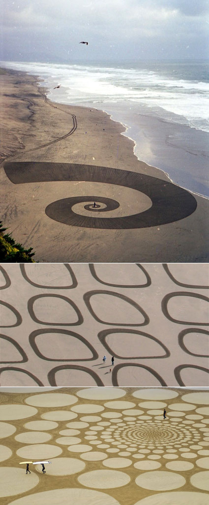
Sure, we have seen a fair share of crop-circle art before – here’s something equally amazing, but done on sand instead of crops:

Jim Denevan makes freehand drawings in sand. At low tide on wide beaches Jim searches the shore for a wave tossed stick. After finding a good stick and composing himself in the near and far environment Jim draws– laboring up to 7 hours and walking as many as 30 miles. The resulting sand drawing is made entirely freehand w/ no measuring aids whatsoever. From the ground these environments are seen as places. Places to explore and be, and to see relation and distance. For a time these tangible specific places exist in the indeterminate environment of ocean shore. From high above the marks are seen as isolated phenomena, much like clouds, rivers or buildings. Soon after Jim’s motions and marks are completed water moves over and through, leaving nothing.

Pretty cool (it’s a pity these art pieces are all temporary though), eh? Tonnes more, and some processes on the artist’s website.

The Super-est Hero

superest

With the idea of ‘Mine is better than  yours’ as a central theme, Superest is a funny, continually running strip of comic in which two main comic artist draws a super hero that is better than the previous. Like scissors-paper-stone, except in this case, the subject are superheroes, and the loop isn’t closed at all.

This led to some wildly imaginative and funny characters, possessing a bizarre range of powers. Shown above are just a small slice of all the heroes. You’d probably want to head over and start at the very first hero, just to see how this whole thing unfolds.

Alphabets of Design Classics

alphabet-of-design-classics

What better way to turn your tots into design addicts and connoisseurs than this Alphabet of Design Classics series by Blue Ant Studio. Or simply as a great decoration in the spirit of humor and fun. The likes of apples, bananas and cats fades out to give way to Aalto, Bertoia and Castiliogni – each with a nicely done silhouette of an iconic design piece. Personally for me I would have put the LCW molded plywood chair for Eames, and perhaps Panton for P. Perhaps you’d have a different take too.

After publishing it on their blog and receiving great feedback, these posters are now available as prints too!

Construction Paper Art

construction-paper-art

I thought construction papers were mostly just for book covers and the occasional handicraft – but look how far this material can be sculpted! Breathtaking works of art by Jen Stark – the explosion of colors were carefully cut and ‘peeled’ off from a thick stack of construction paper – I really wonder how much time and painstaking effort it took to create an artwork like this. Great photography to capture it too!

More of her works here!

Cool Desktop Wallpaper

desktop-wallpaper

These desktop wallpapers aren’t quite like the typical pretty ones – more than being just a passive background, these are soulful wallpapers that demands your desktop icons’ cooperation to form themselves – at times seemingly thoughtful, at times contented, at times poetic. Just make sure your desktop ain’t too cluttered!

Art – Daydream of the Faceless Worker

daydream-of-the-faceless-worker

“The piece is called Daydream of the faceless worker. It is about 6×14 meters and made up of 4000 post-it notes. I wrote poetry on about 400. They had told me that the wall was half the size. My idea then was to let people take what they liked and have pens around, so that they could add their own thoughts to the empty notes. Now it became too big, the notes are too far up for people to write on unfortunately.”

An art piece by Sixten – I truly dig the use of Post-Its on the wings that so effortless and cleverly brought out the art piece – illustrating in one go the sheer amount of mundane office paperwork, and yet the physical form of those Post-Its also form up nicely as ‘feathers’ in the wing. And for those who watch Heroes, does this remind you of the artist in it?

The artist has a jaw-dropping portfolio of diverse ranges of artwork right here – you’d be impressed!

Trash Art with Shadows

shadow-trash2

Some people’s art is other’s trash. In this case, however, the trash is the art. Artists Tim Noble and Sue Webster have some great pieces (literally, pieces) of work that at first sight looks simply like trash that does not belong at all in an art museum. When the spot light is turned on however, a totally different paradigm is unveiled in the shadows on the wall. Magnificent!

Diverted by money, property and prestige it is easy to avert our gaze from the vapid bankruptcy and wasted by products of the consumer cultural dream. In a post radicalized world of ambivalence where consumption and oblivion seem the order of the day Tim Noble and Sue Webster’s collaborations “literally” shine a light upon the untouchable residue of conspicuous consumption. With an unpretentious touch of desperate glamour and self deprecating humor they have transformed the gaze upon heaps of trash and side show ephemera generating a playful and contemplative allegorical space in which to consider the consequences of our choices and a hopeful humorous glimmer of the future.

That was a pretty dense paragraph – I’m sure the work speaks for itself and can floor many people indeed. It really makes you see things in a different light, doesn’t it?

More here.

Hand Shadow


Forming shadow patterns with a light source and hands are an old trick that everybody would likely have used to entertain themselves in those days of black-outs and power outage. But our tricks were probably nowhere as imaginative and well-executed as this one from artist Raymond Crowe.

The Art of Shattering Sculptures

shattered-sculptures

I wonder how many figurines it takes to capture just one of these photos of figurines being smashed while seemingly being posed and arranged in a thoughtful composition. As the artist Martin Klimas explains,

Yes, the shooting environment must be controlled and kept consistent. The lighting is clear and direct, head on. My background is neutral, but bright enough so that the shattering object completely stands out. I drop the figurine from the same height in complete darkness while the lens of the camera is open. When the figurine hits the ground, the sound triggers the lights to go off for a fraction of a second. I do this procedure many times or until I find the one frame that is just right. I keep just one such picture for every figurine. Every attempt yields a unique outcome, so I need to look for the one that best expresses a transformation of the figurine into a new form.

More shattered works over here.