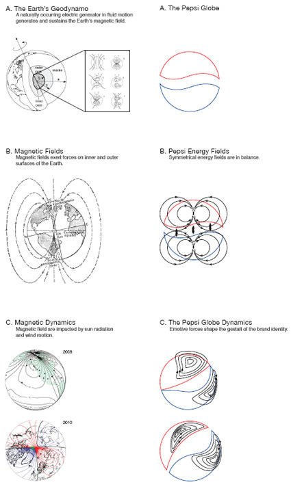
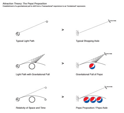
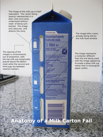
Archive for the ‘design’ Category

Olympic Logo through the Ages

Just found this video from a month back where designer Steven Heller gives a commentary on the series/evolution of Olympic pictogram designs through the years:

Gotta agree with him on almost all of it personally!

Pigeon: Impossible

Pigeon:Impossible is a short animation with a rather quirky story premise:

A rookie secret agent is faced with a problem seldom covered in basic training: what to do when a curious pigeon gets trapped inside your multi-million dollar, government-issued nuclear briefcase.

To me, what is much more interesting though is the series of video podcasts by the creator Lucas Martell on the Youtube page, explaining different aspects of how the animation came into being, tips/techniques on 3D video rendering, etc.  Examples like:

Hacking the glint on the eye with a clever workaround:

Behind-the-scenes on the Pigeon’s construction:

You can also visit his blog with even more back stories to 3D animation.

Green Screen in Movies

We know that ‘green screens’ (or more accurately, “Chroma Key“) are commonly used in filming, be it weather or action movies so that the actor/presenter need not be physically within the context of a scene, whether for safety, costs or technical reasons. The reel from green screen specialist studio Stargate would show just how much it is used in movies and dramas:

Actors probably have gotten better over the years, as they adapt to this technique during acting to respond to non-existent cues within the movie frame. For instance, the instinctive slight shivering while walking through a particularly cold street in Russia – without the immersive visual and visceral setting, one has to imagine the hundreds of minor environmental cues that may affect a character within the environment’s context. Tough!

Sochi 2014 Olympics Logo

Even as the Vancouver Winter Olympics draw nearer at 2010, Sochi (the Russian host city for the next Winter Olympics in 2014) has already rolled out their brand identity. Now, if you were in charge of the Sochi Olympics, which would you choose? My first reaction was certainly the top one – it looks fresh, Olympic-esque and contemporary. The one at the bottom had so much Russian old-schoolness, it seemed like they were still stuck in the Soviet-Russia era, and have not caught on the graphic design evolution.

But following the argument on Sans Raison made me a convert (it’s too detailed to be quoted or reproduced her – please head over!) – as she carefully and patiently compared between the 2 final candidates, and espousing the merits of this logo that has much more long-term strength in its identity; that Olympics logo frequently falls into a certain cliche (like the one at the top). Eventually I became a convert for the second one too.

Of course, seeing it being applied in context gives it a whole new render/perspective as well:

In context, it does hold a lot on its own (although the shade of blue on the logo in context seem much friendlier too). You can also check out the full identity in action at their official website.

[inspired by Sans Raison]

Apple’s Offer Letter

apple offer letter

You can see how much design lives in Apple’s DNA – the same type of care, consistency and quality that they put not just in the products that faces the external parties (iPods, ads, etc.) but internally as well. Shown above are the offer letters and HR paper work that was delivered - the signature Apple simplicity and elegance, even with the same type of punchy lines on the top of each page  (“Ah paperwork”; “Ready, set, go”) .

See the full “unboxing” or unfoldering in more detail over at Glyph.

The Sound of a Car Door

We’ve (probably) all heard stories about how the sound of a car door greatly affects the perception of its value, and how engineers/marketers/car-makers would spend countless hours perfecting the perfect ‘thud’.

closing car doors
[Picture source]

Here’s a much more detailed analysis on this topic – with sound samples to explain exactly what makes a car-door sound cheap, and what may make it sound better.

Apple.com circa 1983

apple circa 1983

This is Dave Lawrence’s imagination of how the Apple website would look like, had it existed way back in 1983 when Lisa is new, and the Mac is still a year away. Check out the iPhone (not quite what we now perceive it to be)!

Phone-Miniaturization Russian-Doll

cardboard_phone_2

cardboard_phone_3

Came upon these set of Russian-doll style mobile phones made of cardboard which simply goes to show how much our devices have shrunk over the years. With each generation we’re probably thinking in our heads “how could we have lived with anything that was before?”

[by Kyle Bean]

50×70 Posters for Social Communication

Good 50×70 is a design contest/collection of social-conscious posters addressing seven of the critical issues affecting today’s world. Posters were chosen as the media for the contest as they’re the most direct way to convey a message and can be easily translated to other media. The creativity unleashed through the competition is then supplied freely to charities. Some that caught my eye:

Reduce CO2

AIDS

guantanamo definitivo 3

Many more here!

Demystifying the Design Process

In my daily work, I’m heavily involved in design research and design strategy, and creating the framework/angle in which the design team can approach a project. One of the things that I have always yearned to do is to create a series of ‘standard steps’ to take – a design strategy/framework set, if you will – the basic ‘design process’ that can lead to sound strategies that leads to creatively-directed and successful work both internally and for our clients.

This of course, is a good thing. With a more structured process, there is the effect of leverage – the same results can be replicated and amplified through more designers. Even for myself – this could be a good library of ‘known-solutions’ to fall back on – projects can get on faster and easier, without having to spend too much time re-thinking each project as they come.

heart-wire1

But I always seem to come to a stumbling block. I can try to summarize all of the frameworks/methods that I know of, or have applied in past projects, but inevitably they boil down to a few issues.

The strategies/approaches can become simplified – but to what extent? If I boil it down so that it can be applied across different projects, it can end up somewhat like IDEO’s Method Card (which I do have in my cabinet), which is good enough as a ‘spark plug’ to remind one in the existence of a particular approach, but hardly sufficient to take it and run (it’s not a ‘play book’).

If I do not simplify – and choose to instead include all the little extra steps, the creative angles, the specific techniques, then it’d seem to revert back to a very specific and narrow method, suitable perhaps for that one particular project of that one client, but difficult to transfer across projects (it cannot be generalized).

And today, I stumbled upon this quote by Michael Beirut – an old Design Observer essay from 2006, to be sure – but I thought “Wow, that captured my dilemma!”:

When I do a design project, I begin by listening carefully to you as you talk about your problem and read whatever background material I can find that relates to the issues you face. If you’re lucky, I have also accidentally acquired some firsthand experience with your situation. Somewhere along the way an idea for the design pops into my head from out of the blue. I can’t really explain that part; it’s like magic. Sometimes it even happens before you have a chance to tell me that much about your problem! Now, if it’s a good idea, I try to figure out some strategic justification for the solution so I can explain it to you without relying on good taste you may or may not have. Along the way, I may add some other ideas, either because you made me agree to do so at the outset, or because I’m not sure of the first idea. At any rate, in the earlier phases hopefully I will have gained your trust so that by this point you’re inclined to take my advice. I don’t have any clue how you’d go about proving that my advice is any good except that other people — at least the ones I’ve told you about — have taken my advice in the past and prospered. In other words, could you just sort of, you know…trust me?

Beirut’s main struggle seem to be “how to convince clients of the worthiness of his (team’s) ideas while the process appears fuzzy, unexplainable and/or non-logically-sequential”. In my case, the struggle is the attempt to sequential-ize and formalize a process that is in itself a blend of intuition, experience, fuzziness and voodoo magic.

The temptation to create a play-book (just like how football coaches do) is still strong – and I’d probably still want to (try to) do that. But perhaps I can take a page off Beirut’s experience and acknowledge that hey, not everything is a straightforward and repeatable process – particularly not in the fuzzy front end of design.

Follow

Get every new post delivered to your Inbox.