
The trailer for the film “Objectified” (a documentary about industrial design by Gary Hustwit, the same guy who directed “Helvetica“) is certainly making the rounds around design blogs today – so here you go in case you haven’t seen it yet:

The trailer for the film “Objectified” (a documentary about industrial design by Gary Hustwit, the same guy who directed “Helvetica“) is certainly making the rounds around design blogs today – so here you go in case you haven’t seen it yet:
Wow!
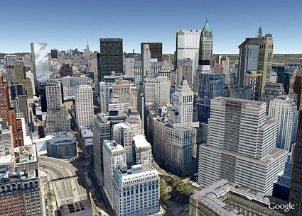
That’s not a picture of New York city, but rather, Google Earth’s rendering of it. From satellite images, to building maps, to rough 3D block models of the building, the next layer is now in progress: mapping those buildings with photo-realistic textures.
Sim City version GOOGLE coming through!
Could this be the David that takes down Goliaths like HP, Canon and Epson?
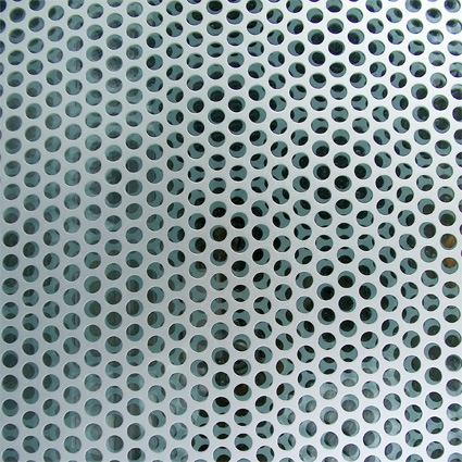
Architects have been using perforated metal panels like this for a long time. The holes are spaced and cut in a way that does not compromise the overall strength of the material, while removing a substantial portion of the weight, making it easy to use these panels for applications from facade to railing panels (with the bonus of allowing some light through and sometimes making interesting patterns from).
What happens when the same spirit is taken to typefaces? That’s what happened to Ecofont (a free font), designed with minute perforations in its face without sacrificing legibility:
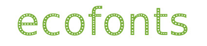
The Ecofont is developed by SPRANQ, based on a hunch of Colin Willems. We tried lots of possible ink-saving-options. From extra thin letters to letters with outlines only. We have omitted various shapes: dashes, squares, triangles and even asterisks. In the end the circle was chosen as the best candidate for the job.
With the Ecofont SPRANQ hopes to increase environmental awareness too. Increasing customer awareness about printing behavior: is printing really necessary or (partly) a waste of ink and paper? We also hope to inspire software giants and printer manufacturers to innovate in an environmentally conscious manner.
Would this be a small catalyst that dramatically reduces printing ink needs? Probably not – but still, I liked the interesting thought and cross-field application of the same concept!
Blog posts are like buses…when they come they come in clusters of the same kind or number.
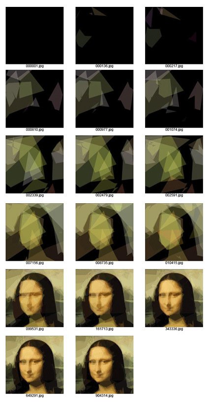
Hot on the heels of computer-generated algorithm to design – here’s yet another manifestation – this time the challenge was to paint as close to Mona Lisa (or for that matter, any other image) as possible simply by using no more than 50 semi-transparent polygons.
As described:
We start from random 50 polygons that are invisible. In each optimization step we randomly modify one parameter (like color components or polygon vertices) and check whether such new variant looks more like the original image. If it is, we keep it, and continue to mutate this one instead.
You can see that by iteration 904314, it’s very close to the original (or probably about as close as it can get for just 50 overlapping polygons).
Go on, play with it yourself here and see how it is done (you can use your own pictures too!), and the explanation (source code coming soon too) is here.
If you’ve ever wondered how they transitioned from rotary dialing to button-press on the telephone, here’s an interesting background story. Before it became a standard that every phone now follows, human factor specialists (or the equivalent in those time) actually tested 18 different possible key layouts:
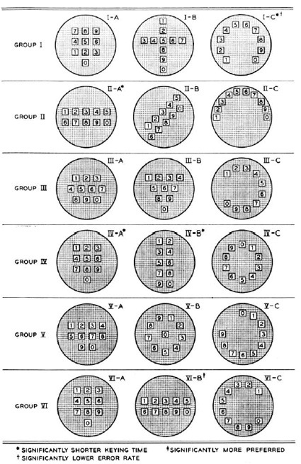
The participants were asked to key in a bunch of numbers and timed for it. Other factors like aesthetics and error rates were also computed. The five finalists were as follows:
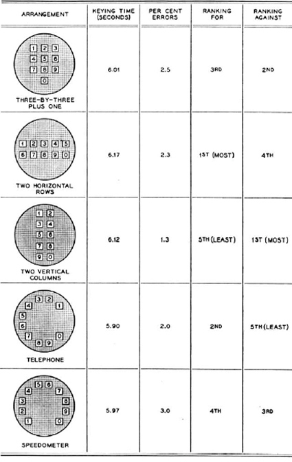
Some pretty mixed results there actually. The familiar layout of the predecessor (the 4th one – ‘Telephone’) scored the best on timing, most likely due to the inherent familiarity. To be honest though I don’t quite know how they chose the (3×3)+1 arrangement that we now have though. From the data it seems it could’ve really gone any way. Perhaps because it’s a less polarizing option?
Now, someone needs to explain why the arrangement is different on calculator numberpads.
And while we’re on the topic of key arrangements – here’s a different but similarly intriguing story about the placement of the arrow keys: how did they come to the arrangement that is standard across all keyboards today? It turns out that there were testing and studies too:
![]()
Check it out here.
[via mental floss]
The Advanced Design team in Nokia set up a website – The Five Dollar Comparison – to find out what can people buy with $5 in different parts of the world.
Discussions around the consequences of a truly connected planet have been going on for some time in our organisation, and maybe also in yours. Five Dollar Comparison is a small step to broaden the discussion and explore how the impact might vary across cultures and contexts by asking a simple question: What can you buy for five dollars?
![]()
Did you know that the Major League Baseball logo was designed 40 years ago (1968) and have never been updated since?
Did you know that the baseball player in the logo was designed so that he can either be a right or left-handed batter?
I didn’t know either of those – this logo looked contemporary so I’ve always thought it was done or at least updated recently. Made me think about classic designs that can stand the test of time – all ye glossy bevels and reverse shadows, die!
And the left-right handed thing is somewhat like the arrow in the Fedex logo – once you know it you can’t un-see it.
Here’s an ESPN interview with the unacknowledged (officially) designer of the logo Jerry Dior, a 76-year old retired graphic designer.
[via Brand New]
wefunction.com had a list of 50 redesigns – from the minor nips-and-tucks to full-fledged revamping of various designs – from logos, characters to products. It’s quite interesting to put the ‘before-and-after’ side by side and see the improvements: sometimes a little tweak can go a long way. Here is the list:
The colors are the same. The graphic is now 3d and the text is made lower case so it mimics what would by typed in a browser. These small changes make a huge difference.

The text was changed to lower case, again making it Web friendly. The colors were also retained. Changing the graphic to a flower was likely done to convey a “green” image.
![]()
New colors, new font and new image. It is a nice simple logo.
![]()
The text was changed to all caps and a new font was used. The color was retained for one of the “PacMan looking” circles.
![]()
By changing the shading, the impact is significant.
![]()
In Photoshop CS4 Adobe went to a solid color packaging and one color font. No way you will mistake one version over the other.
![]()
Very nicely done. The font was changed and both words are now in inverse print. The graphic works well both on web site and as the graphic shown in the lower right hand corner during broadcast.
![]()
The new look is brighter and fresher. The wording was also made more planar and in order to make the whole word visible from one direction, the letters were brought closer together. Very nice.
![]()
Inverse print and more diffuse colors. Gentle is the theme.
![]()
The difference in these is huge. The former version would pass for an older east European model. The new version looks modern.

With richer coloring and effective use of shadows, the design looks modern and attractive.
![]()
The new font and using a slogan instead of a title is effective. The colors were also updated.
![]()
The logo was changed to a round one (similar to Windows Explorer and Chrome) and the name was also changed. By including the blue globe, the colors are attractive.
![]()
Major change to the color, font and new Graphic symbolizing the Q. I expect to see an update to this one soon.
![]()
In line with what Ford did to the Mustang logo, dark/black is used with bold shadows to give a modern look.
![]()
A simple change of font and as other web properties have done, going to a lower case word.
![]()
By bolding the font slightly and creating a shadowed background, the new logo is definitely more modern.
![]()
The newer Ford Fiesta design is much improved and is made to look expensive even more so than the Fiat Bravo mentioned earlier.

New font and higher contrast. They did not go to lower case. Very clean while keeping with tradition.
![]()
The font and design stayed the same. Only a slight color change and use of shadows makes it look much better.
![]()
This website redesign was very well done. The new version utilizes brighter coloring and shadows effectively.
![]()
A new larger and bolder font combined with higher contrast is a major improvement.
![]()
A new font that is bolded and the removal of the blue line at the bottom is the upgrade here. I’m not sure how effective this change was.
![]()
This is another example of how many modern sites are successfully using these design concepts.
![]()
By placing the star inside the R instead of outside enabled a slight enlargement of the other letters. The colors were also adjusted slightly. Very nice.
![]()
The new model design sure speaks “Lets race”.

By fully utilizing the background with colors and design, the web site shows off very nice.
![]()
The new design of the BBC website is a huge improvement and is geared toward more video articles.

By adding color and shadows, the upgraded site appears modern and has an attractive feel to it.

This redesign happened quite a while ago, however, as we have seen, by going to a high contrast simple logo is often very effective.
![]()
By letting us see the mascot is carrying the mail, the new logo is still cute, but gives us a bit more info.
![]()
CNET was already using lower case. I like the updated logo that removed the line between the letter c and n. Shadows were also added to give it a slight 3d appearance. Small but effective changes.
![]()
A large and expensive redesign of Wembley Stadium resulting a modern looking structure.

Apple has done well with the designs they use for consumer electronics. Here they use contrast to great effect.

This redesign made the characters more unique and easier to recognize. Very well done.

The new design almost made it look like something Apple would produce. The new clean case looks good in modern entertainment centers.

By lighting up the background a bit and a new logo, the sight continues to stay at the forefront in design.

With cleaner lines and an apron, the colonel is also made to appear slightly younger. The letters KFC are also larger and more visible.
![]()
New colors and a new font (almost all lower case), improves this venerable logo.
![]()
With this re-branding, the logo continues with the old colors, however, the font is bold and in all lower case.
![]()
Best Buy did a good job with the original logo and few in the US will not recognize it. The new version bucks the trend to go all lower case and also uses a less bold font.
![]()
The new font using the green throughout makes this logo redesign look much improved and modern.
![]()
Going to a warmer green color with shadows, and a new font, this is a great improvement.
![]()
The color was given more contrast and the graphic was made more abstract with additional colors. The original graphic could be confused with sports so this is a great improvement.
![]()
Going to one color and utilizing shadows giving it a 3d look, the Vicks redesign is very effective. It also will invoke an association with the what Vicks sells. The original logo looks like something you would find on some running shoes.
![]()
Changing to a high contrast bold font and taking the flame out of the letters was a smart move for this logo.
![]()
The original logo was conveying the Amazon river, however, the new logo in lower case fits the company much better. The orange graphic also conveys moving fast, again reflecting the message Amazon wants to convey.
![]()
Although this was a buyout, the new logo is a huge improvement that conveys better what the store carries.
![]()
Made modern by a solid glass front and a solid aluminum base.

HP added shadowing to the circle for a 3d effect while keeping the lettering and font in the circle, however they have shed the tagline and the frame. A great example of making it simple.
![]()
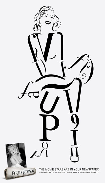
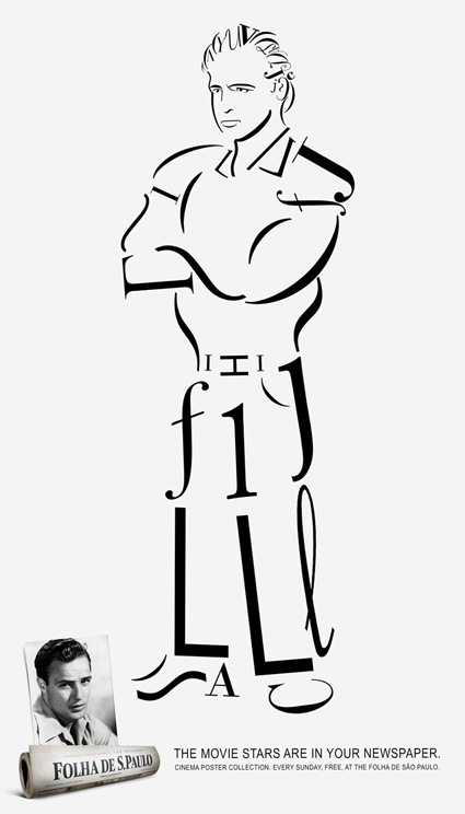
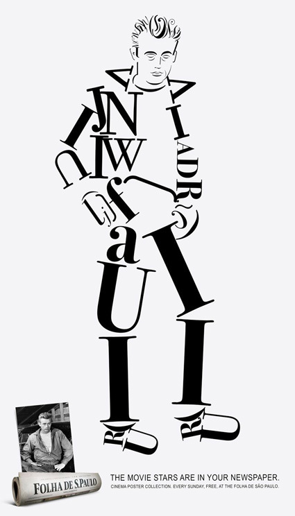
Some interesting portraits of celebrities (Marilyn Monroe, Marlon Brando, James Dean) constructed entirely from fonts and glyphs (well, except the facial features).
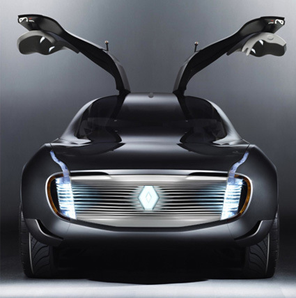
The Paris Motor Show is a biennial affair showcasing production and concept cars from many major marques for automobile fans to salivate on. Here are just some highlights from the show:
Lamborghini Estoque
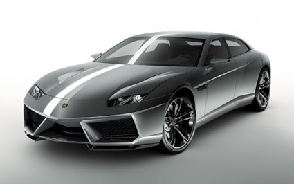
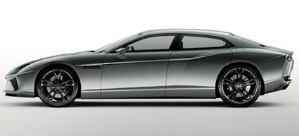
One of the highlights of the show was the Lamborghini Estoque – yes, Lamborghini is showing a car that you can actually enter/exit with reasonable ease! The four-door sports car is only the second in Lamborghini’s history. Personally I didn’t quite like the last third of the car from side view: it looked slightly awkward, like two cars were forcefully blended in the middle.
Some other interesting rides from the show:
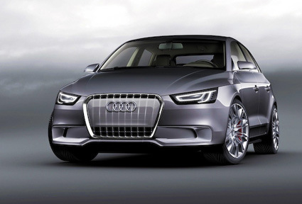
Audi A1 Sportsback – Audi’s answer to a lower end, sporty and smaller car.
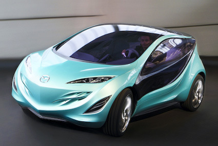
Mazda Kiyora – yes, yet another Nagare-styled Mazda concept.
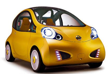
Nissan Nuvu Concept – you’d either hate or like the cutesy electric car
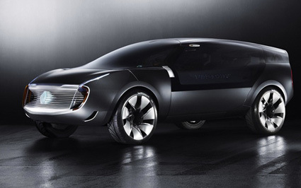
Renault Ondelios Concept – Like a bird on the open roads
For more information about each of these cars, head here~