Multicolr – Search Flickr by colors

idee-multicolr-1-color

idee-multicolr-2-color

idee-multicolr-3-colors

This is Multicolr by Idée Labs – allowing you to search Flickr’s photo pool based on the key colors. What’s cool about this is you can choose more than 1 color. As shown above – you can have just one color, or keep adding key colors into your criteria. Pretty nifty huh?

Now when’d they combine this with tag-searching as well…(e.g. look for pictures of green apples)?

Ballot Design

The US Election seasons are here, and voting comes into the spotlight once again. Here, AIGA (American Institute of Graphic Arts) attempts to redefine how ballot cards should look like – from the almost-incomprehensible version (on top) to the much clearer version below:

old-ballot

new-ballot

Among the improvements are clearer and more structural layouts, a direct and friendlier language as well as clearer instructions on the proper way to fill up your votes. It seems however that due to a range of difficulties these changes may not be in place for the upcoming elections, even if it is many years after the famous ‘Butterfly Ballot‘ incident in 2000.

Definitely miles better in my opinion.

[New York Times has more details on the ballot design elements]

Bombay Sapphire

Bombay Sapphire has always been somewhat the Patron Alcohol of the design scene – you can see their presence in virtually every major design show. Traditionally they’ve also organized an annual design competition with the theme of designing a martini glass to contain their liquid in. This year, however, it seems like they’ve taken on a different subject.

‘Glass’ was the focus – not just the vessel holding the gin – but the material itself.

Glass is an everyday material that in the hands of a talented artist or designer can be transformed in countless ways to produce stunning results. To spotlight contemprorary glass and to reward the creativity and expertise of artists, designers and architects working with glass, the BOMBAY SAPPHIRE Foundation launched the world’s biggest annual glass award.

And here are the winners (there are two! They will be sharing the top prize):

chandelier-vii1

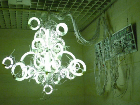
‘Untitled (Chandelier VII)’ by Yuichi Higashionna, Japan is composed of various sized circular fluorescent lamps. In Japan, unlike Western countries, people prefer lighting their home very brightly with fluorescent lamps, favouring the very white light that is emitted from these lamps. Mystified as to their popularity, Higashionna takes this mundane everyday lighting product and creates an elegant chandelier with an extravagant industrial twist. The assembled circular lamps and electric cords are left exposed, giving the piece its rawness. The chandelier is an artwork rather than a lighting appliance, a handmade object, not a product.

bombay-sapphire-capacity-chandelier

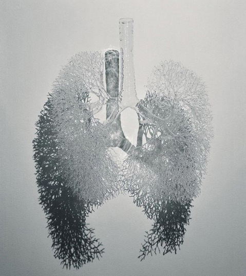
The inextricale link between the making process of, and what it represents, is at the root of ‘Capacity’ by Annie Cattrell, UK. It is made by blowing air into malleable glass; therefore the act of breathing creates the organ of breath, the human lungs. Working with borosilicate glass and lampworking techniques traditionally used by laboratory glassmakers, Cattrell constructs and models the overall structure; elegantly assembling and fusing hte blown glass trachea, arm and fine outer branches together to create the human lungs.

The structure’s light aesthetics, suggestive of the breath and the paradox of the fragile yet resilient qualities of glass intensify the connection between the complexity of the body and the transitory nature of life.

I prefer the second one. But if you want to see more finalist, head on to the Gallery at Bombay Sapphire.

[Pet peeve – I know it is required by law, but it’s really irritating (not to mention ineffective) that liquor sites have to have this ‘Are you under 18’ check on their website. As if it’s ever effective in any way. Just simply a little hypocritical device that everyone knows doesn’t work, and everyone still has to put it up for politically correct reasons. Gah.]

Alphabet-Vegetable Book

alphabet-vegetable-book

Find it difficult to get your kids to munch their vegetables? Maybe transforming it into a fun learning process helps? In comes Great Big Veg Challenge:

From artichokes to zucchinis, broad beans to yams, every aspect of this family vegetable adventure is lovingly chronicled in Charlotte’s book “The Great Big Veg Challenge”. As well as being highly practical containing over 100 delicious child-friendly recipes, this fully illustrated book is also the funny and touching story of how a mother changed her son’s eating habits for good.

Not sure if it’d work – but if you’re interested you can always give it a try?

Green = Cute-sifying?

cute-green-logos

Must you cute-sify your logo if you want to show you’re green? For instance, major corporations like BP and Monsanto have ditched their stodgy and serious logos in favor of cuter and more ‘down-to-earth’ ones. Nicole Peterson (who has a very interesting research going on – the usage of cute in contemporary design) ponders in this article. Excerpt:

Environmental awareness has been around for decades, but increasing alarm about global warming has put it on the forefront of the public mind. It is no longer only in the realm of hippies and tree huggers; the average American consumer can also be an environmentalist! But since the issue of environmentalism is so vast and complicated, many newcomers to the green movement may feel unsure about where they can start. Cuteness is an effective way to make novel, complicated ideas and technology easier to understand by taking away uncertainty and allowing empathy. For example, when introducing the iMac G3 in 1998, Apple focused on the computer’s cuteness and ease of use rather than its technological capabilities. Television commercials playing the Rolling Stones’ “She’s a Rainbow” emphasized that the G3′s rounded, approachable design came in a variety of bright colors. Similarly, the green movement is now focusing on easy, feel-good ways consumers can help the planet.

Design Posters for Designers!

Frank Chimero is a talented graphic designer from Missouri, with a particular knack (as far as I see) blending wholesome goodness and bits of humor into nostalgic designs. This post features one of his series ‘Inspirational Design Posters’:

I decided to embark on creating some “inspirational” posters aimed specifically at designers. The topics range from various truisms I’ve discovered about the field in the past few years to snarky tongue-in-cheek comments. I think we designers spend an awful lot of time talking to ourselves, and I consider this my contribution to the monologue.

I quite like how most of his posters are simple and well-proportioned juxtaposition of just a few elements – and there’s no harm having these to inspire you.

Creative Profession

creative-profession

Ignore People

people-ignore-design-that-ignores-people

Courage

simplicity-requires-courage

Big Ideas

frankchimero_BigIdeas

Barriers

frankchimero_Barriers

Proposed Creative Workflow

frankchimero_Proposed_Workflow

Making Design

frankchimeroMakingDesign

That Idea

frankchimeroGoodDesign

Productivity

frankchimeroProductivity

Life is Fun

frankchimeroLifeIsFun

Concerned with People

frankchimero_Concerned_with_People

Human Being

frankchimero_Human_Being


Frank Chimero web site.

Shadow Signage

gallery-hotel-singage

The sign is discreet – not too common for a marque bearing the name of a tourist-attracting business like a hotel. But that’s how this hotel in Florence, Italy roll. A faint spotlight at the top of the wall casts light upon what we usually see as an awkward ensemble of wires and voila – the name of the hotel is spelled out in the shadows on the stucco facade.

Subtle art!

Designing the Magazine’s Feature Article


Matt Willey recently put together a video snapshot of the design and editing (and editing, and editing, and editing…) process for a Royal Academy magazine cover story. Before the final layout is frozen – there is a pretty long and iterative process that designs in general often undergo before it reaches the final glossy look (which is what most laymen may have access to).

This may help in-part for those of you who have clients or others saying “What? You spent a whole day just on this”? type of questions.