Fitzsu Grand Prix

playsamgpmainmo2

The Fitszu Society, a home accessories store, took their iconic PLAYSAM car and invited many designers across the world to give their interpretation/design of the original toy car, including Karim Rashid, Syd Mead, Yves Behar and Richard Meier. It’s certainly interesting to see each person impart their design characters into the toys, which will then be auctioned off for charity.

Now now, why can I instantly guess that Michael Graves was one of them?

Visit Fitzsu for the full collection.

[via NOTCOT]

COOL (Environmentally Friendly) Bikes

These days, going green quite often implies going cool. This is also true for bike designs.

env2be2

envcore

Instead of gasoline, this ENVBike uses hydrogen as its power source. Usually, “green” vehicles are associated with low power and not much fun. The ENV is not stellar in engine performance (it goes 0-50 mph in twelve seconds and its top speed is 50 mph.). It does look powerful though.

The second photois the power source of the ENV. It houses the fuel cell generator. It is removable/detachable and could be used as a separate power source. The intricate engravings on the housing display its status as a beautiful object in itself, showing off  hydrogen technology’s cleanliness.

While we’re looking at fuel cell bikes, we might as well look at the ones   from Yamaha too (from quite a while back):

yamaha-passol

Yamaha_Divide

Yamaha_FC06

Yamaha_FC06

Yamaha Passol, Yamaha Divide, Yamaha Pocke, Yamaha FC06.

Wii – Good design?

nintendowii

Before the Nintendo Wii was first released, I first came across a trailer for the game console Nintendo initially was referring to as the Revolution. It was an amazing example of innovation in the interface of video games.  I had a classic moment of “why did I not think of that”.

To me, it was great design – giving the users a much more immerse and intuitive gaming experience. Gaming is about pretend-play, where one imagines oneself to be another character. So why should the controls be an array of buttons, when you can pretend it’s a wand, a tennis racket, or a light saber?

Searching for more information, and I observed that this is a clever approach. The Xbox360 and PS3 are geared for and compete for the increasingly difficult niche of hard-core gamers, the Wii aims for a different consumer instead – the casual or social gamers who’d play a game or two at leisure, or while doing chores. Nintendo avoids a head-on competition with its rivals. Moreover, concentrating on this market also means it does not need to spend resources on (expensive) ultra-realistic graphic cards and hardware, and so they are in a much easier position as compared to Xbox/PS3.

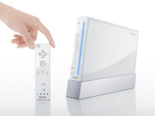
As the sale date drew closer, images of its design details emerged, and I became somewhat disappointed. The physical console itself seem to be a far cry from what it promised, especially as one inspects the details. It seemed ordinary, and mediocre. Perhaps this is due to the much lower price-point that they targeted. The plastic housing and buttons screams ordinary and cheap.

Expectation meets Reality

nintendowii2nintendocloseupbase

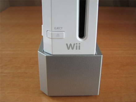
One could argue that during game play, no one pays attention to the console itself. It’s the game itself that is important. From an industrial design perspective, the console  overall looks good – it looks well sculpted as it sits proudly in the cradle at an angle, with sleek proportions and simplicity. The let-down, however, is in some of the details such as the cables, the finishing and the buttons.

So in a way, the Wii console is a hallmark of good design – well thought out novel approaches to bring a new and exciting experiences to users, which is what design ideal is about. But I’m scrutinizing it extra hard, because I had set much higher expectations for it. Therefore when the physical product isn’t as astonishing as the experience of the game play, I find myself somewhat let down.

After two years of having all three consoles (Wii, Xbox and PS3) in my home with two teenagers and the third at 10, it is the Wii that gets the most play time.

Failure by Design

ParkBench-anti-homeless

The public park bench shown above in Japan is designed in a number of ways to be very unergonomic:

  1. It has a rigid, upright back that forces you to sit upright.
  2. The seating slopes down and outwards, this makes the user feel like he/she is slipping off the bench constantly.
  3. Firm dividers that prevent users from laying down on the bench.
  4. Relatively shallow seat depth.

This bench was commissioned, designed and produced for use in Japan’s oldest park, Ueno Onshi. It was specifically designed to be unergonomic. This is because the park where this bench was placed is host to many homeless Japanese. The design and features of the bench are intended to deter the homeless from sleeping on them. Unfortunately the benches are so uncomfortable that other park guests are not able to enjoy a nice relaxing rest on them while using the park.

It is clear that these benches have failed in their purpose. While they may be effective in deterring the homeless, they have also at the same time deprived or severely limited other guests from its benefits. It is simply, designed to fail. It’s like asking Mercedes to design a car that only goes 5 mph to deter thieves from stealing their cars.

Leander Crib

leandercrib

The Leander baby crib is a fantastic blend of simplicity and beauty. There are  furniture designs that goes for simplicity (Scandinavian furniture come to mind), portraying a sense of minimalist neatness and cleanliness.

This one is special, however, because it manages to look and feel rich instead of merely clean or sterile. Your kids would probably imagine themselves to be in a boat, a throne, etc. as they play and sleep in it. And it grows and converts with your kid!

[via swissmiss]

Gehry – Purple Ribbon Hotel

gehry-purple-ribbon

When I first saw the Hotel Marqués De Riscal architecture, the thought of a Gehry-copycat came to my mind. Turned out that it was Gehry who did this. Brutally put, I think Gehry has lost his touch. Guggenheim Bilbao was great because it was a breakthrough against the literally brick-and-mortar architecture mold. The curves were elegant and flowing – unlike this jumbled mess-tangle. While certainly iconic – I love the purple – it doesn’t quite remind one of the beautiful vineyard, the rolling hills that it sites in.

Maybe I’m just not geared to see the beauty in Gehry’s imagined slimy fish scales in his architecture. And I don’t dig his chair either.

Design Detail: Cup – Ikea

ikea-trofe-mug

If you’ve been given a very tight design brief where the client specified everything – size, material, color, etc., and are whining that there is no scope for innovation or design, this TROFE mug from IKEA may inspire you a little. The tiniest of detail – a little gap in the base of the cup that helps drain the excess water after you wash the cup and turn it upside down.

This is great design, in my opinion. You can always still be clever in every space and every detail.

Zen – Pebble Sofa

zen-pebble-sofa

Carefully aligned, smooth pebbles are virtually synonymous to Zen interiors. A professor once told me that the pebbles are actually a form of abstraction of water. As one can’t afford to bring a stream into the living, the Zen-enlightened masters extracted the symbolism of pebbles in the stream.

This line of Livingstones products mimics these pebbles – but instead of stone, it is cleverly made of fabric and are soft. So you get the cool Zen feel while still being able to laze and lounge around these things.

Call Blocker

callblocker

While I’d stop short of calling it a disgrace to logic and design, this device purports to shield you from evil salesmen and telemarketers by announcing this message to all incoming calls:

“You have reached CallBlocker™ and not an answering machine. All commercial sales calls and fund raising requests are not accepted, place this number on your do not call list. Personal and invited callers press 5 on your touch phone to proceed.”

Right. That REALLY makes sense huh?