(LESS) of (RED)?

red2

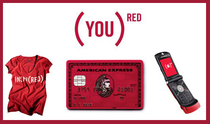
Product Red (styled (PRODUCT)RED) is a for-profit brand which is licensed to some of the more iconic brands: Apple, Motorola, AMEX, GAP, etc., who are then entitled to use this brand on their products. In return, they donate a percentage of profits towards the AIDS cause in Africa.

I don’t harbor warm feelings to this campaign – a marketing gimmick that leverages on human compassion to dig more gold from the consumers. Look at the copy of what (Product) RED is about – if this isn’t marketing and branding fluff, I don’t know what else is:

“Each company that becomes (RED) places its logo in this embrace and is then elevated to the power of red. Thus the name — (PRODUCT)RED. You, the consumer, can take your purchase to the power of (RED) simply by upgrading your choice. Thus the proposition: (YOU)RED. Be embraced, take your own fine self to the power of (RED). What better way to become a good-looking samaritan?! [bold mine, ?! theirs]

Stemming from a reaction against the (RED) campaign, the (LESS) campaign invites donation to the same charities for AIDS as (RED), but without the conspicuous consumption of the branded goods. When I first saw the ads/pictures, I thought it was rather refreshing. I must say I’m a little less inspired when I went to their website though.

While they sharply challenged the (RED)’s ideology of copious consumption in the poster ads, they have inherited and duplicated (RED)’s style – be it in their web design, approach or their overtly-marketing tone, complete with slogans and a faux sense of grandeur. While reacting against the superficiality of (RED), they seem to be sorely lacking in sincerity of their own.

It does make me ponder if (LESS) is even operated by the same people in (RED) – like you’d learn in Marketing 101 – it never hurts to capture more segments of the target demographic.

Visual Branding – more than a mark

cow-branding

The idea of branding – and indeed the term ‘branding’ itself – began thousands of years ago, when people started literally branding their livestock with hot iron as a mark of ownership or quality. Gradually through the years, the notion of branding as a clear visual symbol has evolved and spread to practically all industries. Some of the principles of branding include clarity (legible, easy-to-read even within a short time), identity (the mark should communicate the idea/spirit of the brand) and consistency (consistent style of application to reinforce the mark’s strength and recognize-ability).

These principles have generally evolved into extremely comprehensive brand identity guidelines – the exact vector of the marks notwithstanding, there are also generally stringent rules about the colors, minimum perimeter space around the logos, where and how the logo may be used, etc. Like a jewel on a crown, they were the untouchables – the identities must be so – they stand proudly on or atop products, displays, posters, etc., almost like a king watching in solitude over the rest of the artwork doing the legwork in conveying the message. The brand-mark was very much simply a stamp of approval.

Lately though, I’m beginning to see some forward-thinking brand-marks developed less as a stamp, but more as a flexible lasso to hold everything together. Wolff Olins is among the pioneers in this school of thought. As their CEO, Karl Heiselman remarks:

In the past, corporate identity was about control and consistency. With too much control, people tend to forget about content. In the era of blogging, social networking and user-generated content … a bit of flexibility is essential.

They are often just as strong and iconic (if not more), but they have an added dimensionality and freeplay that allows for creative interpretations of the symbol, rather than just a static stoic symbol. Sometimes they are used as a design tool – an example is the ‘NYC’ logo for New York City, which can be manifested beautifully such as in the second picture below:

nyc-logo-usagenyc-application1nyc-application-2

Some other memorable and successful designs from Wolff Olins include the Sony Ericsson symbol, which is being used in place of a verb in many billboards and poster advertisements, leaving the user to imagine and associate whatever the word is (and associate that to Sony Ericsson too):

se1

Another one is the Product(RED) campaign – the bracket and the superscript RED forms an extremely strong visual identity, and yet allows a large amount of free play to how it is used, which is especially important given the varied styles and usage for its partners.

red2

They are also the ones behind the London 2012 Olympic logo, which I didn’t find too impressive (and blogged here). The logo was along the same thought – promising versatility and flexibility in usage – but I thought aesthetically they weren’t as well-done as some of these above.

It’s great though to see brands getting more alive and versatile. With the new mediums of expression (cellphones? Google Earth views?) and the Web2.0 culture of hacking and mashing, a versatile logo allows the audience not only to receive but also to actively reciprocate and reinterpret what these brands mean to them (such as the (LESS) campaign in response to the RED). Some marketers may freak out and take this as perversions of the company’s brand identity – but let’s face it – a brand is what the consumers think about you, and not what you want them to think about you. And with modern technologies like the net, there is no way you can stop them either. So might as well just leap in!

Digital Price Tags

tokyo-digital-price-tags

Jan Chipchase spotted over at his blog the usage of digital pricing tags in a supermarket in Tokyo. As he noted, there are many possibilities enabled by this new pricing information:

Why? The ability to dynamically change prices based on contexts such as time of day, customers in proximity, levels of stock, or the weather that you experienced five minutes ago creates so many opportunities. Small sign. Big implications.

Of course there’s also additional other conveniences like electronically updating your price, which means your staff won’t have to manually switch tags; or maybe prices of all chains of megamarts are fed back to a central server in real time, to make sure the there are no errant pricing in franchisees; or perhaps they mega ‘cheapest here or else’ marts can upload prices in real time to a social website for comparison.

But, if you have the power to dynamically change price, would you? Would the feeling of certainty and constancy be more important than the perceptively fluctuating or shifting price, which tends to lead to insecurities? Would the customers think they’re getting gouged when they have to pay a higher price responding to a certain context (even though they could’ve chose to think the other way – they got the discounts on other days)?

Food for thought…

Students of Today


This video serves up survey results of what is typically in a student’s life. The description doesn’t sound all that interesting, does it? Growing up, go to school, party, study a little, go online a lot…we probably think we know this age group pretty well already. Yet, there is something fundamentally different about students in that video that made it thought-provoking for me.

It could be the way this video was made and conceived – the survey questions themselves were mass-authored by all the participants in the survey itself – kinda like, Wikipedia asking itself questions. It could be how much ‘non-traditional’ learning and communication tools – like websites and emails – dominate the average student’s life as compared to ‘traditional’ tools like books and assignments.

In our face is a fundamental shift in the way we learn. Rigid and orthodox methods, like formal textbooks and school lessons, are rapidly giving way to much more flexible mediums. Indeed, as Sir Ken Robinson pointed out in this fantastic TED Talk, in the rapid development of the world what we learnt in school would have been obsolete the before we even graduate. Those who recognize this first (and act accordingly) would stand to gain.

Vending Machine Dress (among others)

vending-machine-dress-01

If you noticed something isn’t quite right about the vending machine above, don’t worry, you don’t need to check your eyesight. Yes, the right-most vending machine does look particularly fishy – wait a minute: is that a person wearing a vending machine suit? Has Halloween come to Japan in a weird manifestation?

In what appears to be stranger than fiction, New York Times carried an article with the title ‘Fearing Crime, Japanese wear the Hiding Place‘.

Deftly, Ms. Tsukioka, a 29-year-old experimental fashion designer, lifted a flap on her skirt to reveal a large sheet of cloth printed in bright red with a soft drink logo partly visible. By holding the sheet open and stepping to the side of the road, she showed how a woman walking alone could elude pursuers — by disguising herself as a vending machine.

I’m sure the headline was really just a sensationalist garb – it attempts to suggest that this is already a mainstream practice rather than simply a concept or a chindogu by a designer in Japan. Check how it transforms:

vending-machine-dress-02

vending-machine-dress-03

There are also other manifestations – a bag that transforms into a manhole cover so that people would walk past and not notice it; another bag for children that attempts to turn the child into an unsuspecting fire hydrant. These concepts are certainly amusing, but there is a greater cultural spirit and meaning behind:

But the devices’ creators also argue that Japan’s ideas about crime prevention are a product of deeper cultural differences. While Americans want to protect themselves from criminals, or even strike back, the creators say many Japanese favor camouflage and deception, reflecting a culture that abhors self-assertion, even in self-defense.

Perhaps it is this culture of invention-tolerance, no matter how idiosyncratic or bizarre, that facilitated Japan’s contribution to the world’s other (arguably more useful) innovations and inventions. It’s again of those moments – ‘it could only be Japan!’.

Troika Tape Dispenser

troike-tape-dispenser

Beileger mit †bersetzungen ohne MC.eps

The Troika tape dispenser attempts to break away from the norm – we typically see either the big-bulky desk-bound types, or the disposable light ones that comes with the tape itself. Seemingly alluding to the musical tuning fork, the design is extremely neat and delightful, while shattering the previous stereotypes of tape dispensers. It has even won quite a series of design awards, including the Good Design Award from Japan in 2006.

But how well would it work?ROGER LiVE has a not-so-concise but certainly impassioned plea for its thoughtlessness:

Well, until you actually try and use this beautiful thingamajig: Firmly grip the handle with one hand, stick the roll of tape onto the rubber core with the other hand, place the poster with your company’s goals (or whatever) on the wall with your free hand, try and get it level, hold it firmly in place, realise you have no hand left to pull off a strip of tape, try and hold the poster with your little finger and your ring finger while pulling off the tape with the other fingers, drop the poster on the floor, swear a little bit, pick the poster up, place it on the wall and get it level again, hold it in place with your elbow, notice the poster slipping away, swear a bit more, decide to rip off four strips of tape first, stick them onto the cupboard next to you, put the adrollding aside, get the poster level AGAIN, pull the strips off the cupboard, remove half of the varnish while doing so, try and fix the poster with the bits that aren’t full of varnish, swear at the abrollding and decide to give it to some poor colleague when it’s time for Secret Santa.

What’s your verdict? Is it a good design (perhaps for shattering conventions with a fresh new form in return), or would you crucify it for its not-so-usable design? Or maybe you can actually do a better one! (This is probably another JuicySalif-like discussion). Sad to say though, this is now discontinued.

Outsourcing to India

Outsourcing has been the media and management’s darling for the past few years – you can’t have leafed through any magazines or newspapers without having come across this term. Of course we know, we know – improved infrastructure, wage differentials, and a million (or as some articles might suggest, 10-12 billion) other reasons why outsourcing is the way to go.

But what about us mere mortals who don’t happen to own a multinational or two? A.J Jacobs from Esquire is equally piqued by this proposition – and ventured to find out. After hiring a few personal assistants (outsourced from India), he documents his little adventure in this light-hearted article. It’s quite amazing how deft in words these assistants can be – for instance (Honey is the name of his assistant from India):

Plus, Honey is my protector. Consider this: For some reason, the Colorado Tourism Board emails me all the time. (Most recently, they informed me about a festival in Colorado Springs featuring the world’s most famous harlequin.) I request that Honey gently ask them to stop with the press releases. Here’s what she sent:

Dear All,
Jacobs often receives mails from Colorado news, too often. They are definitely interesting topics. However, these topics are not suitable for “Esquire.”

Further, we do understand that you have taken a lot of initiatives working on these articles and sending it to us. We understand. Unfortunately, these articles and mails are too time consuming to be read.

Currently, these mails are not serving right purpose for both of us. Thus, we request to stop sending these mails.

We do not mean to demean your research work by this.

We hope you understand too.

Thanking you,

Honey K B

That is the best rejection notice in journalism history. It’s exceedingly polite, but there’s a little undercurrent of indignation. Honey seems almost outraged that Colorado would waste the valuable time of Jacobs.

Interested in your own concierge already?

Smile Detection mode on Sony’s T200

sony-t200

So I just realized that the Sony T200 has a feature/mode known as the smile detector. When this mode is activated, the camera goes into a standby mode, capturing your subject once they flash their pearly whites. I don’t know about you – on my camera, there’s a long list of modes – night shots, sports, portrait, landscape, etc. – but I have never ventured past the first few options. This feature seems like one of those – enough to be marketed as a unique selling point, but not quite compelling enough to be useful in real life.

Or maybe that’s just me?

Apple iPhone unlocked

iphone-unlocked

Prayers of fans worldwide has been answered – the Apple iPhone has finally been fully unlocked (with just software, no hardware modifications at all) from the AT&T Carrier, and can now be used with any carriers worldwide. Of course this isn’t a turnabout on Apple or AT&T’s management decision – rather it’s the result of weeks of sleep deprivation, code cracking, head scratching and clever programming from hackers.

Engadget here has the full documentation right here – or, find unlocked phones on Amazon here. They have not released the software publicly yet – judging from their website they seemed intent on making a quick buck via licensing or selling the unlocking software – but I’m as certain that it will eventually be free (if you can unlock the iPhone, others can unlock your software).

So Apple and AT&T executives would lose some sleep – and are perhaps already furiously working on patches to cover this loophole. But as we can see from hardware-software-locked examples like the PSP, you’re (almost) certainly never going to win. Sony tried to patch up their firmware from custom-firmwares and even throwing in incentives for users to upgrade, but they still failed every time to get it secured. In my opinion, iPhone will be no different.

Perhaps it’s also time to think – now that the cat is out of the bag, how could each stakeholder make the best out of the situation?