studio juju @Milan Fair

Singapore-based designer-duo Timo Wong and Priscilla Lui formed “studio juju” based on the philosophy of a hands-on approach to designing and crafting. For the Milan Fair they  launched some of their collections:

Rabbit
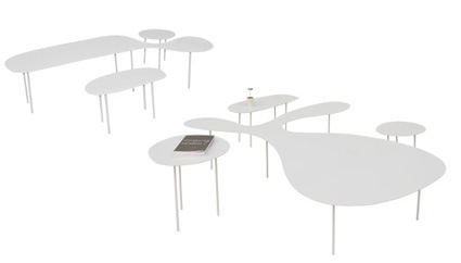
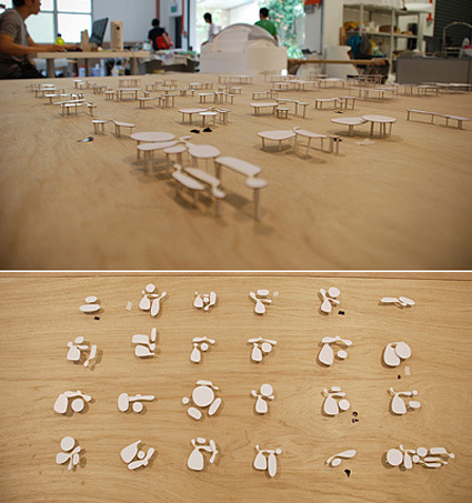
None of the tables are the same in height, dimension or shape. The arrangement becomes fluid and, hopefully, will inspire an indefinite interaction when people sit themselves along the curves and place their cups on different heights and shapes.

rabbit

rabbit-2

One Shelves
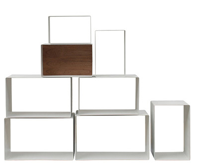
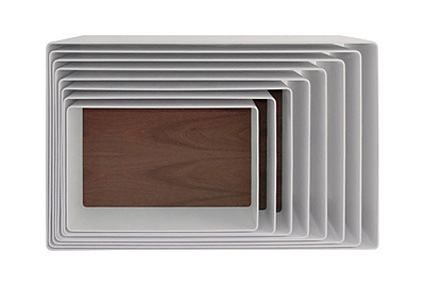
A set of small boxes that can be nested together to take up the least amount of space and expanded without tools to form a big shelf. stack and arrange the boxes to fit different rooms.

one-shelves1

one-shelves-2


Why are Browser Icons Round and Blue?

Voltage Creative asked an interesting question:

Every single (even moderately successful) [note: except Opera] web browser’s logo has been round… Why?

Some plausible explanations:

  • IE was a blue rounded icon and everybody just followed suit
  • The globe is the best representation of the Internet (and it’s round and blue)

I tend to concur with the blue-globe metaphor explanation – if you look at most of those icons, there are explicit globes in it and you can’t quite have a square globe, can you? Which leads me to think – is there any better metaphor apart from the globe for the Internet?

Urbano Bin

urban-trash-can-design

urban-creative-alternative-trash-bin-copy

In the recent years there have been some attempts at bins that specifically addresses the usage of plastic bags. The ‘Urbano’ is another similar attempt – with the design thoughtfully being doubled up as a plastic-bag storage:

Another twist to make this design even more compelling: extra bags can be stored under the one in use, pushed down by the handles and tucked beneath them. Replacing the bags, then, is even easier than in a traditionally designed trash can – you just pull up the new bag after your remove the old one and hook its handles around the catches provided.

My little question is just – when the bin has some rubbish in it (but not full enough to throw it away yet), you can’t really store it (it’s too much of a mess to lift the rubbish-bag up, tuck the bag in, and put the rubbish bag in again). But overall, neat design!

Youtube Symphony

Mash-up; collaborative web; globalization…these are just some of the typical terms you hear nowadays regarding the development of web technology – and this orchestra is yet another example, where the London Symphony Orchestra plays the Internet Symphony No. 1 “Eroica” – for YouTube, conducted by Tan Dun:

Personally for this specific application, while it’s interesting to see this (can we still say novel?) form of expression enabled by the web, the lingering question remains as “why?”. What exactly is it about this collaboration that makes it special, something that you can’t achieve with the typical orchestra?

Has the music become something different or special due to the ability to compose from multiple cuts of home-recorded videos? Not really. For me this became simply a ‘because-I-can’ demonstration – it has not truly leveraged the power of the collaborative masses. Not yet anyway.

Tweenbot – Will you guide a robot?

tween-bots

Tweenbots is an interesting (not to mention adorable) project testing the kindness of the general (New York) population towards a robot:

In New York City, we are very occupied with getting from one place to another. I wondered: could a human-like object traverse sidewalks and streets along with us, and in so doing, create a narrative about our relationship to space and our willingness to interact with what we find in it? More importantly, how could our actions be seen within a larger context of human connection that emerges from the complexity of the city itself?

All it does is to roll in a straight line at constant speed. It, however, has a flag on top showing the desired destination. Thus, when released from one location, all it can do is to depend on kindred strangers to turn it towards the correct direction.

peoplebotweb

path

Tada – the diagram shows Tweenbot’s successful navigation at the Washington Square Park, taking 42 minutes and 29 people’s assistance to get from one corner to the other.

I’d say that the robot is too adorable to give a real test on the people’s kindness level though – make it look wholly unremarkable, and maybe we’d have a different results.

Check out the Tweenbots site – videos of Tweenbot’s view and more robots in the line-up.

How Offices have Changed since 1900s

office-seating-arrangement

Office planning is critical – get it right and everyone’s productivity can improve. Get it wrong, and the effectiveness can nosedive. Historically, it’s a see-saw balance between openness and privacy, oversight and autonomy, free-form and grid. WIRED has an article on it chronicling the major trends in the past century or so, showing how various arrangement may reflect the attitude and zeitgeist.