

This site will show you your global wealth rank based on your yearly income. If only wealth was measured in pure money.

This site will show you your global wealth rank based on your yearly income. If only wealth was measured in pure money.
Jeni Wightman asked about 2000 Cornell University staff the following question:”Of the many charts (graph, map, diagram, table and ‘other’) you have seen in your life, which has been the most important, remarkable, meaningful or valuable?”. Then they were asked to attach a copy of it and are collated.
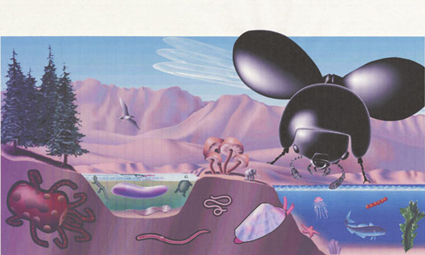
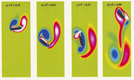
1) Vorticity field created by idealised 2-dimensional dragonfly wing. 2) Proportional representation of bioscape on Earth: fungi, birds, insect, etc. (notice the small elephant representing mammals). 3) Moore’s Law.
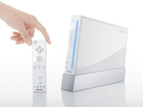
Before the Nintendo Wii was first released, I first came across a trailer for the game console Nintendo initially was referring to as the Revolution. It was an amazing example of innovation in the interface of video games. I had a classic moment of “why did I not think of that”.
To me, it was great design – giving the users a much more immerse and intuitive gaming experience. Gaming is about pretend-play, where one imagines oneself to be another character. So why should the controls be an array of buttons, when you can pretend it’s a wand, a tennis racket, or a light saber?
Searching for more information, and I observed that this is a clever approach. The Xbox360 and PS3 are geared for and compete for the increasingly difficult niche of hard-core gamers, the Wii aims for a different consumer instead – the casual or social gamers who’d play a game or two at leisure, or while doing chores. Nintendo avoids a head-on competition with its rivals. Moreover, concentrating on this market also means it does not need to spend resources on (expensive) ultra-realistic graphic cards and hardware, and so they are in a much easier position as compared to Xbox/PS3.
As the sale date drew closer, images of its design details emerged, and I became somewhat disappointed. The physical console itself seem to be a far cry from what it promised, especially as one inspects the details. It seemed ordinary, and mediocre. Perhaps this is due to the much lower price-point that they targeted. The plastic housing and buttons screams ordinary and cheap.
Expectation meets Reality

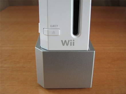
One could argue that during game play, no one pays attention to the console itself. It’s the game itself that is important. From an industrial design perspective, the console overall looks good – it looks well sculpted as it sits proudly in the cradle at an angle, with sleek proportions and simplicity. The let-down, however, is in some of the details such as the cables, the finishing and the buttons.
So in a way, the Wii console is a hallmark of good design – well thought out novel approaches to bring a new and exciting experiences to users, which is what design ideal is about. But I’m scrutinizing it extra hard, because I had set much higher expectations for it. Therefore when the physical product isn’t as astonishing as the experience of the game play, I find myself somewhat let down.
After two years of having all three consoles (Wii, Xbox and PS3) in my home with two teenagers and the third at 10, it is the Wii that gets the most play time.
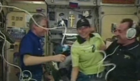
Anousheh Ansari on the International Space Station.
The first woman to travel into space as a tourist is Anousheh Ansari. She was the 4th space tourist. She kept a blog that is unlike the others where she documented her thoughts and emotions before, during and after the space travel. Her blog that is written in a honest and simple manner brings home the human and personal thoughts and reflections as humans travel off our small planet. She was not the first tourist to go up into space, however, she is the first one to give us an intimate view of the adventure.
While reading her blog, I can imagine myself peering out the small window and floating weightless far away from home. It puts many of our petty daily issues in a different perspective. In some ways it is similar to my post about Earth being a small pale blue dot.
The cities are easily distinguishable because they look like someone took a shovel and messed up the ground in that area. The agricultural lands have specific geometric shapes and demonstrate different colors based on the crop and the type of soil. You cannot see any borders… you cannot tell where one country ends and another one starts… the only border you see is the border between land and water.
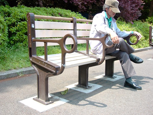
The public park bench shown above in Japan is designed in a number of ways to be very unergonomic:
This bench was commissioned, designed and produced for use in Japan’s oldest park, Ueno Onshi. It was specifically designed to be unergonomic. This is because the park where this bench was placed is host to many homeless Japanese. The design and features of the bench are intended to deter the homeless from sleeping on them. Unfortunately the benches are so uncomfortable that other park guests are not able to enjoy a nice relaxing rest on them while using the park.
It is clear that these benches have failed in their purpose. While they may be effective in deterring the homeless, they have also at the same time deprived or severely limited other guests from its benefits. It is simply, designed to fail. It’s like asking Mercedes to design a car that only goes 5 mph to deter thieves from stealing their cars.
Flying bears, flying cows, and occasionally, a bird will fly. This time-laps video is from the Reno Balloon race several years ago.
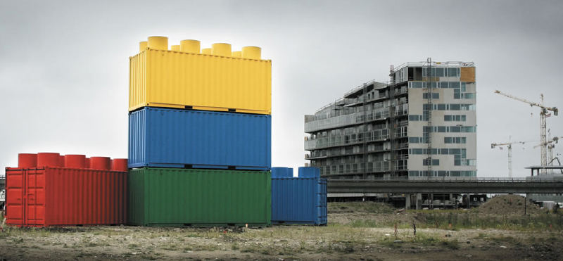
Someone at Lego had a bright idea for a low budget ad. Lego placed containers that were transformed to Lego blocks at real constructions sites. I think it was quite effective since the shape is so iconic.

We have all seen the advertising campaign for Absolute Vodka. Perhaps the there was some tipping point after wiping up the remains after yet another accident that prompted this advertisement by the Bucharest Traffic Police.
This performance, “The Sultan’s Elephant” by Royal de Luxe is an amazing puppet show – if you could call a (30feet?) tall puppet that. Maneuvers are done via long ropes, cranks and tall cranes instead of nimble fingers and threads. However, don’t let that set-up fool you. The motions are totally natural, without the slightest hint of a mechanical nature.
This puppet show is the most realistic I’ve seen – the puppet itself is already a mastery of crafts. The eyes, eyelashes, the hair, etc. as she blinks, wonders, ponders; the expressions on the wooden puppet that seem to almost quietly whisper you a question. Eerily real, wonderfully superb.
“Hun, do I look fat?” Well with 150 t-shirts on, yes.