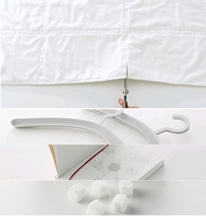
You might’ve known that the results for MUJI Award 02 was announced some time ago – the winners were selected from among 3422 entries from the world. ‘Towel with Further Options” won the Gold Prize:
This bath towel moves your mind toward further uses of the product. Towels take every day dirt and gradually become damaged. In accordance with such changes, you can downsize the towel with “further options” from a bath towel to a bath mat, and then to a floor cloth and dust cloth. The towel has a vertical and horizontal textured surface that does not produce pile-fabric waste when cut with scissors. The lines act as a marker for cutting and form square modules that let you imagine other uses, encouraging you to re-use it.
The rest of the entries are the Stackable Hanger, Chronotebook and Kakujio (cube salt). In this post, I’d like to explain more about the Chronotebook design: if for no other reasons – well, because I’m the designer behind this. As the title implies, this is a notebook with Time as a central element in design.
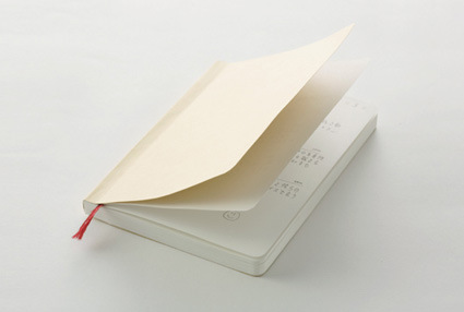
On the outside, the Chronotebook is a rather plain notebook meant for daily use – much like a daily planner. It is A6-sized, thus able to fit into your pants pockets if you really wanted it to. It comes with rounded corners both for aesthetic purposes, as well as to minimize ‘dog-earing’ of the book pages as you use it. A handy bookmark ribbon helps you remember which page you stopped at. Overall, simple plain MUJI-ness.
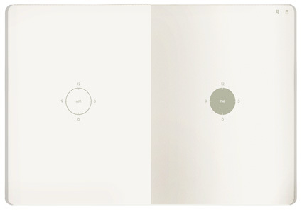
The inside is where the difference lies. Instead of lines and rows of scheduling grids, you are greeted by stark and minimal graphics. At the center of each page there is a graphic of a clock – AM on the left and PM on the right. That’s it. You plan your daily activities around the clock.
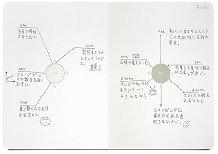
That much about the product design and usage itself. Why do it this way? Quite a few factors. A daily planner’s central purpose is to communicate clearly what the owner needs to do at each time. Here’s where I thought the design can be improved:
1) Grid Phobia
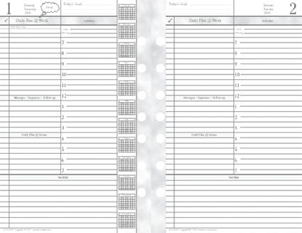
This is how a typical daily planner might look like. In the traditional layout, time is usually arranged in rows defined by horizontal lines. At a glance, they look oppressive and rigid, as we are forced to segment our lives and activities into an artificial lattice of compartments. We are however, not that robotic.
2) Analog vs Digital
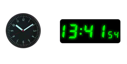
We lead our lives in analog, continuous circles of days and nights. While some have grown used and fond of digital watches, I believe that many of us still feel a more direct and intimate connection to an analog watch face. Time seems to be more human this way – maybe it’s the tradition dating all the way back to the first sundial. Or that it’s round and repetitious, just like time (day and night). These are subtle qualities that are lost in the translation to the digital notions of telling time (albeit more precise perhaps). 3) Writing within the lines All Over
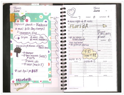
Because of the numerous hours in a day (and various other constraints), the lines in a diary are typically very narrow. They are also usually equally distributed (somewhat). But our information is a hierarchy. Some are more important to us. Some we feel happier about. We want to highlight stuff that’s important to us. We want to write things that are more important in BIGGER sizes. Our lives cannot be so easily and clearly divided into equal parcels.
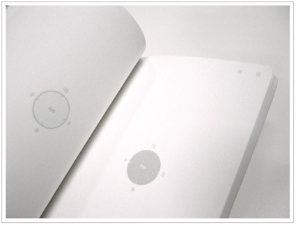
In response to those issues, the Chronotebook’s design gives freedom: You can write all over the page – there are plenty of blank spaces. It’s not entirely haphazard either – the central graphical ‘clock’ element still holds all the appointments and schedules together in a logical and intuitive way. It is also easier and quicker to glance at the happenings for the day.
So, those were some of the thoughts behind this design. Hope it helped you understand the design intent behind. If you have any comments/criticisms, do voice them out – I’d certainly appreciate them. Meanwhile, I’d be away for the next few days in Tokyo for the award ceremony – so there probably won’t be any updates until next week.

