How a Tower Crane Grows


We probably all have a vague idea (and have probably seen many) towering cranes in construction sites – those flamingo-legs scratching the clouds, almost unlimited in height, while hauling concretes and what-not around the site. Above is a video that shows exactly how it is assembled and grown as required, in tandem with the building construction.

Architectural LEGOs

Hmm this is certainly an interesting development from LEGO:

lego-architecture

If LEGO bricks can be made into trucks, dinosaurs, and pretty much everything under the sky – of course this mighty little bricks can be used for what their real-life real-size counterparts do: be made into buildings!

With models developed in collaboration with architects, LEGO Architecture works to inspire future architects, engineers and designers as well as architecture fans around the world with the LEGO brick as a medium. Builders of all ages can now collect and construct their favorite worldwide architectural sites through these artistic replicas.

Sounds like a perfect gift for your architecture friends?

[LEGO Architecture]

How Offices have Changed since 1900s

office-seating-arrangement

Office planning is critical – get it right and everyone’s productivity can improve. Get it wrong, and the effectiveness can nosedive. Historically, it’s a see-saw balance between openness and privacy, oversight and autonomy, free-form and grid. WIRED has an article on it chronicling the major trends in the past century or so, showing how various arrangement may reflect the attitude and zeitgeist.

Ecofont

Could this be the David that takes down Goliaths like HP, Canon and Epson?

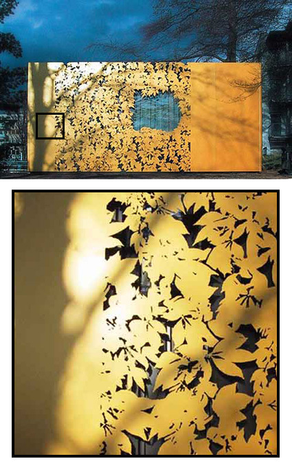
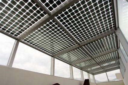
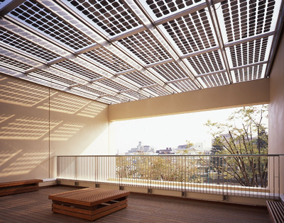
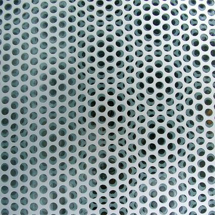
Architects have been using perforated metal panels like this for a long time. The holes are spaced and cut in a way that does not compromise the overall strength of the material, while removing a substantial portion of the weight, making it easy to use these panels for applications from facade to railing panels (with the bonus of allowing some light through and sometimes making interesting patterns from).

perforated-panel

What happens when the same spirit is taken to typefaces? That’s what happened to Ecofont (a free font), designed with minute perforations in its face without sacrificing legibility:

eco-fonts

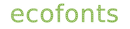
The Ecofont is developed by SPRANQ, based on a hunch of Colin Willems. We tried lots of possible ink-saving-options. From extra thin letters to letters with outlines only. We have omitted various shapes: dashes, squares, triangles and even asterisks. In the end the circle was chosen as the best candidate for the job.

With the Ecofont SPRANQ hopes to increase environmental awareness too. Increasing customer awareness about printing behavior: is printing really necessary or (partly) a waste of ink and paper? We also hope to inspire software giants and printer manufacturers to innovate in an environmentally conscious manner.

Would this be a small catalyst that dramatically reduces printing ink needs? Probably not – but still, I liked the interesting thought and cross-field application of the same concept!

Perforated Container Architecture

angela_fritsch_architekten_pavillonimparkdesalicenhospitals-copy

It’s rather incredible how the details in surface treatment makes all the difference in this prefab container:

In Darmstadt, Germany, The Alice-Hospital vom Roten Kreuz has commissioned Angela Fritsch Architekten to build a pavilion in the park in front of their main building, and the final result is a really creative design. The pavilion was constructed using a conventional system of prefabricated containers. In order to integrate it into the park, the surface finish of the facade is committed to adhering sheeting system patented by Hannes Freising from architectural facade firm Huellwerk. This ZGG pavilion (Zentrum Ganzheitlicher Gesundheit) was to consist of a cheap container box with a wallpaper made out of sheet metal. This golden cover has ornamental leaves cut out of it, making it a shiny and decorative structure in the hospital’s park.

I thought the solution was really elegant – transforming the drab container into 1) a pleasant thing to look at, just like a tree shedding its autumn leaves; 2) fitting into the context of the park; and 3) doing so at a (presumably) very low cost.

[via freshome]

Solar Power + Skylight in One

suntech-solar-grids

light-thru-kowa

We have learned from iPod that an elegant (need not be novel) and well-executed solution could herald a revolution in how we perceive and subsequently expect products. To me, the solar panel above could very well be one of the examples too.

Traditionally solar power panels are often conceived as an additional layer in the architecture – they are added onto existing infrastructure (roofs, walls, etc.) in large pieces. While there are some exceptions, often these solar panels jar out compared to the rest of the aesthetics. In a way you trade aesthetics for eco credence.

The photovoltaic system above by Suntech, however, is an elegant exception. The photo-voltaic cells are integrated within the laminated glass panels. They are arranged in a grid of rounded squares, with spacing in between that allows sunlight to fall – so you get both sunlight and power in one go (and some shade too!). I could imagine many courtyards, balconies, high-rise green canopies, etc. that would benefit from this.