

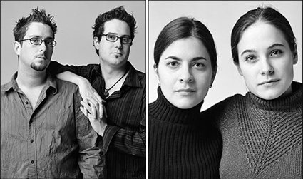
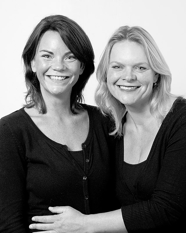
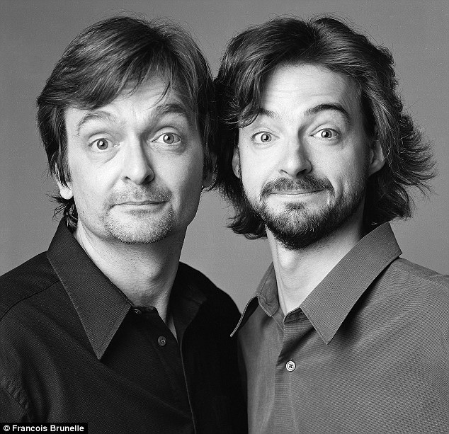
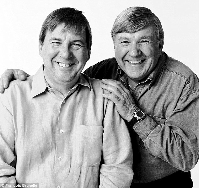
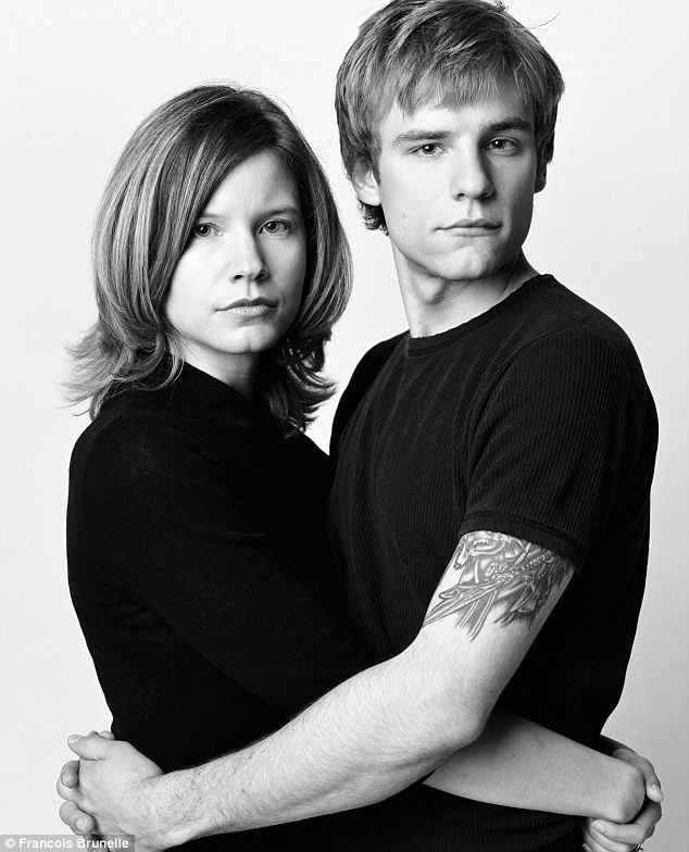
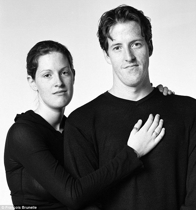
Photographer Francois Brunelle is a Canadian photographer that shoots photos of two people who are not related, however they look alike. Several years ago, someone mentioned to Francois that he looked like Rowan Atkinson, most known as “Mr. Bean”. This intrigued Mr. Brunelle and he started the “I’m not a look-alike project”. Once he has acquired about 200 photos, he plans to publish them in a book. If you look at the examples included here, these strangers could easily pass as siblings. If you just showed me the pictures, I would immediately think they were twins. The photos have no editing other than touch up for distractions like dust etc.
Francois is interviewed here by CBCTelevision.
It is just fascinating to see these pictures of unrelated people that look alike.
Tamara Stomphorst Sandra Meines 2010
Yves Megert (left) and Remi Bacon, 2001

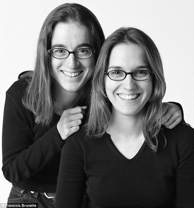
Marie Chantal (left) and Nancy Paul, 2004
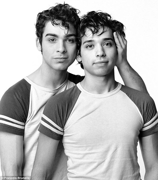
Nathaniel and Edward, 2003
Edith Prefontaine and Stefanie Tremblay, 2001
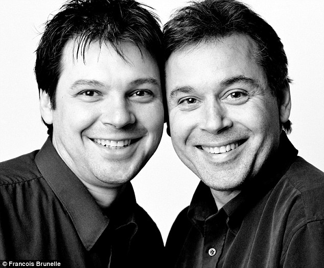
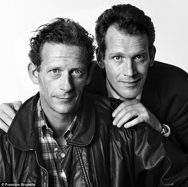
Stéphane Morin and Claude-Simon Langlois.
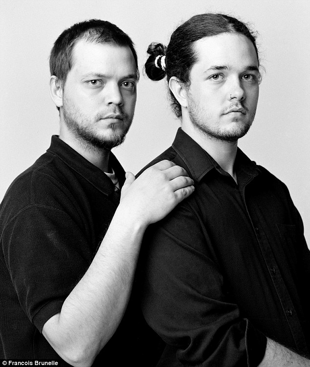
Marcel Stepanoff and Ludovic Maillard, 2005
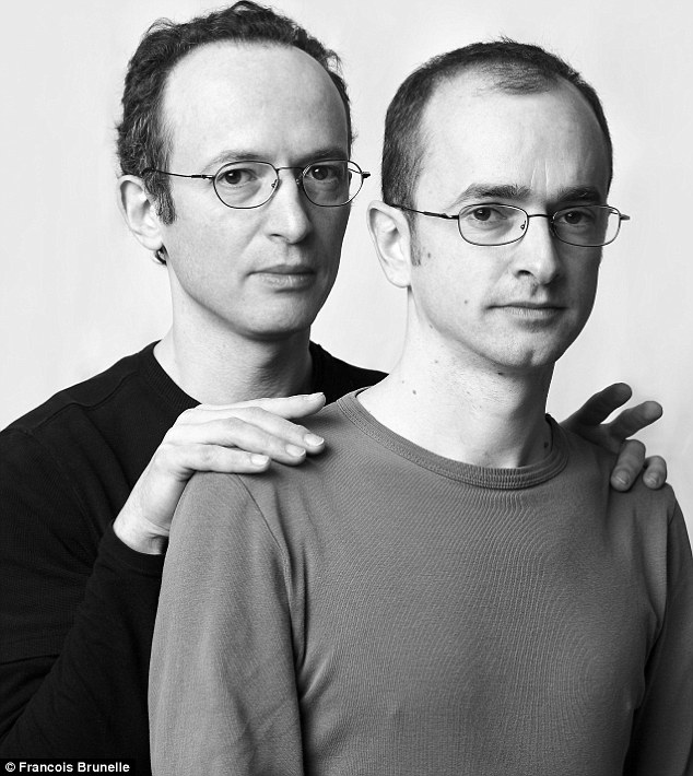
Frederick Hryszyn and Justin Ford, 2004
Jean Vachon and Jacques-Dominique Landry
Remy Girard and Gabriel Guibert, 2003
Valerie Carreau and Jean-Phillippe Royer, 2004
Sarah Fournier and Alan Madill, 2005
As of December 2012, Francois is still looking for look-alikes for his “I’m not a look-alike project”.

