Pantone Color Cue 2

art_colorcue2_more

Looking like a cross between a Darth Vader (I’m serious, the first thing I saw was the face shape – maybe a frowning, angry Egyptian mummy) and a generic poorly-designed MP3 player, this device helps you identify swatches in real life by scanning it and matching it to a Pantone color.

It reminds me of a previous post where people tagged Pantone color charts to real-life objects. I used to think that these gadgets are the marks of a designer – I’d imagine someone who’d get “inspired” by the surroundings – perhaps the autumn leaves triggered a new fashion scheme or something.

But now I’m totally not sure about it. For one, “inspiration” would be pretty weak if all you can derive from it is a bunch of RGB or CMYK numbers. And also, why’d you need to match a color of a real life object – unless of course you’re simply just trying to copy it wholesale?

For those of you who do happen to use on of these, it’d be great to shed light on the how’s and why’s!

Cubrick: Stackable Storage

dragtrolleys

Cubrick is a stackable storage system that doubles up as a trolley when you need to move them around. This, to a person who’s been packing and moving around hostel rooms every once a year or so, is heaven-sent. Combining two different objects in one stroke, where both the design language and the usage-compatibility are apt and spot on.

Some (especially electronic firms) seem to think that having more features is a good thing. Well, some times it is, but much more often we see a mismatch of interface, function ala “USB-alarm-clock-radio-mp3-40functions-all-in-one”, unexplainable and confusing array of buttons not withstanding.

We must always maintain the clarity and focus especially when combining features with variable requirement into one product. One way I use is to cover up the other feature and see if the design is still pleasing/logical. For the example above, the product still look good if e.g. it is not a trolley and functions only as a storage box, and vice versa.

Dutch Design Prize 2006

bicycle-stand-with-pump

The Dutch Design Award winners for 2006 are out!  There are more than 15 categories: transport, product, illustration, interaction, well basically everything. Head over to the site – you can also see last year’s winners there. For those of us who have not quite mastered Nederlandse, Bing Translator can help – well at least somewhat!

[Pictured above – Winner for Public Space Product – A bicycle bump has been integrated unobtrusively into a standard bicycle parking beam.]

Art-o-Meter

artmeter

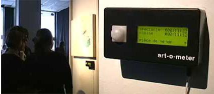
“Art-O-Meter is a device that measures the quality of an art piece. It bases its evaluation on the amount of time that people spend in front of an artwork compared to the total time of exhibition. The measurements are graphically represented by comments and a 5 star rating system”.

The design of the physical artifact aside, I think this device is symptomatic of a two interesting issues: 1) Democratization of content selection, and 2) Love/Hate is better than Indifference.

1) Democratization of content selection
While Internet search engines like Yahoo!, Altavista and Lycos (*gasp*, do you still remember them?) and others were still grappling over who had the largest directory. As hindsight would tell, it wasn’t the quantity that mattered, but the quality of these sites. The spawning of larger masses of choices made human top-down editing nearly impossible, and spurred the creation of aggregate sites like Digg and Reddit, where users up votes or down votes site links that interests them. The collective scores would reflect the aggregate interest level in the community, and be afforded prominence on its site accordingly.

I can imagine the same happening here too. When an art museum installs this (hopefully more discreetly), it could gauge the human interest level in their patrons with respect to individual art pieces and adjust accordingly. At the elementary level, the art museum may shift the more popular pieces to more strategic locations, like nearer the entrance, around the corners etc., and perhaps also influencing which pieces get stored and which get displayed more often. In a longer run, I can even envision a user-generated art museum that has tools where patrons contribute, and the pieces be up/down voted by fellow patrons based on the Art-O-Meter principle.

Some may argue that nothing beats the artistic taste and direction of a human, experienced curator. Well perhaps there are indeed art collections that will pale if one or more pieces are removed from the series; but I do believe that there are room for both types (curatorial vs popular choice) of galleries, just as there are both types of websites today.

2) Love/Hate is better than Indifference

Of course, some may say that the time spent in front of a work cannot equate to its quality – for all you know, he could be condemning the piece – and surely that must be the worst possible rating. But alas, the purpose of art is to provoke, to suggest, to bring in new dimensions. As many marketers (and perhaps also college fraternity boys trying to get a girl) preach, the worst part of the love-hate curve is in the middle – in the “indifference” zone. “Love” is good, “Hate”, you can still work it out, but indifference – not even noticing or caring that it’s there – is certainly the worst.

Borrowing a diagram from the blog “Creating Passionate Users“:

loveandhate10bt1

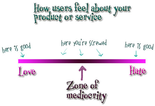
Mac vs PC. Pepsi or Coke. Settling and compromising for something that pleases everyone eventually would be a guarantee for failure – the zone of mediocrity above.

Wow, did all rant all that just because of a little black box? Hmmm, looks like it’s pretty effective already!


LG KB6100

lg-sb610

Woo! Cellphones with antennas. The old-school phones needed antenna for better voice signal reception; in this new LG SB6100 though, it is for wireless digital TV broadcasting signals – you can even record the TV shows to watch later. I totally dig the retractable, telescopic antenna.

It has a 1.3m camera, MP3 player, 2″ display – and packing all these into a very slim 10.95mm (3mm thinner than the Razr). The best part of it – it comes well-integrated with a leather wallet – if there’s just an elastic band on it, I could see myself storing some essential cards/cash with it – voila, an integrated “bring-it-all”.


Daewoo Two-Door Microwave Oven

daewoo-microwave1

This is a Daewoo microwave model that hit the stores in 2007. While the design itself does not fascinate me, the innovative feature of having double-doors are great – especially as home kitchens become more d-emphasized in the the future. Cabinets that encircle the kitchen space are slowly giving way to space-saving kitchen islands – some homes even forgo the concept of having a kitchen as a room, in favor of a flexible space surrounding a bar top.

Anticipating that, Daewoo would be launching this microwave oven. I suspect that in the future, as food preparation becomes more straightforward and simpler, the relative importance of the stove diminishes, while this microwave could just be the cornerstone feature of a kitchen island.

Centre Pompidou & Nike Air Max

centre-pompidou

This is the Centre Georges Pompidou, a museum for the modern art in Paris. Its architecture was bold and controversial: in the midst of classical Parisian buildings, it proclaimed its presence with big exposed service elements outside the main columns – red elevators, escalators in clear plastic tunnels, and various color-coded tubes: green for water, yellow for electricity, and blue for air. The “inside-out” approach let it stand out from its neighbourhood, and gave it an uncluttered inner space for artworks and displays, though it also also drawn fierce critics labelling it an oil refinery.

airmax87

This is the Nike Air Max I. It is the first of the Air Max series, launched almost 20years back in 1987. It was a pioneer in utilising Nike’s air-cushioning unit in the shoe’s sole, and was a popular item for both runners and casual wearers. The series draw a somewhat cult-following over the years, where fans anticipate and collect each year’s models.

Question: Why are these two disparate items appearing in the same post?

Answer: Tinker Hatfield was originally hired by Nike as its corporate architect, in charge designing its offices, showrooms, and retail spaces etc. He was requested to design a shoe – the first Air Max. Being an architect, he naturally brought his architectural background and perspectives in his shoe design process. In the video, he shares he was inspired by the Pompidou in the Max design, most conspicuously the exposed air cushion, which does indeed draw reminiscence of the Pompidou’s ventilation shafts.

As with the case of the Pompidou, Nike’s Head of Marketing was not in favor of the shoe with a hole in the side, and there were concerns about perceptions of leakage and vulnerability. Nike went ahead with it anyway, and as with the case of the Pompidou, it turned out to be a major hit.

Rob Zinn: Expansion Wall Sconce

expansionlamp

This wall-lighting looks just like any other at first glance; in fact, the thing that first drew me to it was the realization that this type of fixture is known as a “sconce”. Upon closer examination, I came to realize that it is clever in a subtle and specific way.

A standard, more straight-forward way to design this would be to use various colored panels to create the layered-lighting effect. In this one, a bit more thought was invested in the design process. Instead of simply using colored plastics, this sconce consists of 5 white plastic panels – it’s only the reverse side that is printed with vivid colors.  When the white light is shone from the central axis, colored lights are reflected onto preceding planes, making it seem like the planes are colored.

Thus, when switched off, it is a subtle, subdued piece of sculptural whiteness; when switched on, it becomes a retro-sh and brightly-colored focal point in the room, giving a more layered character to a simple object. Well done, Rob Zinn (the designer)!

[Found this product on 2modern.]