
Here’s a rather inspiring commencement speech from J.K. Rowling delivered at Harvard – a mixture of one part Harry Potter jokes, one part serious message and three parts earnest advice like that from a mother:
Part 1:
Part 2:
Part 3:

Here’s a rather inspiring commencement speech from J.K. Rowling delivered at Harvard – a mixture of one part Harry Potter jokes, one part serious message and three parts earnest advice like that from a mother:
Part 1:
Part 2:
Part 3:
Something to get inspired for the weekend – carpe diem!
A very powerful message encoded in a very clever narrative – it’s all a matter of perspective and choice, isn’t it? If that previous sentence seems a little cryptic – just watch the video titled Lost Generation – I just don’t want to spoil it.
What are you doing now that is making your world, and this world, a better place?
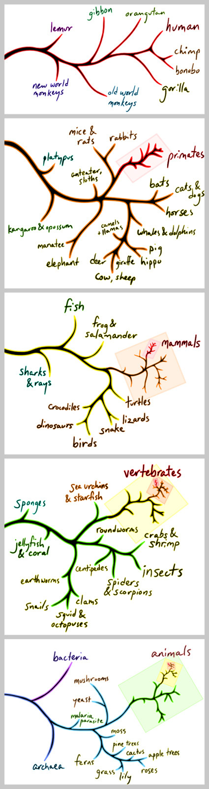
Some posts back, I blogged about Carl Sagan’s insightful and inspiring take on the smallness of mankind in the grand scheme of things – Earth was really just a speck in the universe, and humans are, in turn, specks on this little blue dot.
Here again, is yet another take on the smallness of Man in the grand scheme of Life. A visualization we might all be familiar with – the branches of life zoomed out in each frame to reveal its place and proportion in the overall picture.
And with this perspective, does the further divisions – the artificial divisions that we have erected in our existence – race, nationalities, religion, origins – start to fade away, and perhaps seem somewhat less surmountable?
Stanford has an ‘Entrepreneurship Week’ with a rather interesting ‘Innovation Tournament’. A mundane object (this year’s being the rubber band) is the theme for groups to innovate and create value upon:
The 2008 Innovation Tournament is open to teams of Stanford students, as well as students around the world. Teams can be of any size. Your challenge is to create as much value as possible using rubber bands. You can use as many as you want, of any size, shape, or color. Value can be measured on any scale you choose. Remember, value comes from actually implementing your ideas and delivering results. To be successful, challenge assumptions, seize opportunities, be creative, and Make it Happen!
This, I guess is probably really the equivalent of the common ‘drop-an-egg-from-a-certain-height’ assignment that many design/engineering students get. With the minimal of materials (and usually time), teams have to be really creative, innovate and in this case, get the most amount of value (money?). Here’s the video of the winning team, who effectively leveraged the visuals of an bigger-and-bigger rubberband ball as a focal point in their donation appeal, and subsequently trying to harness the internet viral effect.
Would you’ve been able to pull off something like this (or even better!)? For good measures too, they did it in 24 hours.
PS:
I quite like the prizes in this competition too. In most university efforts, what you’d probably get is maybe a certain budget, with the top prizes invariably some variant of iPod or some other ‘young hip thing‘. An object of desire of some sort – easily dealt with. But for this tournament, all of these are experiences that you can’t buy (in part with the sponsorship from Deloitte) – “A day of sailing on the San Francisco Bay on a 36′ yacht provided and skippered by Club Nautique; Meet Deloitte’s Global leaders, hear Al Gore speak in person, and enjoy cocktails and dinner at Deloitte’s World Meeting at Stanford University; Box seats to Sharks game – Donated by Deloitte, etc”.
I’m sure Deloitte et al could’ve have it much ‘easier’ by signing a cheque for a certain amount to buy prizes – but putting effort into creating experiences and meeting the winners shows some measure of sincerity. Plus it’s a win-win situation for both parties – for the experienced directors to meet with the young upcomings – I’m sure the exchange would be both much more fruitful and remembered.
It’s a long video – slightly over an hour – so set yourself the time/place when you’re ready for this video. It is certainly a very inspiring video – here’s the short introduction:
Carnegie Mellon Professor Randy Pausch, who is dying from pancreatic cancer, gave his last lecture at the university Sept. 18, 2007, before a packed McConomy Auditorium. In his moving talk, “Really Achieving Your Childhood Dreams,” Pausch talked about his lessons learned and gave advice to students on how to achieve their own career and personal goals.
It’s truly amazing how much positivity Randy can exude – he’s got not much time to live, and yet his message is nothing but life, achieving your dreams and remembering the priorities of life. It was truly a moving moment when he said that he had the lecture only for his three kids – but certainly millions more around the world have been inspired. I hope this video helped to ignite and spark our own dreams in our lives.
This original post by Derek Silver was from several years ago – but I stumbled upon it recently and thought, “Great Reminder!”:
To me, ideas are worth nothing unless executed. They are just a multiplier. Execution is worth millions.
Explanation:
AWFUL IDEA = -1
WEAK IDEA = 1
SO-SO IDEA = 5
GOOD IDEA = 10
GREAT IDEA = 15
BRILLIANT IDEA = 20NO EXECUTION = $1
WEAK EXECUTION = $1000
SO-SO- EXECUTION = $10,000
GOOD EXECUTION = $100,000
GREAT EXECUTION = $1,000,000
BRILLIANT EXECUTION = $10,000,000To make a business, you need to multiply the two.
I think as designers we are naturally protective of our ideas – and probably tend to overestimate an idea’s value. Of course, ideas are valuable and sometimes they can be the difference between success and failure. However, to think that “idea is everything” is certainly very myopic. Eventually, what other see is the final embodiment, which are synthesized from a whole long process after the idea’s been generated – to develop it, to refine it, to test it, to rework it, to market it, to publicize it, to distribute it, etc.
Also, I think it is very important for designers to be able to ‘release’ the ideas – to discuss them, share them, get it out of the system somehow – unless you are working towards patents and such. This means ‘getting over the idea’ – in some ways, to no longer be convinced that the idea is the ultimate, unbeatable best-in-the-world thought that man can ever muster. The process of ‘releasing’ the ideas is also simultaneously releasing yourself from the idea, so that you are not overly tied down by that single idea, or become paralyzed as you bask in the glory of the idea. This way, it leaves much more mental space that (almost always) lead to even better concepts and developments, which might lead you to wonder ‘why did I shackle myself to that idea for so long?’
Design is indeed the business of creating ‘multipliers’.
I came across and was very much inspired by the two ads above from Nike, titled ‘Defy’ and ‘Endure’ respectively. They were really wonderful in many senses. For both videos, a series of really expressive scenes extracted from sports played in slow-motion, coaxing and allowing the emotions from the sportsmen/women to really flow out to the viewer (with matching background music too).
‘Defy’ paints a picture of hope and of celebration of the human body – how great athletes seem to defy gravity and common notions of what is possible – aptly ending with the tagline ‘A little less gravity’. On the other hand, ‘Endure’ takes a straight look at the less glorious part of sports – the agony in endurance, defeat and disappointment, with the tagline ‘A little less hurt’. Juxtaposed together, they show poetically the humanness and the emotions in sports – and that they are very much simply two sides of the same coin.
If you have been inspired and motivated by the strength of human spirit in sports and endurance, be sure to also check out this story which has been floating on the Net recently, chronicling the superhuman feat of a 61-year old farmer who beat professional athletes in a grueling 875-km race, simply because he didn’t know he was supposed to stop and rest.
This video serves up survey results of what is typically in a student’s life. The description doesn’t sound all that interesting, does it? Growing up, go to school, party, study a little, go online a lot…we probably think we know this age group pretty well already. Yet, there is something fundamentally different about students in that video that made it thought-provoking for me.
It could be the way this video was made and conceived – the survey questions themselves were mass-authored by all the participants in the survey itself – kinda like, Wikipedia asking itself questions. It could be how much ‘non-traditional’ learning and communication tools – like websites and emails – dominate the average student’s life as compared to ‘traditional’ tools like books and assignments.
In our face is a fundamental shift in the way we learn. Rigid and orthodox methods, like formal textbooks and school lessons, are rapidly giving way to much more flexible mediums. Indeed, as Sir Ken Robinson pointed out in this fantastic TED Talk, in the rapid development of the world what we learnt in school would have been obsolete the before we even graduate. Those who recognize this first (and act accordingly) would stand to gain.
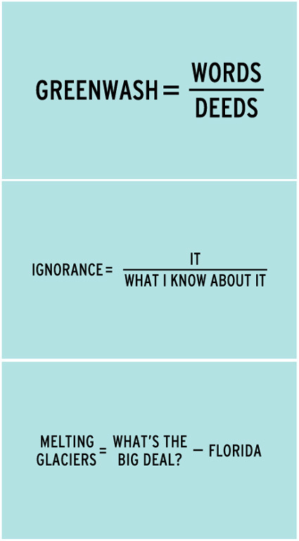
Craig Damrauer has some rather thought-provoking equations that implores the reader to recognize and reconsider relationships – it’s one of those rarer times where math feels more imaginative, and leans closer to the arts than the sciences.