Higher Furnitures – Air Division

I just came across these coverage of these furnitures from SaloneSatellite by Nathan Yong of Singapore-based Air Division – the 70cm High Bed and Every Sunday:

70cm High Bed
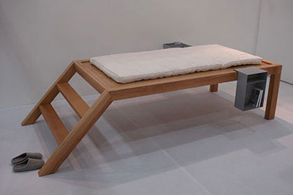
yong_bed

70 cm High Bed occupies a curious and unfamiliar height for beds. With the extra elevation, the bed becomes a mini levitating loft in the room, requiring one to perform the ritual of literally climbing into bed everyday. Here’s what he says:

I keep the height at 70cm because I find familiarity in this height. The height of a table is about 75 cm and I have always felt good standing and resting my bum on it to take a short rest while chatting with friends in the workplace or at home. And sometimes I sat at this table height and felt a sense of playfulness and casualness. Hence I think 70cm is a good height for getting “high”… so a height of 70cm is appropriately functional in this case.

Every Sunday
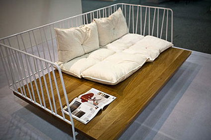
yong_every_sunday

This was yet another intriguing furniture as familiar elements of the railing are stripped away and reattached onto this furniture – an island of simulated balcony –

Every Sunday was inspired by the balcony. I like the ideal of lazing around on a Sunday on a balcony. I remember when I was young, the balcony was the only place that was closest to the outdoors. As most houses in Singapore are flats, I had a good view of the city. There is a sense of liberation in that, and I used to throw paper planes down the storeys. This image stayed on, and when I wanted to design a sofa, I wanted to evoke a sense of openness when people sat on it. Most sofas kind of coop you inside…so my aim was to have an open sofa that encourages sitting, playing, sleeping, and working within the space of the sofa … so a balcony space sort of has those kinds of functions. Thus I do not think it will work on a smaller scale.

It is perhaps a reflection of Singapore’s life – the density, pace and general attitude that requires a borrowed metaphor on the furniture to restore just that bit much of spirituality into life itself; where designs (have to?) manifest themselves as tangible, transplanted cues to trigger off a certain familiarity.

It is perhaps also telling that these furniture are both little islands within the room. Within the boundaries of the rock-solid HDB flat walls where one can possibly seek to isolate oneself, and create/redefine his own island-space within the larger island (Singapore).

How lonely?

Full interview via moco loco

Schwepperverscence Ad


Sony Bravia may be one of the early pioneers of ads in this style – but this ad from Schweppes is no less in artistic merit either. Using high-speed cameras at 10,000 frames per second, the ad lines up a series of moments just as water balloons burst, releasing the splashes of water inside in a cool, sensual and captivating manner (when seen in slow-motion and paired with apt music).

Hopefully more ads in the future move towards this!

Cone Pizza

cone-pizza

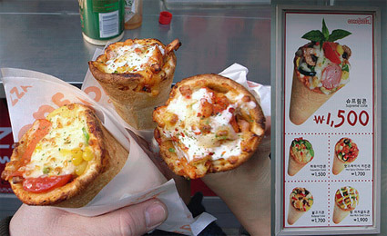
I was quite amused and inspired simultaneously when I came upon this picture of a cone pizza – it’s the first time I’ve seen it, and got me thinking about the form of pizza – is this a more optimized form for the function (pizza-enjoyment)?

I see quite a few strong points going for this design. The cone form, just like the ice cream, gives it a much more portable interface for individual servings of pizzas to go, though it becomes rather unwieldy if you’re a big-eater who needs more than a few of them.

It also concentrates the toppings (do you still call them toppings if they’re more like, well, “innings”?) in a more concentrated manner – you can certainly imagine the oozing, flowy melted-mozzarella as you bite in, and probably more fitting for the mouth as well. As a stall owner, this arrangement seems to let you get away with less ingredients to achieve the same impact too.

However, the satisfaction-curve for this form perhaps leaves something to be desired. Assuming that the ingredients are generally preferred over crusts (I see many who leave the pizza crusts behind in a pizza buffet, for instance), your experience gets worst as you chomp your way down, until you’re left with the tip of the cone – large mouthful(s) of relatively dry dough.

Interesting innovation dough though!

(Any even better/alternative forms of pizza?)

Clever Nikon Ad

nikon

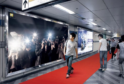
This is  a brilliant billboard advertisement execution for Nikon’s D700 camera in Seoul.

Along a busy subway station, there’s a backlit billboard featuring images of paparazzi (presumably holding the D700). As passers-by walk past, flashes are triggered, giving the illusion that the paparazzi in the billboard are jostling to snap a picture of the passers-by. The red carpet on the floor completes the scene, while also leading them to the store where the camera can be bought.

This ad is genius on a few levels:

  1. Attracts specific attention of the passer-by – there’s simply no way you can not look at the source of flashes.
  2. Appropriate – the context of the paparazzi photographers with Nikon cameras is a perfect pairing as well. Not only is the context for grabbing your attention with the flashes appropriate, the fact that paparazzi are probably one of the most discerning users of the camera (implicit endorsement) is also at work.
  3. The red carpet also serving dual-function: setting up the scene to make the passer-by feel like a celebrity, while also simultaneously doing the very important role of attention-conversion (into possible purchase) by leading to the shop.

Genius!

[via The Cool Hunter]

Digital Ruler

regla1

regla4

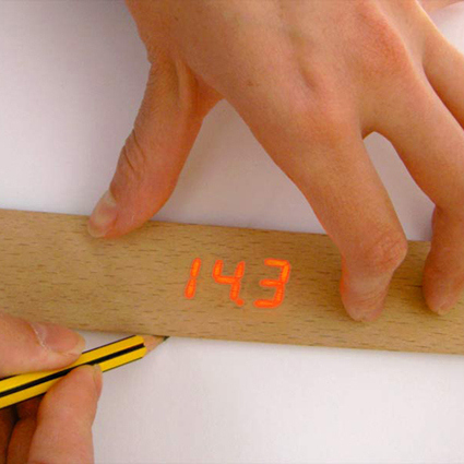
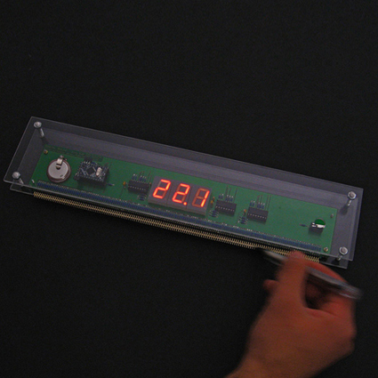
At the first sight of this ruler concept by designers Shay.Shafranek the thought of  ”this must be one of those ‘mesh-up-digital-and-physical-objects-experiment-again” sprang into my mind, almost in a knee-jerk reaction. But upon further consideration, it does have quite a lot of merit (if a little indulgent) in this combination.

This is a work done in conjunction with a PCB-manufacturing company. The most interesting bit, in my opinion, is the idea that with this digital-sensing modules lined up along the sides, you don’t have to line-up a “zero” point. You can start to pick and draw from anywhere, and the reading is automatically calculated from where your pencil first contacts the paper.

More advanced use of the idea also includes: adding distances (you can keep drawing and the ruler adds up the sum of the lengths); having units in different dimensions automatically (e.g. mm, inches);

Intuitive, simple, elegant solution that still retains the familiar analog ruler – you can be as advanced as you want with this ruler.

Great concept!

Nothing to Hide (Air New Zealand)


At first it looks just like any normal in-flight safety briefing video, perhaps just a little cheerier and more upbeat than usual. If you look closer, however, you’d realize that all the crews doing the briefing are… naked!

Fear not of indecent bits though – while they’re naked, they’re body painted with their usual uniform to still look very much un-naked; and of course, all their camera takes are cleverly angled and timed to avoid any sensitive exposure.

And why go through all these? The airline behind it – Air New Zealand – is promoting their tagline of having “Nothing to hide” (no hidden charges for checked baggage, refreshments, etc.). I suppose this somewhat gimmicky video just about captures this spirit and eyeballs!

(PS: the guy loading the baggage in the video is actually the CEO Rob Fyfe – I don’t suppose many CEOs have this sense of fun and involvement with their company!)

Marching Band


Segway was meant to change the face of transportation forever. Unfortunately, that promise didn’t seem to pan out. One unexpected application, however, is found in this video – the mode of movement for an eerily creepy “marching” band. The smooth glide of Segway gives off a ghost-like aura, as if these were wandering spirits making music.

It’s a segment from the street performance “Glissendo” at a French art festival: “Lightning” by Philip Glass. Concept and technical design by Ulik (the mechanical clown).