Green Screen in Movies

We know that ‘green screens’ (or more accurately, “Chroma Key“) are commonly used in filming, be it weather or action movies so that the actor/presenter need not be physically within the context of a scene, whether for safety, costs or technical reasons. The reel from green screen specialist studio Stargate would show just how much it is used in movies and dramas:

Actors probably have gotten better over the years, as they adapt to this technique during acting to respond to non-existent cues within the movie frame. For instance, the instinctive slight shivering while walking through a particularly cold street in Russia – without the immersive visual and visceral setting, one has to imagine the hundreds of minor environmental cues that may affect a character within the environment’s context. Tough!

Sochi 2014 Olympics Logo

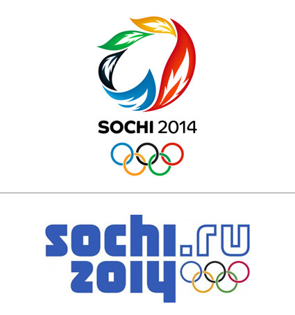
Now that the 2014 winter Olympics have wound down, it is fun to look back at the decision the Russian Olympic committee had to make between two competing logo choices.

Choosing the logo for the Sochi 2014 winter games

Which would you choose? My first reaction was certainly the top one – it looked fresh, Olympic-esque and contemporary. The one at the bottom had so much Russian old-schoolness, it seemed like they were still stuck in the Soviet-Russia era, and have not caught on the graphic design evolution.

But following the argument on Sans Raison made me a convert (it’s too detailed to be quoted or reproduced her – please head over!) – as she carefully and patiently compared between the 2 final candidates, and espousing the merits of this logo that has much more long-term strength in its identity; that Olympics logo frequently falls into a certain cliche (like the one at the top). Eventually I became a convert for the second one too.

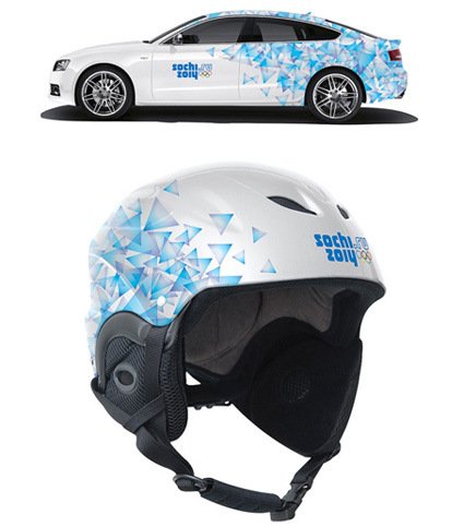
Of course, seeing it being applied in context gives it a whole new render/perspective as well:

socchi-carhelmet

In context, it does hold a lot on its own (although the shade of blue on the logo in context seem much friendlier too). You can also check out the full identity in action at their official website.

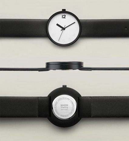
Maezm “Sharing Watch”

maezm-sharing-watch

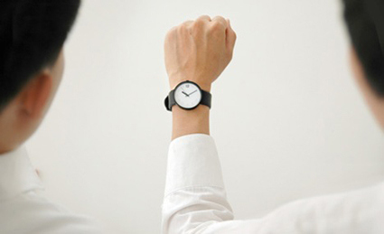
It is the tiniest of gestures in watch design – but it’s one that I’m loving. As a young kid without a watch I often had to steal glances off other people’s wrists to determine the time, and I’ve always appreciated people wearing watches with very legible faces. The “Sharing Watch” by Korean design studio maezm takes the concept a little further:

When someone asks what time is it, the wearer simply has to raise his arm: the watch face is rotated clockwise 90 degrees, making it easier for both parties to read the time.

maezm-sharing-watch-2

And it’s all achieved by simply (though really, this is probably the difficult part requiring very sensitive observation) discovering and communicating this very natural habit; and the rest of the design was probably straightforward with no modifications (minus the watch face orientation).

Clever!

Wedding Magic

Recently there’s been a flurry of weddings and invitations – something along the combination of friends around my age getting hitched, and auspicious dates/months/years. For those who are thinking of getting married, here’s a video to either stress you (if you’re a guy), or to lift  you to dreamy romantic imagination (if you’re a girl):

I thought it was a relatively simple proposal, but apparently he has more magic up his sleeves than Mickey.

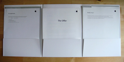
Apple’s Offer Letter

apple-offer-letter1

You can see how much design lives in Apple’s DNA – the same type of care, consistency and quality that they put not just in the products that faces the external parties (iPods, ads, etc.) but internally as well. Shown above are the offer letters and HR paper work that was delivered – the signature Apple simplicity and elegance, even with the same type of punchy lines on the top of each page  (“Ah paperwork”; “Ready, set, go”) .

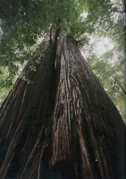
The Immense Redwoods

redwood

Since young I’ve known from statistics in encyclopedias that redwoods are the planet’s tallest trees – the tallest of which grows in excess of 100 meters. While my mind could probably read the numerical figure, it probably doesn’t comprehend the actual immensity and awe of it. And that’s where the following video from the National Geographic help to give some perspective:

Such amazing mother nature, and what dedication and tenacity on the parts of the photographers to capture that magnificent image!

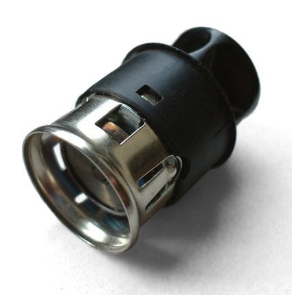
Car Cigarette Lighters

car_cigarette_lighter

It’s one of those things that I’d label as ‘dormant trivia’ – curious questions that I didn’t know exist, even though on hindsight, the bigger question is “why didn’t I think of that question (and find out the answer)? Maybe it’s just me being particularly ignorant or slow – that this is general knowledge to everyone but me:

Why are car cigarette lighters so big (diameter) compared to the cigarettes they are supposed to light?

And today (finally?) I learned the answer.

Sand Animation


Sand animation is often mesmerizing as you look at how graceful and smooth the narrator can craft out illustrations out of (essentially) a pile of dirt on an overhead projector surface.

Watch artist Kseniya Simonova’s mesmerizing fingers twist and turn as she unfolds a story about Germany’s invasion into Ukraine in the WWII, as her act brings her to win “Ukraine’s Got Talent”.