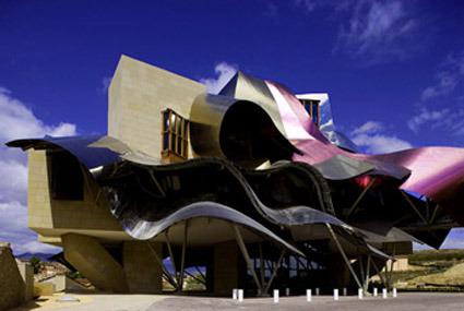
When I first saw the Hotel Marqués De Riscal architecture, the thought of a Gehry-copycat came to my mind. Turned out that it was Gehry who did this. Brutally put, I think Gehry has lost his touch. Guggenheim Bilbao was great because it was a breakthrough against the literally brick-and-mortar architecture mold. The curves were elegant and flowing – unlike this jumbled mess-tangle. While certainly iconic – I love the purple – it doesn’t quite remind one of the beautiful vineyard, the rolling hills that it sites in.
Maybe I’m just not geared to see the beauty in Gehry’s imagined slimy fish scales in his architecture. And I don’t dig his chair either.

