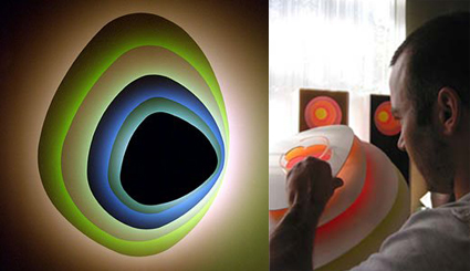
This wall-lighting looks just like any other at first glance; in fact, the thing that first drew me to it was the realization that this type of fixture is known as a “sconce”. Upon closer examination, I came to realize that it is clever in a subtle and specific way.
A standard, more straight-forward way to design this would be to use various colored panels to create the layered-lighting effect. In this one, a bit more thought was invested in the design process. Instead of simply using colored plastics, this sconce consists of 5 white plastic panels – it’s only the reverse side that is printed with vivid colors. When the white light is shone from the central axis, colored lights are reflected onto preceding planes, making it seem like the planes are colored.
Thus, when switched off, it is a subtle, subdued piece of sculptural whiteness; when switched on, it becomes a retro-sh and brightly-colored focal point in the room, giving a more layered character to a simple object. Well done, Rob Zinn (the designer)!
[Found this product on 2modern.]

