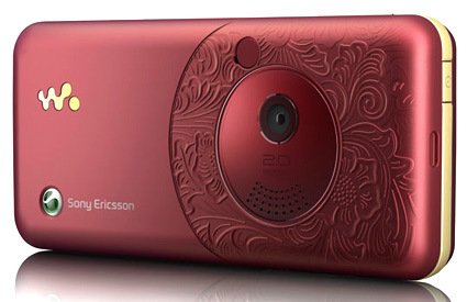
Sony Ericsson recently launched the W660i – its back face has an elaborate, intricate and rather classical floral motifs on it. Which is about time – many small consumer electronic products have taken on Apple’s clean style – keeping to one or few color tones, vast stretches (is this too much an adjective to use on a gadget?) of white spaces – which is good at times, but when everything around me became just flat, blank pieces, it becomes rather monotonous and dehumanized.
So I applaud them for being brave enough to launch this – where the motif is actually molded into the piece, rather than just some “safe” option of having the pattern printed instead, or even “safest” – have the basic option, but allow the consumer to “fully customizable faceplate with stickers you can buy at 7-eleven according to lifestyle preferences for a different experience!”. Though, regrettably, that’s about the only part of the phone that I liked.
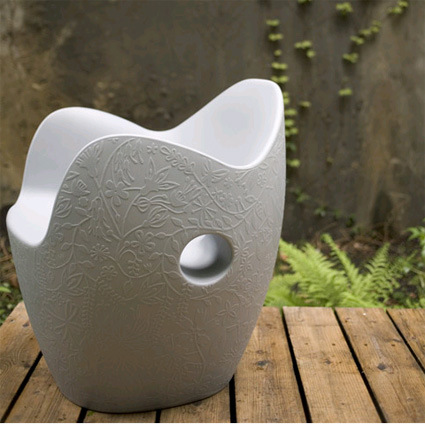
More of other more intricate, craft-originated designs that goes into products:

Marcel Wander’s HE – the four “pebbles” with intricate patterns on top are the speakers.

The “Nest” chair by Tord Boontje

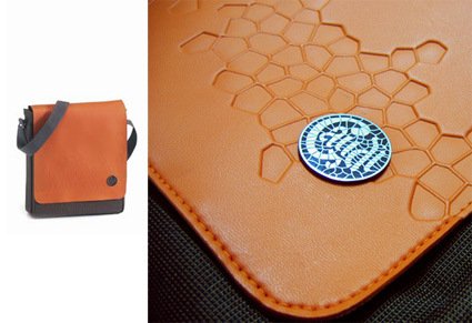
Above is a bag that I bought – inspired by the mosaic patterns of Park Guell by architect Gaudi through embossed stamping on the leather.
[Disclaimer: This entry is not a post of cognitive dissonance or a justification to the purchase of said bag.]

