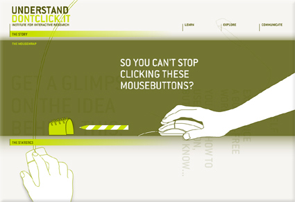
The Internet is pretty much defined by the “click” – people are trying to improve “clickthrough” rate, the cliché goes: everything is just a “click” away, etc. Whether we realize it or not, our experience and perception of the Internet is defined by the “click” (and by extension, the physical input that goes with it, like the mouse). Don’t Click It is an interesting website that attempts to breakthrough the “click”, featuring a full website where clicking is not an option – there are no buttons or links that are clickable, so alternative navigation methods were explored. Personally I felt this is quite a refreshing take on the Internet and the browser environment – I was secretly hoping for even more conceptually interesting navigation though!
PS: You’d have to click on the “Don’t Click It” link to get there. Then be prepared to resist clicking!

