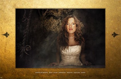
I stumbled upon this website, which starts by asking which of these do you feel today: nostalgic, like dancing, blessed, like stargazing, surreal. 2 more of these somewhat irreverent questions later, it finally reveals itself as an experiential outreach site for a wedding photographer.
It’s hard to describe it in words – but I think this was a great site and experience. Most professional wedding photographer’s sites would probably showcase their own work, how good they are, the variety/depth of their commissions, etc. It’s like a slick business presentation, hoping to impress the visitors enough to engage them. In other words, those sites are about them, the photographer(s).
This one takes a totally different tack – by being human and caring about the visitor. I felt like I was the center of this site’s universe (whatever that meant). Accompanied with a splendid choice of music (great music, but not mainstream or cliche at all), it feels really personal and special. The questions at the start worked to set a mood by laying down the visitors’ guards, while inviting a reflection of themselves. The Flash usage is for once aiding the site design, IMHO: seamless, straightforward, where one doesn’t look for the “Skip Intro” button. The photographs themselves are of course also great – some of them are almost like classical paintings.
After all, weddings is an intimate, special and happy occasion for the couple, perhaps also a time of reflection and to count the blessings, rather than simply an event that you tick off and execute like your typical business convention. I think this site caught that spirit.

