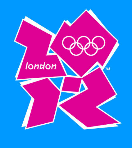
I can’t say I liked this logo designed for the London Olympics 2012 – in fact I think it’s outright ugly. The colors hurt my eyes as much as they are loud, while the shapes look haphazard except for the requisite “2012″ embedded within. For a lack of a more elegant way of putting it, I shall block quote from retry:
This is the logo unveiled for the 2012 Olympic Games in London. Lord Coe, the guy who spoke at this auspicious event said “London 2012 is inspired by you and it’s for all of you.” The people of London are wondering what they did to deserve that comment. The thinking was sound: Olympic viewing will take place on a lot of media devices in 5 years time so they wanted a recognizable shape that can work across lots of platforms. I love the bold intention to create an original Olympic ID and break from Otl Aicher’s Berlin ID (enough with ancient history! most of us weren’t born when that work was done.) I’m disappointed that the execution will open it up to massive criticism and give smug design/client conservatives one more arrow.
Lisa Simpson giving a blowjob indeed! Haha, I couldn’t remove that mental image after this comment was made, much like the hidden arrow in Fedex’s logo (I apologize if I have irreparably rid your mind’s ability to look at this logo simply as a London Olympics logo). An excerpt of some of the (predominantly negative) reactions on the BBC Sports Blog as well:
Is this supposed to be one of those picture puzzles that eventually makes sense after slowly refocusing your mind’s eye?
It looks like a logo designed for young people by old people who don’t understand young people.
Like the 2012 Committee had a student intern who said he could use Photoshop and they said ‘Great, you can design the logo’.
Disjointed and dysfunctional, a graphic mess and also underwhelming and uninspiring.
It’s awful isn’t it. I just can’t decide which bit of it I hate the most.
Oh,dear! This is so sad. Aren’t Logos meant to sum up the spirit of something and capture a vision. This one only seems to evoke derision.
This is foul beyond words and a total embarrassment to a world leader in design. which London is (or was).
For better or for worse, the logo seemed to have rallied a great majority of Londoners (if only in opposition of a common enemy) – it’s like a grand party of universal condemnation, seeing who has the wittiest retort for the design. Oh well, Creative Review has more to say (a more neutral and considered article). If you liked this logo, don’t be afraid – you’re not alone either!

