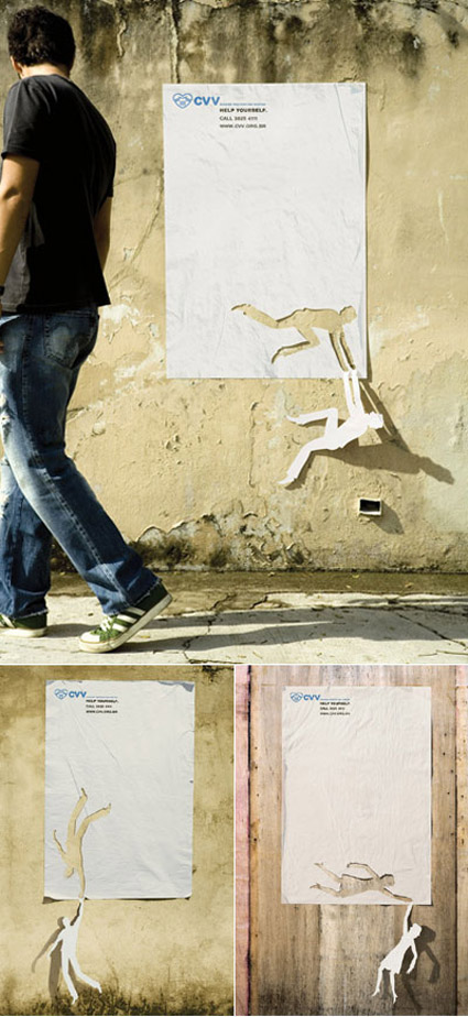
The visual impact of these Suicide Awareness posters are already very high – but what I really liked about them are also perhaps the depth behind. The core message on the posters read: “Help yourself”- and it’s so cool that the falling men/women were rescued by the outline that they were cut from – the concept here isn’t simply a superficial visual trick to grab attention, but gels really well with the message itself.

