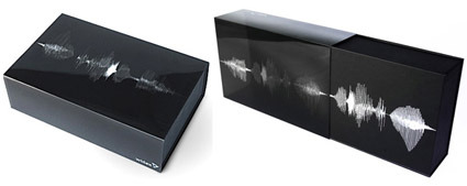
This is simply brilliant. While the technique is not new – bands of print on a transparent sleeve can look animated when paired with appropriate underlying box graphic – the aptness absolutely shines through in this packaging design by Goodmorning (a design consultancy from Denmark) for Widex, known for their high definition hearing aid .
As the user pulls out the case for the hearing aid, the graphics dance and animate, mimicking the delightful motions of a sound wave. In fact, the graphics for this raster effect isn’t random either – it spells out Widex’s slogan “High Definition Hearing” (or how someone pronouncing it would look like anyway). Video here:

