Yamaha had exhibited a series of piano design concepts at the Milan Salone 2008. Titled ‘Keys’ in reference to the defining common element among all these concepts, they explored some alternative configurations or perspectives to the familiar piano – asking “what would a piano look like if it is used in another context?” At first I didn’t pay too much attention to it amidst the avalanche of visual candies pouring out at that time, thinking that they’re mainly just Yamaha tossing a few concepts to attract attention and all.
In fact they probably are just that. But if you look closer at each concept, there are quite interesting and thoughtful details with each of the 7 concepts that deserve more than a fleeting glance – these design details do demonstrate the thoughtfulness, the idea behind the design, and each new design is refreshingly suited for their new calling through various sensitive design touches:
Key Between People
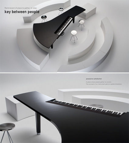
‘Key between People’ is (in your current Internet lingo anyway) the grand piano brought to the social. In the traditional grand piano, the lid is lifted high up (like a bonnet) forming a formidable visual impact, accentuating the lone genius at the keys. In this concept, the piano is turned much more into a grand, flat table or bar-counter where people just hang-out, recalling the unifying, social dimension of music that perhaps get forgotten these days. The players and the listeners are placed on a level plane, giving a more direct and intimate connection between the two parties. The matte finish also makes the piano look more approachable and down-to-earth, in contrast to the traditional high-gloss piano black treatment.
Key as Gift
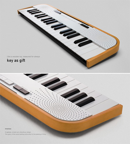
Key as Gift looks at the piano that gains connection and intimacy with the owner as it ages gracefully. The C-shaped band of bent wood juxtaposes well against the friendly and slightly-playful looking design – as seen through the flowery array of speaker openings and the softer, more rounded keys. As time passes by, the wood will age with a patina and impressions that you’ve left on it – the special little personal marks that eludes modern plastic gadgets – almost like something you brought out from your childhood.
Key for Living
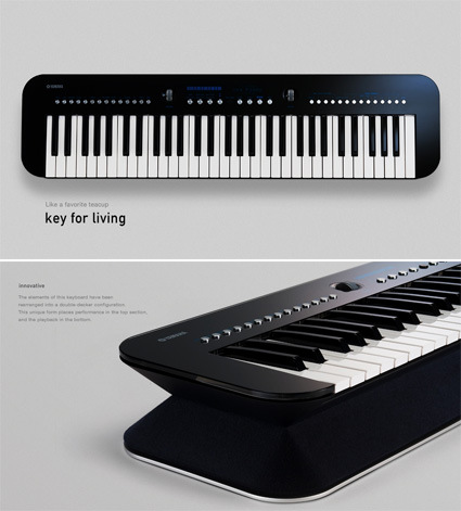
Key for Living, with its rounded-rectangle silhouette – is more modern looking, having no problems fitting into a typical contemporary apartment or loft. It seemed to be designed with compactness and versatility in mind. For instance, it can be stood-up vertically at the corner of your room or something. Another interesting detail is the speakers which are placed in between the keys and the base – there are a total of 10 speakers and a subwoofer within for sound to emanate in every direction. I also quite like the row of round metallic button – I think it gives a visual highlight to the top surface.
Key for Journey
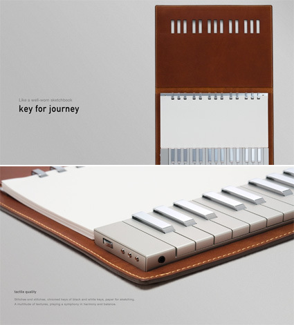
Key for Journey is perhaps the iPod of pianos. Housed like a sketchbook (with binded paper for the musical genius in you to perhaps jot down the more inspired tunes while on-the-go) within leather-bound covers, the authentic material finishing and the detailing are very exquisite and sensitive. Instead of the standard black-and-white, the finishing plays the role in differentiating the keys: high-chrome vs matte metallic. The juxtaposition gives a harmonious and yet refreshing feel to it. If you look closer, you’d also notice the diamond-knuckled metal dial at the side, and also the squarish metallic paper binding that comes in sets of 3s and 2s (reflecting the arrangement of the piano keys). I think these little design touches go a long way in lending character and demonstrating the designer’s sensitivity to the product.
Key in Cantilever
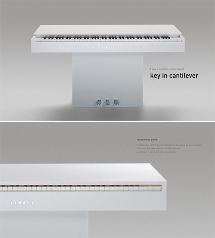
Key in Cantilever gives a much more simple and yet sculptural look. Composed basically of two rectangles – the piano surface cantilevered on the rectangular stand, it delivers a strong visual impact, accentuated by the quality of the extremely geometrical and straight-cut slabs of white marble. In its simplicity, it is very strong in the visual impact, distilling every element down to the purest of forms.
Key Like Jeans
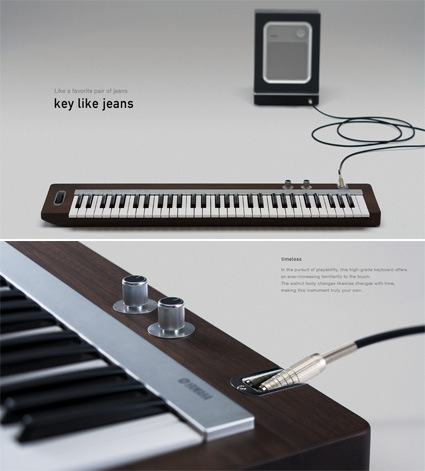
Key like Jeans again plays with the idea of a well-aged, patina-inducing product. With a solid dark and smooth walnut body that is oiled to finish, you are reminded of a vintage guitar. Details like the screwed-in chrome metallic socket where you can plug your cables in, the keys that extend beyond the body’s footprint, and the heavy and solid feel of the walnut-wood encasement also help to give it the feeling of a classic electric guitar.
Key near Window
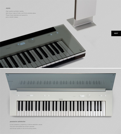
Key near Window has a bit of a retro-futuristic look, especially with the dark-tinted glass cover. Once you lift it up, you get a more soothing-tech feel as the embedded lighting and display shines through the white casing. The three distinct layers in construction – dark glass, white marble and dark wooden base – also help give the piano very different and distinct appearances.
All in all, as I looked through the design details in each of the concept, I must say I am quite impressed with how the designers modified the little design elements to suit each concept, and the result is a set of widely different designs that appeal in their own ways for their own contexts.
Head on to the official Yamaha Gallery to see these concepts. I do wish they designed their website as well as they did with the pianos though – the menus seem to be over-eager in popping up in some cases, and I’d say the short looping background music doesn’t show too well for Yamaha (who are supposed to be good in music?).


Where can I purchase a key of journey?