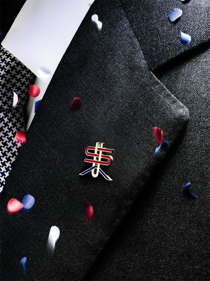
There were some hoo-ha a year ago about the wearing of lapel pins as a sign of patriotism in the USA elections. The small metal accessory was suddenly cast into the spotlight. It became a marker of loyalty and patriotism – the absence of which signifies the absence of these values as well. For all its absurdity, it became a big talking point particularly between the Republicans and Democrats.
One year on, Men’s Vogue commissioned renowned graphic designer Michael Bierut to redesign the lapel pin, “which members of both political parties can wear into the voting booth and beyond”:

According to the blurb:
“I tried to defamiliarize a very familiar configuration of letters,” [Michael Bierut] explains, referring to his unconventional, interwoven font — inspired by the country’s history as a melting pot. “A flag is a corporate logo. A monogram is much more private.”
…
After nearly a decade of limited lapel options (you’re either with the flag pin or against it), sporting this one shows support for the true meaning of bipartisanship — pride in America.
The first thing I saw on the pin didn’t remind me of ‘melting pot’ and ‘multiculturalism’ though – the $ sign is definitely and unmistakeably the most prominent element on the whole pin. Perhaps this is what you can say unites America – the pursuit of wealth and capitalism?
The next, secondary element that I see is the A that has the horizontal bar removed, with a particularly wide stance. This to me looks much more like a chevron in the military ranking insignia – perhaps a subtle allusion to the US’s military might.
The article makes no direct mention of either of these symbols – even though to me they are quite readily apparent. While these are certainly facets of America that are quite distinctive, I’m not sure if they are integrative or ‘private’, particularly at this trying economic climate with war that has dragged on, where the positions on these issues are frequently much more divisive than unifying.
Or maybe I’m just seeing things with my tinted eyes?

