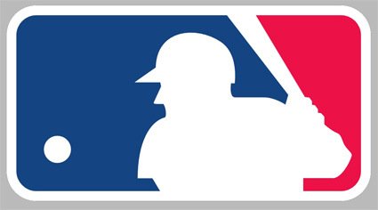
Did you know that the Major League Baseball logo was designed 40 years ago (1968) and have never been updated since?
Did you know that the baseball player in the logo was designed so that he can either be a right or left-handed batter?
I didn’t know either of those – this logo looked contemporary so I’ve always thought it was done or at least updated recently. Made me think about classic designs that can stand the test of time – all ye glossy bevels and reverse shadows, die!
And the left-right handed thing is somewhat like the arrow in the Fedex logo – once you know it you can’t un-see it.
Here’s an ESPN interview with the unacknowledged (officially) designer of the logo Jerry Dior, a 76-year old retired graphic designer.
[via Brand New]

