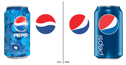
It has been some times since Pepsi launched its new logo and identity. In the old design, the blue-red sphere sits above the can with various (blue-toned) graphic designs behind it that were launched every 3-4 weeks, in an attempt to reflect the fickle-mindedness and lack-of-attention of today’s generation. Apparently that didn’t work out well enough – they’ve now come up with a much more toned down can design, removing all the distractions (ala Coke) to leave a flatter, much more graphical and in-focus Pepsi globe, adorned with a new twist in the white partition.
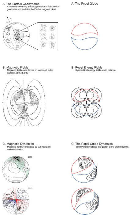
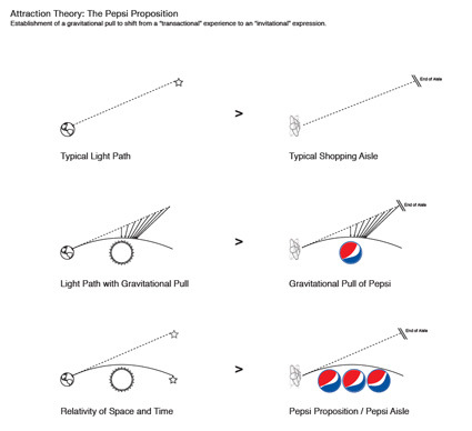
Most of the reaction I see on the web expressed disapproval over the makeover, feeling that much heritage was destroyed in an uninspired stroke. I stumbled across a brand identity file that was supposed to support this new brand direction and was surprised by the amount of “inspiration” for this new identity – of how this new Pepsi Globe is basically going to be the center of the universe after the re-branding:


Personally I thought – hey, it’s great that you have an inspiration. But to me it seemed in this case the inspiration went really hyperbolic – contrived scaffolding (weakly) attempting to persuade and hold up the new identity. It is trying to make linkages between the visual identity and the ‘cool concept’, but often where there is none.
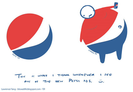
And at least for Lawrence Yang, it seemed the notions of the Pepsi Globe supposedly bending the space-time continuum doesn’t quite carry through:


