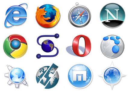
Voltage Creative asked an interesting question:
Every single (even moderately successful) [note: except Opera] web browser’s logo has been round… Why?

Some plausible explanations:
- IE was a blue rounded icon and everybody just followed suit
- The globe is the best representation of the Internet (and it’s round and blue)
I tend to concur with the blue-globe metaphor explanation – if you look at most of those icons, there are explicit globes in it and you can’t quite have a square globe, can you? Which leads me to think – is there any better metaphor apart from the globe for the Internet?

