VW Golf Design Sketches

vw-golf-design-sketch-2-lg

vw-golf-design-sketch-4-lg

vw-golf-vi-04-lg1

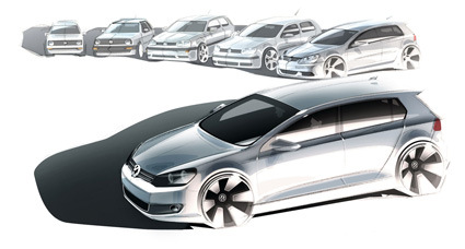
Car Body Design has a great article/interview with the designers behind the VW Golf –  definitely one of the icons in Volkswagen portfolio. See how they explain the evolution of the Golf from its earlier incarnations to the present design, playing the balance between blending new changes and updating its image:

In the process, Walter de Silva, Flavio Manzoni (Group director for creative design) and Klaus Bischoff, (design chief for the Volkswagen brand), have not jettisoned the powerful design details of days past.

On the contrary: “We have assembled a selection of core elements, which can be described as ‘historical DNA’.

“Successful new Volkswagen designs – such as the one now realized on the Golf – will take on this DNA to create both a familiar impression and yet new feeling in the eye of the beholder”, says Walter de Silva.

Full article here.

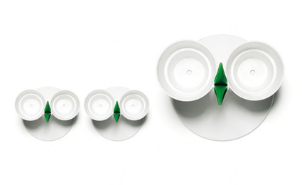
Thoughtful Herb Pot

normann-copenhagen-herb-pot-top-view

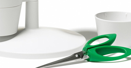
normann-copenhagen-herb-pot

The Herb Stand by Normann Copenhagen (designed by Jakob Heiberg) is certain to give your kitchen a fresh lift! Nothing compares in aroma or effectiveness as fresh home-grown herbs, so perhaps this nicely designed pot will spur you towards some micro home-gardening?

What I liked most about it, however, is the scissors that is innocuously concealed as a green decorative motif. Tada – all the tool you need for your planting and harvesting in one coherent, complete design~

normann-copenhagen-herb-pot-scissors

[Normann Copenhagen, via NOTCOT]

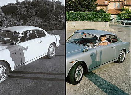
20 years, 1 owner

one_owner_02

one_owner_06

one_owner_07-copy

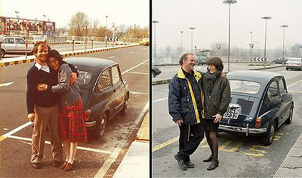
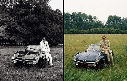
Even as it seems like planned-obsolescence and a quick-fix mentality is the flavor of the moment, it is still heartening to see some objects that have served their owners a long time (and very likely became an integral part of their lives). Here are some photos of cars where their owners have held on to for twenty years – and from the looks of it, still roaring to go as ever~!

[Photographer Matteo Ferrari]

Instant Mona Lisa

Well the Mythbusters point was to illustrate the difference between CPU and GPU processing (graphics hardware terminology) and how GPU being parallel-processing would be much faster. But that doesn’t really matter, because all you need to see in this video is how they INSTANTLY painted with a massive array of paintball barrels all lined up and programmed to shoot a colored ball at specific locations.

Jump to 8:00 if you’re impatient:

Ballot Design

The US Election seasons are here, and voting comes into the spotlight once again. Here, AIGA (American Institute of Graphic Arts) attempts to redefine how ballot cards should look like – from the almost-incomprehensible version (on top) to the much clearer version below:

old-ballot

new-ballot

Among the improvements are clearer and more structural layouts, a direct and friendlier language as well as clearer instructions on the proper way to fill up your votes. It seems however that due to a range of difficulties these changes may not be in place for the upcoming elections, even if it is many years after the famous ‘Butterfly Ballot‘ incident in 2000.

Definitely miles better in my opinion.

[New York Times has more details on the ballot design elements]

Pencil Sculptures

pencil-sculpture-1

pencil-sculpture-2

pencil-sculpture-3

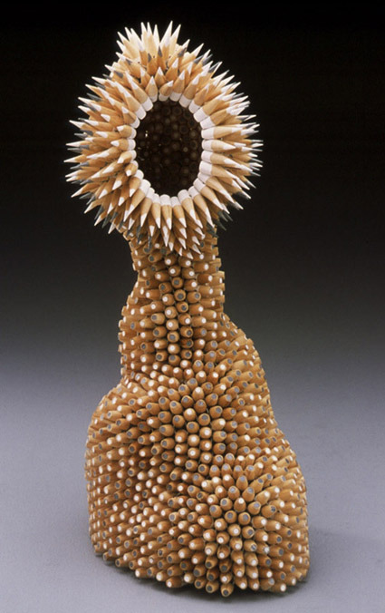
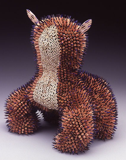
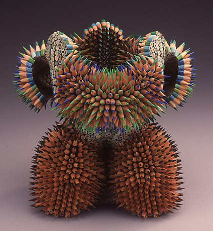
Some artists have great skills with pencils – though most of them use them to draw/sketch, instead of making sculptures like Jennifer Maestre. The sculptures are made by drilling one-inch section on the pencils, and then beaded with ‘peyote stitch‘. Many of them have animal-morphic genes in them. Here’s what the artist says:

Sometimes I have a rough idea in my head for a form, sometimes things go awry, and I end up somewhere I never envisioned. Sometimes I make a ‘pattern’ for myself, and follow it to see what happens. Many times, one sculpture will inspire the next. Originally, I was inspired by the form and texture of the sea urchin, I still make them out of pencils.

For a more comprehensive interview, head over to ReubenMiller.

Photorealistic Animation


I think we are on the verge of surpassing the what animators term as the ‘uncanny valley’:

For many years now, animators have come up against a barrier known as “uncanny valley”, which refers to how, as a computer-generated face approaches human likeness, it begins take on a corpse-like appearance similar to that in some horror films.

As a result, computer game animators have purposely simplified their creations so that the players realize immediately that the figures are not real.

The animation above is being done by Image Metrics (who are behind popular computer/video game Grand Theft Auto). We’re still not able to do this on-the-fly. Massive amounts of computations are required to calculate and control every little movement – every little twitch of the eye, the sneer, the muscles that contracts under the skin, etc.

But with chip technologies and architecture developing, it’s certainly not a pipe-dream to envision some day in the very near future where this becomes common place. What does it mean for us in the real world when we cannot distinguish the real from the fake? At a massive, ubiquitous level?

Really amazing animation – check out Times Online for a more comprehensive article.