Sliding Radio

08-radio

The 08 Radio is a concept that interestingly fuses technology and plain old-schoolness. The tuning bar common to most analog radio receivers is magnified to a structural scale, while the radio itself (along with the speaker) travels along the rail to seek your favorite station.

I like how the screen seem to have unfolded and stretched straight horizontally, bursting through the sides of the plastic housing of the sliding unit to display its full content in one shot. The old-schoolness of the font and calibration, as well as the colors & materials on the speaker were also a delightful nod to the bygone style of the past.

The design is by Michael Silvanto, a part of the aivan! group based in Finland, whose website seem to have an even greater affinity for simplicity than their designs.

Perforated Container Architecture

angela_fritsch_architekten_pavillonimparkdesalicenhospitals-copy

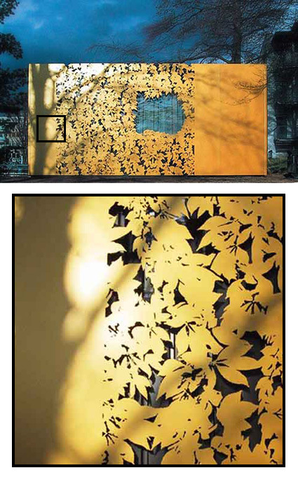
It’s rather incredible how the details in surface treatment makes all the difference in this prefab container:

In Darmstadt, Germany, The Alice-Hospital vom Roten Kreuz has commissioned Angela Fritsch Architekten to build a pavilion in the park in front of their main building, and the final result is a really creative design. The pavilion was constructed using a conventional system of prefabricated containers. In order to integrate it into the park, the surface finish of the facade is committed to adhering sheeting system patented by Hannes Freising from architectural facade firm Huellwerk. This ZGG pavilion (Zentrum Ganzheitlicher Gesundheit) was to consist of a cheap container box with a wallpaper made out of sheet metal. This golden cover has ornamental leaves cut out of it, making it a shiny and decorative structure in the hospital’s park.

I thought the solution was really elegant – transforming the drab container into 1) a pleasant thing to look at, just like a tree shedding its autumn leaves; 2) fitting into the context of the park; and 3) doing so at a (presumably) very low cost.

[via freshome]

Political Cartoons – Clay Bennett

clay-bennett-comics

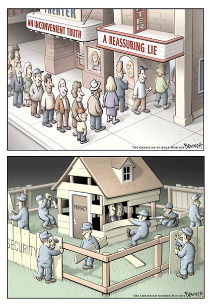
Pulitzer Prize winner for editorial cartooning Clay Bennett is an editorial cartoonist on the Christian Science Monitor – some of his comics (I guess this would probably apply to most editorial/political cartooning) are quite astute, and I thought his drawing style was quite nice too – refined and well-colored. My favorites are above.

Re-Braun

Back in the 1960s especially, Braun was among the very cutting edge in industrial design – they were the pioneer and the leaders that played a major role in defining and shaping conversations on aesthetics and design. Even today, modern design icons from Apple are still arguably very much inspired by the Braun aesthetics of the bygone era.

The Braun Prize is still very much a coveted prize for any design students in the world, though you’d have to admit, Braun itself as a corporation has faded somewhat significantly in its influence on the design world.

Industrial designer Joe Doucet noticed this issue, and took the initiative to start the speculative design efforts designed to reignite what made Braun great:

Doucet hopes the self-funded prototypes (presented to the manufacturer earlier this year) will help initiate a change in the Braun aesthetic, which, since Dieter Rams’ days as head of design, has “lacked distinction”. “It’s been 40 years since Braun was in the design museum,” says Doucet. “The products are still engineered very well, but there is no ethos. If you remove the Braun branding they could be by any other manufacturer.”

Here are his three speculative designs for a toaster, mobile phone and music player:
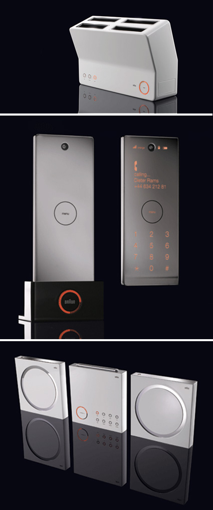
rebraun

For me, I’d agree with the assessment that Braun has faded from design leadership in many (most?) of its consumer product segments. Perhaps they’ve decided that one-style-can’t-fit-all-demographics; perhaps no one could take on Dieter Ram’s hats. In any case, as I glance across the home appliances aisle now, it is difficult to pick out a Braun apart from its (imho) still very iconic BRAUN logo.

What do you think of Doucet’s proposals? Do they work for you?

Bomomo Painter

bomomo

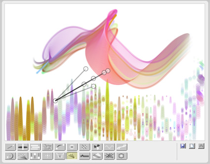
Bomomo is a rather interesting (if awkward) web painting tool – instead of controlling a still cursor as you would in Photoshop and such, the cursor for Bomomo are bouncing, twisting, or moving around. You get a whole series of cursors (seen at the bottom of the screen) with various behaviors; what happens next is probably a mixture of luck and design intuition.

Try it!

The Eco Zoo

the-eco-zoo

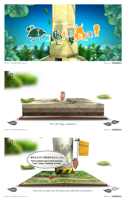
The Eco-Zoo is a rather interesting website with a very light-hearted touch to be more environmentally friendly. The topic isn’t what you’d term informative or authoritative, though what I really liked is the Flash execution: whimsical, detailed, delightful and unmistakably Japanese. See it for yourself!

1969 vs 2008

1969

neil-armstrong-moon-landing

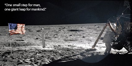
The Apollo 11 landed on the moon, marking one of the most significant milestone in mankind’s conquest into space. It was one of the defining moments in mankind’s history – the sense of awe, hope, humility, and a basket of other indescribable emotions can still be felt through as one takes a walk back through the event transcript:

Then Armstrong said the famous words, “Houston, Tranquility Base here. The Eagle has landed.”

Shortly after landing, before preparations began for the EVA, Aldrin broadcast that: “This is the LM pilot. I’d like to take this opportunity to ask every person listening in, whoever and wherever they may be, to pause for a moment and contemplate the events of the past few hours and to give thanks in his or her own way.

He then took Communion privately.

At 2:56 UTC on July 21, Armstrong made his descent to the Moon’s surface and spoke his famous line “That’s one small step for [a] man, one giant leap for mankind” exactly six and a half hours after landing.Aldrin joined him, describing the view as “Magnificent desolation.”

2008

Fast forward to 2008 – the Phoenix lands, and locates one of the critical factors for possibility of life in space – water on Mars. And here’s the defining moment – a tweet:

mars-water-tweeter

Pulp Branding

logo-pulp-branding

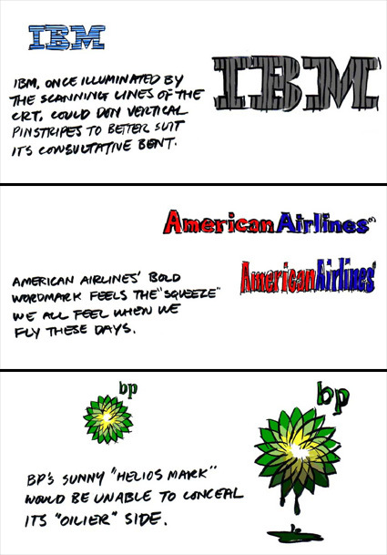
Pulp fiction is a niche comic targeted at marketing and perhaps more specifically, graphic branding people. Above are just some excerpts taken out of one of the issues “Logo Reflections” where the artist pondered what would it be like if logos were more a current reflection of the company rather than the (future) projections. Each issue is about 20+ ‘slides’, and there are already ten issues!

So, if you’re into logos and branding, head over!

Adobe Photoshop in Real Life

Photoshop in Real Life

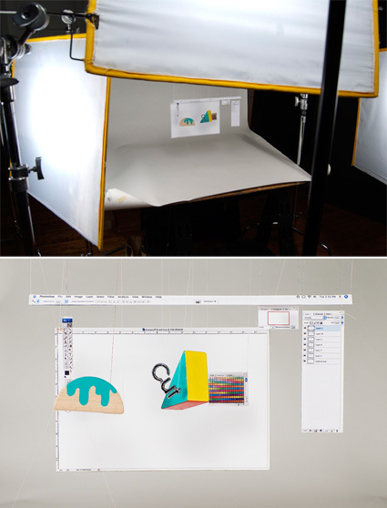
While we may be quite familiar with the Photoshop interface on our screen, the artist here has taken to recreating it painstakingly in real life, even including the layers and menus. Pretty cool huh?

I saved this picture but I forgot to keep the source – anyone knows who to give credit to?

Steel Truss ‘Lego’s

rockefeller-erector-set

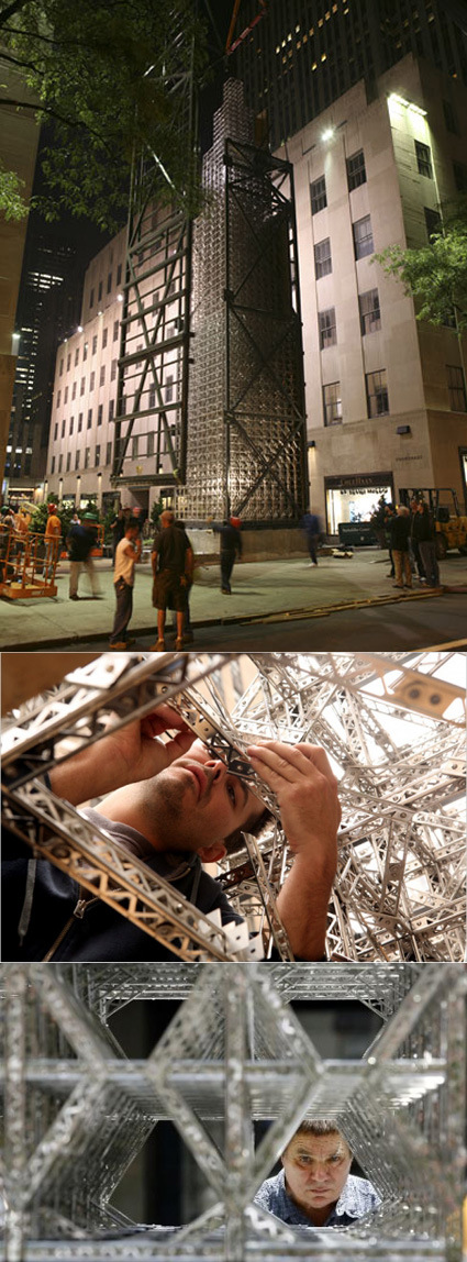
Perhaps I should count myself deprived, or maybe just too young or something – when the NYTimes reported on artist Chris Burden constructing a 65-foot tower using stainless steel modular pieces, I was in awe. I’ve never seen or heard about these metal trusses before – and thought ‘Wow, these are like LEGO for grown-up engineers or something”.

It’s inspiring to see these basic building blocks stretched right to its limits:

“The fact that it is both a model and the height of a real building is bizarre,” she said. “It is simultaneously right and wrong from a traditional building perspective. And so it starts to play tricks on you.”

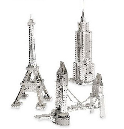
The pieces he used were stainless steel replicas of a toy commonly known as ‘Erector Set’s, which to my surprise was launched almost a hundred years ago back in 1913, and created history by being the very first toy to be advertised nationally.

erector-set

Wish we’d see more (resurgence) of toys like these. Open-ended, as-challenging-as-your-imagination, and probably encourages kids (and adults!) to take interest, understand and marvel at engineering and construction ideas.

I need to play more.