Students of Today


This video serves up survey results of what is typically in a student’s life. The description doesn’t sound all that interesting, does it? Growing up, go to school, party, study a little, go online a lot…we probably think we know this age group pretty well already. Yet, there is something fundamentally different about students in that video that made it thought-provoking for me.

It could be the way this video was made and conceived – the survey questions themselves were mass-authored by all the participants in the survey itself – kinda like, Wikipedia asking itself questions. It could be how much ‘non-traditional’ learning and communication tools – like websites and emails – dominate the average student’s life as compared to ‘traditional’ tools like books and assignments.

In our face is a fundamental shift in the way we learn. Rigid and orthodox methods, like formal textbooks and school lessons, are rapidly giving way to much more flexible mediums. Indeed, as Sir Ken Robinson pointed out in this fantastic TED Talk, in the rapid development of the world what we learnt in school would have been obsolete the before we even graduate. Those who recognize this first (and act accordingly) would stand to gain.

Fastest Rubik Cube Solving


The world record for speed cubing – solving the Rubik’s cube in the shortest time possible – is currently held by Thibaut Jacquinot from France. The guy in this video did it in 10.56 seconds, which is certainly not far away, and shows some really nimble fingers and a good Rubik’s cube (I’m sure the one that I played with didn’t turn that smoothly, and would probably get stuck half the time).

And check out the timer that he uses – pretty cool eh? Based on the text printed on the device, it seems like it was developed for another seemingly trivial but no less speed-obsessed sport: speed stacking.

Fuso Eco-D Dump Truck

fuso-eco-d-1

fuso-eco-d-2

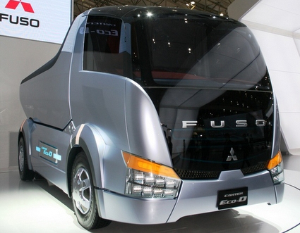
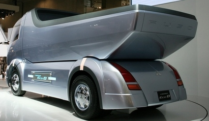
Concept car shows are often reserved for stylish sports cars or next-generation hybrids, but Mitsubishi Fuso is showing all the love to a vehicle we commonly prefer not to see – the dump truck. Sleek, futuristic and dare I even say – glossy silver – are hardly the keywords one would associate with dump trucks, but Fuso’s Eco-D concept may just change your perception of what it could be.

Alphabets of Design Classics

alphabet-of-design-classics

What better way to turn your tots into design addicts and connoisseurs than this Alphabet of Design Classics series by Blue Ant Studio. Or simply as a great decoration in the spirit of humor and fun. The likes of apples, bananas and cats fades out to give way to Aalto, Bertoia and Castiliogni – each with a nicely done silhouette of an iconic design piece. Personally for me I would have put the LCW molded plywood chair for Eames, and perhaps Panton for P. Perhaps you’d have a different take too.

After publishing it on their blog and receiving great feedback, these posters are now available as prints too!

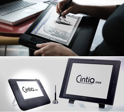
Wacom Cintiq 12WX

wacom-cintiq-12ux

Wacom is about to roll out is the Cintiq 12WX (seen above). Depending on whether you’re an optimist or pessimist (?!), you can either think of it as a younger brother of the earlier Cintiq (a gorgeous 21inch sketch-able monitor), or a Wacom Intuous with a screen. Either way, it plugs a gap in digital sketching product line-up – the Intuous and Graphire tablets can be rather difficult to learn/master, as users are forced to adapt by sketching on one surface while looking at the monitor. The Cintiq, however, can be heard to maneuver, not portable and expensive. As expressed in their website,

All over the world, creative professionals use sketchbooks to express their first ideas. This is why the Cintiq 12WX was developed as if it was a sketchbook: With a smooth, flat surface. And with a light weight that enables you to use it on your knees and to show it around to others. As you would do with paper – digital paper.

No matter whether the Cintiq 12WX is on your desk or in your lap – just plug in and visualize your thoughts immediately with Wacom′s patented pen technology on a high-resolution LCD monitor. Which can be part of a multi-monitor environment, too.

I think Wacom might find itself hard-pressed explaining their reference to a designer’s sketchbook and ‘digital paper’ bit though. Few would doubt Wacom’s expertise in being able to capture and sense the motion of the pen to a high degree – with great tilt, pressure and rotation sensors, Wacoms are recognized as the best in industry for digital sketching inputs.

However, to live up to being a ‘digital sketchbook’, it still has a long way to go, because no matter how you spin it, this is still an input device only. Spontaneity is one of the key requirements in a sketchbook – inspirations may come quickly, perhaps even while in transit – having to boot up a laptop (remember, this is an input device – it has no independent power, memory or sketch programs), connect it (yes, cables and ports!), and start sketching, you’d be wondering why you’d want this as compared to other tablet laptops instead. Add the hefty price tag (estimated at about S$2500 or 1700US) and the appeal starts to fade rapidly.

So if you think of it as an improved input device, you’d probably be delighted if you can spare the moolah. But it’s nowhere near being a digital sketchbook. As a product design though, I thought it was very well executed – it carries the sleek and ergonomic design language that distinguishes Wacom’s product as a professional tool. What’s your take?

VW EOS Shadow Ad

vw-eos-shadow-ad

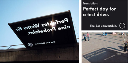
Following right on the trail of leveraging sun-and-shadow, here’s a really clever and engaging VW ad that also cleverly uses the sun. Pitching for the new EOS convertible automobiles, the shadow poster was mounted horizontally so that when the sun shines through the message is revealed – a message saying “Perfect day for a test drive.”

Solar Power + Skylight in One

suntech-solar-grids

light-thru-kowa

We have learned from iPod that an elegant (need not be novel) and well-executed solution could herald a revolution in how we perceive and subsequently expect products. To me, the solar panel above could very well be one of the examples too.

Traditionally solar power panels are often conceived as an additional layer in the architecture – they are added onto existing infrastructure (roofs, walls, etc.) in large pieces. While there are some exceptions, often these solar panels jar out compared to the rest of the aesthetics. In a way you trade aesthetics for eco credence.

The photovoltaic system above by Suntech, however, is an elegant exception. The photo-voltaic cells are integrated within the laminated glass panels. They are arranged in a grid of rounded squares, with spacing in between that allows sunlight to fall – so you get both sunlight and power in one go (and some shade too!). I could imagine many courtyards, balconies, high-rise green canopies, etc. that would benefit from this.

Vending Machine Dress (among others)

vending-machine-dress-01

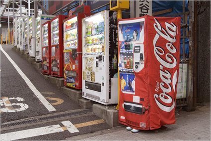
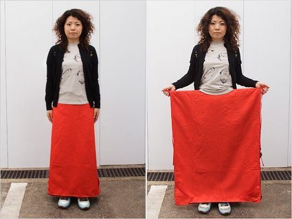
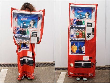
If you noticed something isn’t quite right about the vending machine above, don’t worry, you don’t need to check your eyesight. Yes, the right-most vending machine does look particularly fishy – wait a minute: is that a person wearing a vending machine suit? Has Halloween come to Japan in a weird manifestation?

In what appears to be stranger than fiction, New York Times carried an article with the title ‘Fearing Crime, Japanese wear the Hiding Place‘.

Deftly, Ms. Tsukioka, a 29-year-old experimental fashion designer, lifted a flap on her skirt to reveal a large sheet of cloth printed in bright red with a soft drink logo partly visible. By holding the sheet open and stepping to the side of the road, she showed how a woman walking alone could elude pursuers — by disguising herself as a vending machine.

I’m sure the headline was really just a sensationalist garb – it attempts to suggest that this is already a mainstream practice rather than simply a concept or a chindogu by a designer in Japan. Check how it transforms:

vending-machine-dress-02

vending-machine-dress-03

There are also other manifestations – a bag that transforms into a manhole cover so that people would walk past and not notice it; another bag for children that attempts to turn the child into an unsuspecting fire hydrant. These concepts are certainly amusing, but there is a greater cultural spirit and meaning behind:

But the devices’ creators also argue that Japan’s ideas about crime prevention are a product of deeper cultural differences. While Americans want to protect themselves from criminals, or even strike back, the creators say many Japanese favor camouflage and deception, reflecting a culture that abhors self-assertion, even in self-defense.

Perhaps it is this culture of invention-tolerance, no matter how idiosyncratic or bizarre, that facilitated Japan’s contribution to the world’s other (arguably more useful) innovations and inventions. It’s again of those moments – ‘it could only be Japan!’.

Troika Tape Dispenser

troike-tape-dispenser

Beileger mit †bersetzungen ohne MC.eps

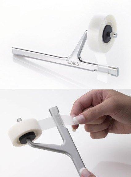
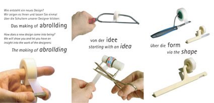
The Troika tape dispenser attempts to break away from the norm – we typically see either the big-bulky desk-bound types, or the disposable light ones that comes with the tape itself. Seemingly alluding to the musical tuning fork, the design is extremely neat and delightful, while shattering the previous stereotypes of tape dispensers. It has even won quite a series of design awards, including the Good Design Award from Japan in 2006.

But how well would it work?ROGER LiVE has a not-so-concise but certainly impassioned plea for its thoughtlessness:

Well, until you actually try and use this beautiful thingamajig: Firmly grip the handle with one hand, stick the roll of tape onto the rubber core with the other hand, place the poster with your company’s goals (or whatever) on the wall with your free hand, try and get it level, hold it firmly in place, realise you have no hand left to pull off a strip of tape, try and hold the poster with your little finger and your ring finger while pulling off the tape with the other fingers, drop the poster on the floor, swear a little bit, pick the poster up, place it on the wall and get it level again, hold it in place with your elbow, notice the poster slipping away, swear a bit more, decide to rip off four strips of tape first, stick them onto the cupboard next to you, put the adrollding aside, get the poster level AGAIN, pull the strips off the cupboard, remove half of the varnish while doing so, try and fix the poster with the bits that aren’t full of varnish, swear at the abrollding and decide to give it to some poor colleague when it’s time for Secret Santa.

What’s your verdict? Is it a good design (perhaps for shattering conventions with a fresh new form in return), or would you crucify it for its not-so-usable design? Or maybe you can actually do a better one! (This is probably another JuicySalif-like discussion). Sad to say though, this is now discontinued.