Construction Paper Art

construction-paper-art

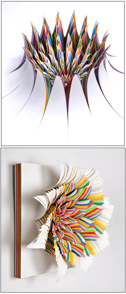
I thought construction papers were mostly just for book covers and the occasional handicraft – but look how far this material can be sculpted! Breathtaking works of art by Jen Stark – the explosion of colors were carefully cut and ‘peeled’ off from a thick stack of construction paper – I really wonder how much time and painstaking effort it took to create an artwork like this. Great photography to capture it too!

More of her works here!

Dandelion – Call for Entries at IDAsia

dandelion_logo

The Singapore Design Festival 2007 ran Nov-Dec 2007, and IDAsia.org had an online exhibition showcasing design talents from Asia. Titled as ‘Dandelion’, it is a virtual exhibition that has the blessing of DesignSingapore as one of the official events in this festival.

It is pretty much targeted to designers who are interested to sell themselves or their products that this exhibition will be their means to an end. Therefore the big requirement is that product images must consist as either non-functioning and functioning prototypes or models. They can be anything, portfolio work, furniture, packaging or anything product related.

The internet is filled with beautifully rendered images that really are at the end of the day impossible to make or realise, often this becomes a circular discussion that goes back to the fact that the design is just not well resolved. Therefore we aim for this exhibition to only showcase fantastic designers that can not only dream but also make as well.

If you have it, go flaunt it! Much more details at IDAsia.

Cool Desktop Wallpaper

desktop-wallpaper

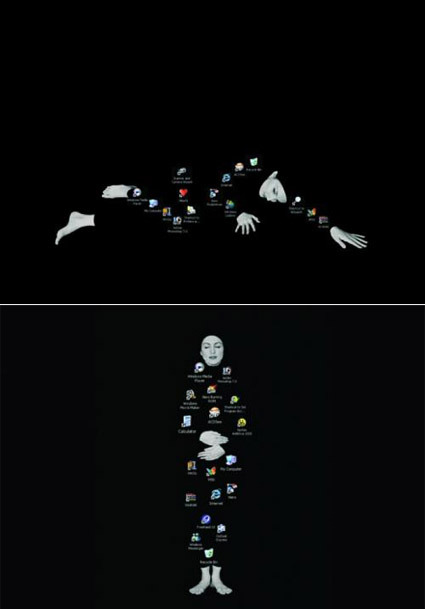
These desktop wallpapers aren’t quite like the typical pretty ones – more than being just a passive background, these are soulful wallpapers that demands your desktop icons’ cooperation to form themselves – at times seemingly thoughtful, at times contented, at times poetic. Just make sure your desktop ain’t too cluttered!

Art – Daydream of the Faceless Worker

daydream-of-the-faceless-worker

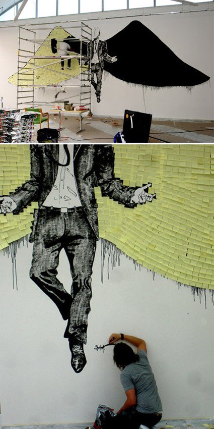
“The piece is called Daydream of the faceless worker. It is about 6×14 meters and made up of 4000 post-it notes. I wrote poetry on about 400. They had told me that the wall was half the size. My idea then was to let people take what they liked and have pens around, so that they could add their own thoughts to the empty notes. Now it became too big, the notes are too far up for people to write on unfortunately.”

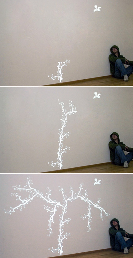
An art piece by Sixten – I truly dig the use of Post-Its on the wings that so effortless and cleverly brought out the art piece – illustrating in one go the sheer amount of mundane office paperwork, and yet the physical form of those Post-Its also form up nicely as ‘feathers’ in the wing. And for those who watch Heroes, does this remind you of the artist in it?

The artist has a jaw-dropping portfolio of diverse ranges of artwork right here – you’d be impressed!

Touching Ad


Thai advertisements are usually known to be funny – they are especially deft in comical exaggeration. This, however, is probably one of the most intense advertisements I’ve seen – it might simply just qualify as a short film instead. Narrating a simple but powerful story, it’d probably touch a nerve or two.

The client is a Thai insurance company.

Stacking Classic Chairs

stacking-classic-chairs

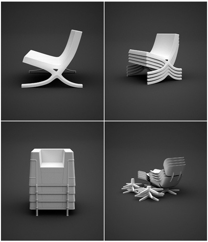
How different would it be to have the very classics of chair design reinterpreted as stackable plastic chairs? Dirk Winkel, from the University of The Arts Berlin, finds out in his project ‘A Stacking Hommage’ (sic). I guess these are really classics – even when recast in another (cheap) material, they still retain an elegant form and proportion – that’s probably what made them real classics through the many decades.

For those of us who aspire to but can’t afford the real classics, we’re going to be disappointed again, as these are not for sale.

Dirk has some other works in his portfolio site here too.

Trash Art with Shadows

shadow-trash2

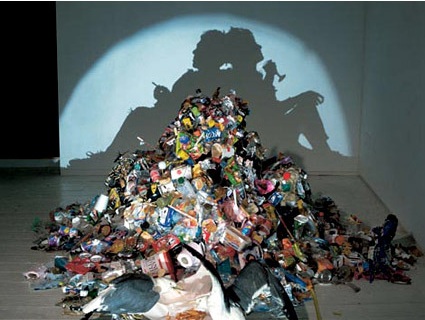
Some people’s art is other’s trash. In this case, however, the trash is the art. Artists Tim Noble and Sue Webster have some great pieces (literally, pieces) of work that at first sight looks simply like trash that does not belong at all in an art museum. When the spot light is turned on however, a totally different paradigm is unveiled in the shadows on the wall. Magnificent!

Diverted by money, property and prestige it is easy to avert our gaze from the vapid bankruptcy and wasted by products of the consumer cultural dream. In a post radicalized world of ambivalence where consumption and oblivion seem the order of the day Tim Noble and Sue Webster’s collaborations “literally” shine a light upon the untouchable residue of conspicuous consumption. With an unpretentious touch of desperate glamour and self deprecating humor they have transformed the gaze upon heaps of trash and side show ephemera generating a playful and contemplative allegorical space in which to consider the consequences of our choices and a hopeful humorous glimmer of the future.

That was a pretty dense paragraph – I’m sure the work speaks for itself and can floor many people indeed. It really makes you see things in a different light, doesn’t it?

More here.

Outsourcing to India

Outsourcing has been the media and management’s darling for the past few years – you can’t have leafed through any magazines or newspapers without having come across this term. Of course we know, we know – improved infrastructure, wage differentials, and a million (or as some articles might suggest, 10-12 billion) other reasons why outsourcing is the way to go.

But what about us mere mortals who don’t happen to own a multinational or two? A.J Jacobs from Esquire is equally piqued by this proposition – and ventured to find out. After hiring a few personal assistants (outsourced from India), he documents his little adventure in this light-hearted article. It’s quite amazing how deft in words these assistants can be – for instance (Honey is the name of his assistant from India):

Plus, Honey is my protector. Consider this: For some reason, the Colorado Tourism Board emails me all the time. (Most recently, they informed me about a festival in Colorado Springs featuring the world’s most famous harlequin.) I request that Honey gently ask them to stop with the press releases. Here’s what she sent:

Dear All,
Jacobs often receives mails from Colorado news, too often. They are definitely interesting topics. However, these topics are not suitable for “Esquire.”

Further, we do understand that you have taken a lot of initiatives working on these articles and sending it to us. We understand. Unfortunately, these articles and mails are too time consuming to be read.

Currently, these mails are not serving right purpose for both of us. Thus, we request to stop sending these mails.

We do not mean to demean your research work by this.

We hope you understand too.

Thanking you,

Honey K B

That is the best rejection notice in journalism history. It’s exceedingly polite, but there’s a little undercurrent of indignation. Honey seems almost outraged that Colorado would waste the valuable time of Jacobs.

Interested in your own concierge already?