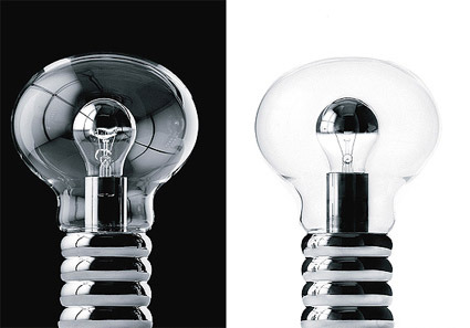
Ingo Maurer’s Light Exhibition

maurer-bulb

Ingo Maurer, one of the luminaries especially in the fields of lighting designs, is showcasing some of his latest works over at Cooper-Hewitt.

The 75-year-old Maurer, whose light-bathed work ranges from macro-scale sculptures of flowing, gilded ribbons to chandeliers reconstructed from shards of exploded tableware, is a visionary—an artist as well as a technical and entrepreneurial innovator. For 40 years, Maurer has been in the vanguard of a technological and aesthetic revolution that has transformed lighting from a mere convenience into a high-cachet object of desire. In the process, he has worked with designers from companies including Chanel, Issey Miyake, and DaimlerBenz (DAI)—and become a guru to artists and commercial manufacturers alike.

Of all the lights, my favorite is the one above. At first glance, I didn’t even realize what was special about it – thinking perhaps it’s just a play of scale – blowing up the traditional and familiar silhouette of a bulb into a more surprising size. It was only through the second read that I discovered the bulb nested within the bulb. I can’t really pinpoint exactly why this fascinates me, but somehow it did.

Perhaps it’s a reminder. In my daily routine I typically come across tens or even hundreds of designs in various kinds. This has almost conditioned my eyes to fleet through and in this case, I got caught drawing my own conclusions before really looking at the picture. Perhaps it’s a reminder to look at every product and savor them in detail – soak in a design before jumping to conclusions.

[Business Week on Maurer’s work]

Donn won Braun

donn-and-braun

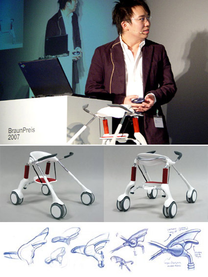
Singaporean designer (and a recent industrial design graduate from NUS), Donn Koh, had recently clinched one of the most coveted prizes for industrial design students – the Braun Prize. Titled Leapfrog, the project helps children with spinal problems to switch between sitting, standing and walking seamlessly:

LeapFrog humanizes the assistive walker for the brain-injured child by combining stander and walker functionality – it transforms, and assists, in sync with the child’s intention to sit, stand or walk. Besides supporting physical development, sense of independence and esteem, LeapFrog also turns ‘painful’ medical engineering aesthetics into sociable, toy-like approachability.

One of the highlights of this product is its trait of being a hybrid product that can accommodate to the wishes of the user, rather than the other way round. Often we find products that reduces a user-state into a single-dimensional, lowest common denominator. The LeapFrog, however, has the innovative ability to scale to its user’s needs: in the sitting-configuration, it fully supports the user and demands nothing; when the user wants to stand up and walk, it knows to ‘retreat’ and surrenders some of that autonomy back to the person – that makes the LeapFrog a lot more human, and certainly less ‘cage-y’.

It makes me wonder also the possibility of developing this product for the other segments too. Having worked with some patients in a geriatric ward, I could see how this could potentially help the elderly who are too weak for sustained walking but feel too undignified in wheelchairs.

In any case, congratulations to Donn for a job well done!

Designing Fonts

hm-font

I came across this series of images by font foundry MAC Rhino showing the design process for a font used by fashion retailer H&M. I think it’s really some great work, because at first look (and maybe even with second, third and fourth looks) you’d probably think it’s hand written with a typical marker pen used in retail shops.

I think this is one of the tougher tasks in font design – to mimic a very natural organic writing into a systematic font. The little nuances of every stroke has to be accurately captured, edited and re-edited (you can see some of that process on the top few images – the pencil mark shows the editing comments). We have seen how a font that mimics handwriting or scripts can easily become unnatural – you know it’s just a font (cue BrushScriptMT, perhaps the notorious Comic Sans even).

For this H&M font though, they’ve made it look effortless. I think that’s probably one of the defining elements of great design actually – an execution that looks effortless (when it’s most likely anything but).

Blood Donation Ad

blood-bank

I thought this ad was very well done – an extremely elegant way to convey the message for the Blood Bank. The outline of a man and the Red Cross are respectively printed on either side of the hourglass, depicting the symbiotic relationship between the (potential) donor and the Blood Center – anytime one is short of blood, the other can help.

Agency: TBWA, Shanghai

Hand Shadow


Forming shadow patterns with a light source and hands are an old trick that everybody would likely have used to entertain themselves in those days of black-outs and power outage. But our tricks were probably nowhere as imaginative and well-executed as this one from artist Raymond Crowe.

Arc Light – Troja

troja-light

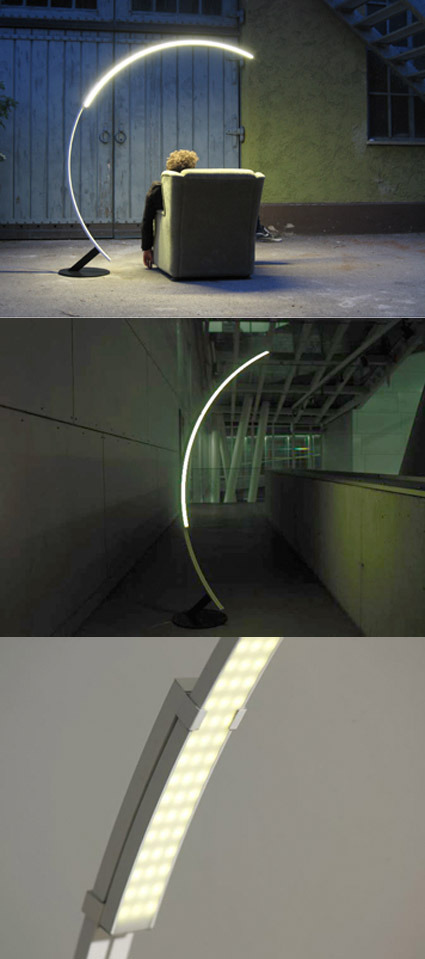
If you’re looking for a arch-shaped floor lamp for your home, and you’re thinking “It’s so cliche to get the Arco!” – well here’s your salvation! The Troja light, by hansandfrans, offers a more modern take on the typology of an arched floor lamp. With its simple and yet distinct outline, it may eventually grow to be another icon in itself. A small peeve for me though is the look of the lights (3rd picture) – it makes it feel just a little too much like a lamp for an operating theatre.

The Art of Shattering Sculptures

shattered-sculptures

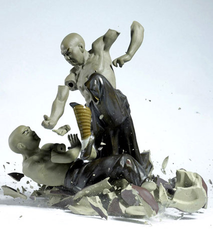
I wonder how many figurines it takes to capture just one of these photos of figurines being smashed while seemingly being posed and arranged in a thoughtful composition. As the artist Martin Klimas explains,

Yes, the shooting environment must be controlled and kept consistent. The lighting is clear and direct, head on. My background is neutral, but bright enough so that the shattering object completely stands out. I drop the figurine from the same height in complete darkness while the lens of the camera is open. When the figurine hits the ground, the sound triggers the lights to go off for a fraction of a second. I do this procedure many times or until I find the one frame that is just right. I keep just one such picture for every figurine. Every attempt yields a unique outcome, so I need to look for the one that best expresses a transformation of the figurine into a new form.

More shattered works over here.