Celebrity Caricatures

celebrity-caricature

Stumbled across some rather well-done caricatures of famous people – usually caricatures are limited to pencil sketches or maybe paintings…but these have a much more 3D feel to them! Not sure who’s the artist behind them though…[Edit: The artist is David O’Keefe – I have modified the link above to point to his site; Thanks Joe]

No prizes for guessing who are the celebrities – though I must say the second one looked rather more like Michael Moore than the supposed Elton John.

[Nicole Kidman, Elton John, Hillary Clinton]


Vinyl Dance Floor

vinyl-dance-floor

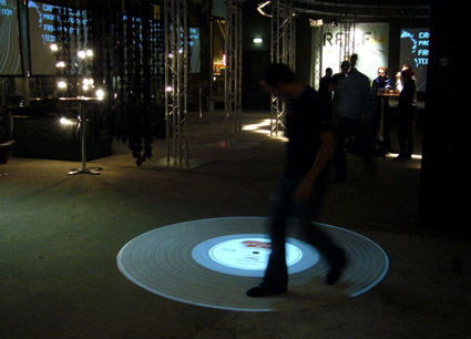
A pretty cool concept – the music plays as you walk or run on the projected vinyl (it also responds to the direction you’re walking – you can play the music either forward or backwards). My immediate thought was, this would make a really interactive piece if people started “scratching” and synchronizing their dance moves to the music – and it turns out this is indeed in the works, and would be released in the next edition.

Stay tuned here!


Sustainable Dance Club?


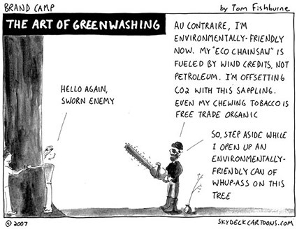
This really smells like greenwashing to me, but for what it’s worth here’s the story: the movements of the clubbers and dancers on the floor are harnessed as electricity by the floor (loaded with springs and such?) – the electricity garnered are used to power itself (the music, the lights, etc).

I am deeply skeptical about this – given the exorbitant amounts of energy that these hundred-decibel, bass-thumping, strobe-flicking, juice-guzzling contraptions uses in any typical day, versus the actual amount of electricity that can be harnessed: it just doesn’t seem logical at all.

And yet it seems that these are some of the most visible or publicized ways to achieve the green agenda – massive undertakings (think of the installations and how much extra energy/resources are required to produce them) with questionable actual effect: my take is, everyone just want to feel good that they’re doing something. Whether it’s really green, well – that may not be so important after all.

[The Dance Club]

Suicide Awareness Ads

suicide-awareness-ads

The visual impact of these Suicide Awareness posters are already very high – but what I really liked about them are also perhaps the depth behind. The core message on the posters read: “Help yourself”- and it’s so cool that the falling men/women were rescued by the outline that they were cut from – the concept here isn’t simply a superficial visual trick to grab attention, but gels really well with the message itself.


IDSA 2007 Gallery

idsa-gallery

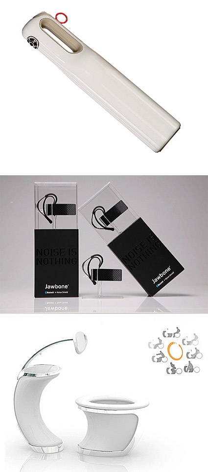
The winners of the IDSA 2007 are out – here’s the link to a gallery of goodness in product design – see if you get inspired by some (hopefully many) of them!

[Some winners shown above in the picture: The HomeHero Fire Extinguisher – the stylish and yet functionally expressive design encourages home owners to display rather than hide them, ensuring its reachability when seconds matter; The Aliph Bluetooth Headset packaging, which highlights the product instead of hiding it in layers of packaging; The Universal Toilet, a student design concept that aims to remove the excessive maneuvering a wheelchair user has to go through even in current toilet designs].


Nose Pouch

nosepouch

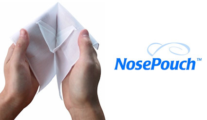
The superlative description on its homepage (seems it is already defunct) – “Newest functional innovation in the handkerchief since the Dark Ages! Dont call it a handkerchief, call it a NosePouch!” amused me. At the same time it also makes me want to dismiss it as yet another entry  in “one-of-those-inventions”. But, (perhaps influenced by my current runny nose), I reconsidered and questioned myself – why was my first reaction to dismiss it? What was the gap between this and those which I’d exclaim “why didn’t I think of that”?

Does it not solve a problem? Well I think it does – the pouch-design would help to contain the goo from a case of bad flu. Even while many have converted to tissue papers, there are still the steadfast handkerchief group – so marketing may not be an issue either. Could it be simply down to the unpolished presentation and web design? Probably.

It really matters how you package it.


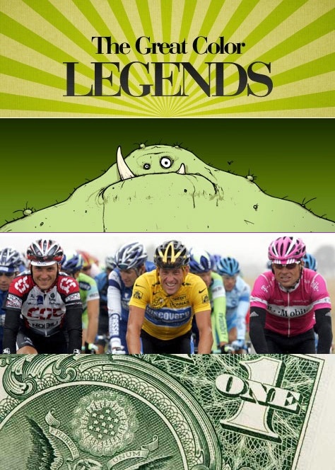
Great Color Legends

color-legends4

If you’re the kind of person who notices little things and likes to know why are things a certain way – this might be a neat gem. The Color+Design blog has compiled a list (actually, now two) of some of the trivia behind why specific colors are attributed to a certain item or notion: why is the envy monster green? Why does the leader of the Tour de France wear a yellow jersey (and why does the Italian one wear pink)? Why is the US dollar the greenback?

If these questions-and-answers fascinate you (as they are for me), be glad that there are over 20 of them right here!