New York’s Garbage Truck Art

yonker-art

Mmm, it’s amazing how art can lift even the most ugly and stinky (literally) dump truck into something that – *gasp* – one might even look forward to, as evidenced by how New York city has to shuffle its truck schedules so that more people can see the truck murals (they have covered 6 of them with artwork):

“We’re going to rotate them so more neighborhoods can see them,” said John A. Liszewski, the commissioner of the Public Works Department for this city of about 200,000. He would like to see the rest of his fleet undergo makeovers if his staff can attract more private sponsors.

Now if they could apply that to trains, light rails, trams, buses too…

Hong Kong, SimCity Style

hongkong-edushi

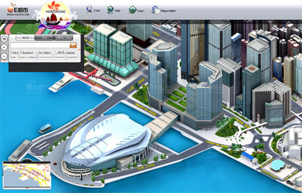
Wow, Google Earth suddenly doesn’t feel all that fun at all now that I’ve seen HongKong Edushi in 3D. With a striking resemblance to a SimCity style of  urban cartography, it makes it seem like the website itself is the destination, rather than simply a representation of a real place (man, maybe I’ve got a dose too much of Jean Baudrillard).

Anyway, it’s fun, it’s zoomable, it’s navigable, and it’s all in intricate, 3d, glorious details! Go on, you know you want to play!


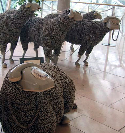
T-Mobile Cellphone-Home Phone

t-mobile

Most of us have mobile phones – they have become so pervasive in modern life that mobile phone usage rate in some major cities like Singapore and Hong Kong have passed 100%, and in Luxembourg, the figure actually stands at a whopping 164% (1.64 mobile phones for every person).

And yet, many of us still keep a house phone – some may keep them because of latency or legacy (some old friends may only have that as contact), but most of the time the reason is more economical – phone charges on the mobile phone is much more expensive than a residential land line, and so it still makes sense if there is moderate to heavy usage of telephones while at home.

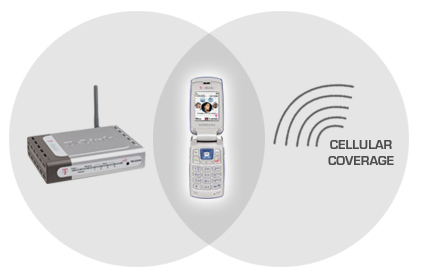
T-Mobile recognized this, and came up with the mobile phone that can “roam” across both cellular and home WiFi networks.

When it’s in a Wi-Fi wireless Internet hot spot, this phone offers a huge bargain: all your calls are free. You use it and dial it the same as always — you still get call hold, caller ID, three-way calling and all the other features — but now your voice is carried by the Internet rather than the cellular airwaves.

These phones hand off your calls from Wi-Fi network to cell network seamlessly and automatically, without a single crackle or pop to punctuate the switch. As you walk out of a hot spot, fewer and fewer Wi-Fi signal bars appear on the screen, until — blink! — the T-Mobile network bars replace them. (The handoff as you move in the opposite direction, from the cell network into a hot spot, is also seamless, but takes slightly longer, about a minute.)

It’s about time! Works with any router (great!) – but with T-Mobile’s, you get some advantages like the router prioritizing your call so downloads won’t degrade the call quality.

I’ve been waiting for this for a long time, and I do hope it comes to where I stay. That will sure save some money!

[via New York Times]

Nokia 7500 Prism

nokia-7500-prism

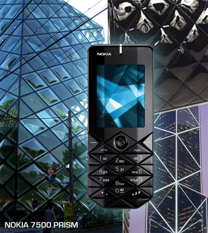
Nokia has launched the 7500 Prism model in China, positioned as a fashion phone with a very unique keypad composed of diamond-shapes (alright, if you are that particular, diamond shape from triangles). It’s certainly a fresh approach to the standard keypad – some blog sites have been calling it fugly, but I actually quite like it. Not sure about the actual product/finishing, but from the glam shot, it gives a rather sculptural quality to an otherwise ordinary handphone.

I’m not sure where the designers got their ideas from – I’ve just put together some images that could’ve been the inspirations – clockwise from left: the Prada store in Tokyo designed by Herzog & de Meuron, a classic ladies Chanel handbag, and the Bank of China in Hong Kong. Or maybe… since this positioned as a fashion phone presumably targeted primarily at girls, it just stems from the old adage “diamonds are a girl’s best friend”?


Kokuyo Toypography

kokuyo-font

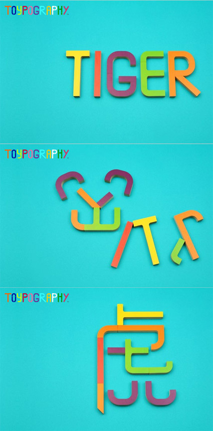
If you reject Transformers for a tad too much of violence, how about some good ol’ fashion wooden pieces that transforms – in the process teaching two languages bundled with a pictogram to boot! These Kokuyo Toypography pieces can be assembled in 3 configurations: English, Pictogram or Japanese Kanji.

Quite a clever manipulation of simple wooden blocks, and are definitely strong on the educational front too, don’t you think?

Many more examples here.


Transformer – The Man behind the Transformation

transformer

Transformer’s of course all the rage now – everything’s getting all hyped up with these shape-shifting robots – I had fond memories of them too, watching these cartoon episodes religiously when I was growing up. There’s always something enchanting about the mechanisms as cars transform into humanoid robots – it’s as if there’s some magic that liberates an inanimate, stale object into enchantment through transformation.

Pingmag had an interview with the man behind the transformation of major characters like BumbleBee and Mirage in the Transformers movie – Australian Alex Kubalsky:

Basically, I’m an inventor and a character designer and my input is bringing everything into 3D reality and adding cool character dimensions like feature weapons and funny things to it: I do the part lists, draw the blueprints and then draw a 10 or 12 frame short animation to show how the toy would transform. I do this based off Hasbro concepts as well as my own characters and concepts that are okayed by Hasbro. They are a great team to work with.

I’ve always wondered how the Transformers toys are designed – how could the designer visualize every single hinge and part that needs to be rotated here, twisted there and snap-folded in, etc., while maintaining the overall animation and cosmetic integrity. Here’s Alex’s answer to whether 3D softwares were used:

No, I draw everything on millimetre paper, including every part. It is all in my head!

Amazing!


6 Billion Others – by Yann-Arthus Bertrand

6-billion-others

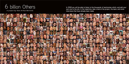
The name Yann-Arthus Bertrand may strike a familiar chord – he’s perhaps most well known for his “Earth from above” series, where he’d take stunning images of the Earth from a helicopter. It turns out he’s not just a one-dimensional aerial photographer.

I just discovered one of his other ventures, 7 Billion others , which is an equally inspiring set of interviews: about 6000 people from 65 different countries were interviewed on topics common to all humanity – god, happiness, parents, experiences, family, etc, bringing a sense of commonality amidst diversity. As Yann-Arthus describes the motivation for this project:

The idea came to me while we were taking the shots for “Earth from Above”, in Mali, one day when the helicopter was out of action. The pilot had gone and I was waiting for him in a little village where I started to have a discussion with someone. I stayed there the whole day. In the evening, by the fireside, that man I’d been talking to told me his entire life, his desires, his wishes, his ambitions – they could be summed up in four words – “to feed my family”. In spite of the poverty, the drought, I still thought I understood the whole situation. But in fact I didn’t have a clue until that man put it to me, just like that, looking me straight in the eye, not complaining, not asking me for anything. That meeting changed me, it changed the whole way I see the world.

6-billion-others-interview

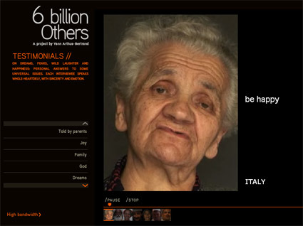
From shooting hundreds of meters above ground, he’s zoomed right to the human, face-to-face videography – the portraitures are close-up and tightly framed, capturing every bit of emotion that makes it much more touching and intimate.

And as these fellow Earth-inhabitants look straight on, honestly and earnestly sharing their personal feelings, dreams, aspirations and worries, we can’t help but be inspired, to relook inside ourselves, and into our own lives.

Head on and be inspired!