Desktopography

desktopography

Desktopography is a website that has a collection of desktop wallpapers:

Desktopography is an exhibition, a showcase of nature themed desktop wallpapers created by designers worldwide.

Designers spend around 90% of their waking life in front of a computer so the most appealing genre for a wallpaper would be one that has beautiful design mixed with the all important aspect of being outdoors. This year we present over 40 new desktop wallpapers for you to display and enjoy.

They do have some really beautiful, high resolution pictures. Some of which perhaps are not quite suitable as desktop as much as just beautiful scenes to look at (I can’t use desktop backgrounds that are too distracting for me to find my icons). What I like most, however, about this website, is their title. A word that succinctly and elegantly summarizes their page: Desktop, photography, topography, all in one word. Whee!

Don’t Click It!

dontclickit

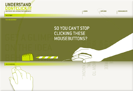
The Internet is pretty much defined by the “click” – people are trying to improve “clickthrough” rate, the cliché goes: everything is just a “click” away, etc. Whether we realize it or not, our experience and perception of the Internet is defined by the “click” (and by extension, the physical input that goes with it, like the mouse). Don’t Click It is an interesting website that attempts to breakthrough the “click”, featuring a full website where clicking is not an option – there are no buttons or links that are clickable, so alternative navigation methods were explored. Personally I felt this is quite a refreshing take on the Internet and the browser environment – I was secretly hoping for even more conceptually interesting navigation though!

PS: You’d have to click on the “Don’t Click It” link to get there. Then be prepared to resist clicking!

Corny Job List

It’s corny, but quite clever at the same time:

  1.  My first job was working in an Orange Juice factory, but I got canned. I couldn’t concentrate.
  2. Then I worked in the woods as a Lumberjack, but I just couldn’t hack it, so they gave me the axe.
  3. After that, I tried to be a Tailor, but I just wasn’t suited for it – mainly because it was a sew-sew job.
  4. Next, I tried working in a Muffler Factory, but that was too exhausting.
  5. Then, I tried to be a Chef – figured it would add a little spice to my life, but I just didn’t have the thyme.
  6. I attempted to be a Deli Worker, but any way I sliced it I couldn’t cut the mustard.
  7. My best job was a Musician, but eventually I found I wasn’t noteworthy.
  8. I studied a long time to become a Doctor, but I didn’t have any patience.
  9. Next, was a job in a Shoe Factory. I tried but I just didn’t fit in.
  10. I became a Professional Fisherman, but discovered that I couldn’t live on my net income.
  11. I managed to get a good job working for a Pool Maintenance Company,but the work was just too draining.
  12. So then I got a job in a Workout Center , but they said I wasn’t fit for the job.
  13. After many years of trying to find steady work! I finally got a job as a Historian – until I realized there was no future in it.
  14. My last job was working as a Pattern Maker, but I had to quit because it was
    always the same old grind.
  15. SO, I TRIED RETIREMENT AND FOUND THAT I’M PERFECT FOR THE JOB!

Around the World Tour! (in 8 minutes)

Scene from a newly-wed couple’s home:

Wife: Honey, where shall we go for our honeymoon? London? Tokyo? Paris would be romantic … the Eiffel Tower and all…but it’d be quite expensive. Maybe India would be a cheaper but good choice – would you love me like Shah Jahan and build a Taj Mahal for me?

Husband: Dear, you know I love you so! We’d go for a tour around the world to ALL of those places!

Wife: REALLY! YOU’RE SO SWEET!

Husband: Click Play!

[This is a video that compiles various landmarks around the world as seen through a round-the-world tour with Google Earth]

3d motifs on products

sony_ericsson_w660_1

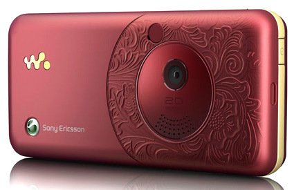
Sony Ericsson recently launched the W660i – its back face has an elaborate, intricate and rather classical floral motifs on it. Which is about time – many small consumer electronic products have taken on Apple’s clean style – keeping to one or few color tones, vast stretches (is this too much an adjective to use on a gadget?) of white spaces – which is good at times, but when everything around me became just flat, blank pieces, it becomes rather monotonous and dehumanized.

So I applaud them for being brave enough to launch this – where the motif is actually molded into the piece, rather than just some “safe” option of having the pattern printed instead, or even “safest” – have the basic option, but allow the consumer to “fully customizable faceplate with stickers you can buy at 7-eleven according to lifestyle preferences for a different experience!”. Though, regrettably, that’s about the only part of the phone that I liked.

More of other more intricate, craft-originated designs that goes into products:

marcel-wanders-he

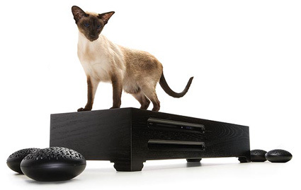
Marcel Wander’s HE – the four “pebbles” with intricate patterns on top are the speakers.

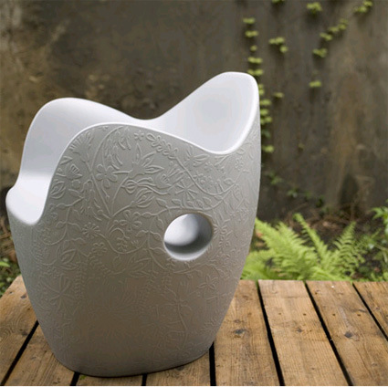
nest-chair-tord-boontje

The “Nest” chair by Tord Boontje

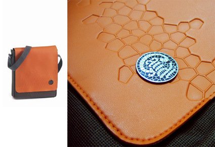
gaudi-bag

Above is a bag that I bought – inspired by the mosaic patterns of Park Guell by architect Gaudi through embossed stamping on the leather.

[Disclaimer: This entry is not a post of cognitive dissonance or a justification to the purchase of said bag.]

Risk and Reward Analysis for Fruits

Fruit

Justin, a copywriter from Brooklyn, applied the risk-and-reward analysis to the realm of fruit eating, resulting in some rather amusing muses:

fruit: banana
risk: low
reward: moderate
analysis: Never a bad choice, the banana is the .290 hitter of fruit. When was the last time you had a surprisingly bad banana? Never, that’s when. More importantly, the banana offers the most easily interpreted warning signs in the fruit family: if it’s slightly green or covered in brown spots, you know you’re rolling the dice. You will most likely never eat a memorable banana, but for a low-risk fruit that pays out solid dividends, you can’t do better. If you don’t like surprises, the banana might be the fruit for you.

Head on to his blog for 14 more fruits!

Japanese Product Design Database

product-design-database

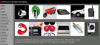
Say, you’re a product designer looking for some retro inspirations for the next digital gadget you’re doodling on, or perhaps you’re a design student hit with a ‘History of Industrial Design’ assignment looking for a place where you can copy-and-paste your homework away creative reference, check out this great resource site: (Japanese) Product Design Database.

It has amassed a rather large collection of rather high resolution photos or posters of Japanese consumer products from the 70s, 80s and 90s – phones, radios, TV and audio sets, etc. Truly a great resource to see some great works from our industry’s seniors.