Artvertising on a building

artvertisingonBuilding

An old concept (similar to the million-dollar-homepage) rehashed onto real, physical space – The Sandberg Institute launched a campaign called Artvertising:

It’s a spectacular work of art on the façade of the Sandberg Institute in Amsterdam consisting of more than 300 logos and trademarks of businesses, organizations and people. The façade consists of more than 16,000 tiles [35x29cm], each of which will soon be supplied with its own individual printed plastic plate. The result will be an overwhelming mosaic of colour and information – a project that seeks to push the boundaries between commerce and art, society and the movements of the market, the private sector and public space. The Sandberg Institute is located on the Amsterdam ring road in the Zuidas district, the city’s new economic center.

Perhaps this is simply a massive advertisement for its own art/design programs as well. This reminds me of Andy Warhol of Campbell-Soup-Art fame, just perhaps multiplied a hundred times. Not quite my cup of tea – advertising in itself is an art, but putting together a collage of brand names is just… not quite the epitome of human mind’s exploration.

Venturi Carbon-Neutral Car

venturi

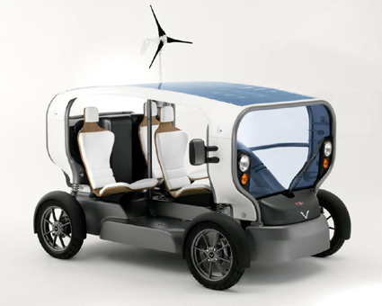
Eclectic, the first autonomous vehicle in the history of the automobile, opens up a new era in the field of mobility : reserved for daily driving in urban areas, its low energy consumption makes it the most economical environmental vehicle ever built.

Innovative and astonishing, Eclectic is much more than a simple vehicle ; it is a production and storage plant for renewable energies, either solar or wind based. Charging of these energies, which is intermittent in certain regions, can also be complemented by electrical recharging.

The car has a rather unique look, reminding me of the typical stripped down skeleton of a cyborg. Concept wise, I think their intentions is nobel – bringing a renewable-energy vehicle into mass market. However, I am still left a little doubtful of its capability, particularly the wind turbine. Hmm.

[Venturi Concept]

What is it?

WeldingElectrodesStorage

2-5/8″ long, the other side looks the same except that it’s numbered 6 thru 10. It may look like the cryptic key that Robert Langdon tried to solve in Da Vinci’s code, but that’s not what it is. So what is it?

The website “What it is?” features a lot of rather obscure products like this, inviting visitors to guess their functions.

[Answer to the above question: It’s a storage for welding electrodes – turning the knurled end piece reveals a separate chamber for each number.]

MUJI Design Award Winners

The MUJI Design Award results are out! MUJI, a Japanese household products brand renowned for shedding branding in its products, launched a design competition some months back with the theme SUMI:

The objective is not to design something that is placed in the middle of the room, but towards the edges, not at the center and not directly around the center; you should look for somewhere that evades the eye, send us an object designed for that place, and name it as you wish.
We are not asking for any particular genre, it could be anything from furniture, stationery and office equipment, to everyday items.

4758 entries later, they present the winners. I am rather underwhelmed:
muji-gold-award

muji-gold-award2

Gold Prize: A Cast-off Skin, by Yoh Komiyama (Japan)

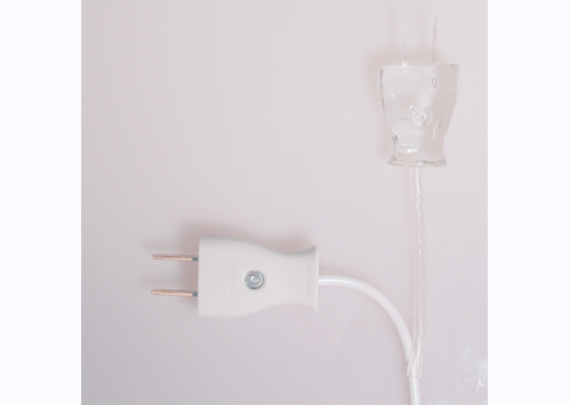
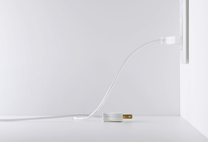
What is it: A transparent plastic part hangs off your power cable, so that when you want to unplug your appliance to disconnect the power, you can plug the transparent plug into the power socket.

The Designer says: Traditional Japanese people called an existing thing in this world “Utsusemi.” “Utsusemi” is a cast-off skin of the cicada insect. The outlet which I saw was an empty container, an “Utsusemi”. An invisible soul (a transparent outlet plug) entered the container, and so it was reborn to connect the world. When an outlet plug is pulled out of an outlet it lies like a cast-off skin without a soul.

But will it yearn for an outlet so? “A cast-off skin” is based on this simple idea.

Judges say:

“A cast-off skin (nukegara)” takes advantage of the blind spots of such sensibility in people. It shows that one small indication can often evoke great awareness. – Kazuko Kaize, MUJI creative director

“The Gold winning design ‘A cast-off skin (nukegara)’ has taken many ideas into consideration whilst theoretic stance of product design may disfavor this approach. I think therefore it has a special value. We don’t live for rationality; we live because we want to enjoy a life enriching our soul. In fact, perhaps the current state of product design should be questioned.” – Takashi Sugimoto, MUJI Adviser (Interior Designer)

“Many electrical appliances are left connected to the power socket, always consuming small amounts of electric energy. This is due to the need to power the light indicating power is coming through. To turn the appliance completely OFF the plug must be unplugged. However, that creates a chaotic mass of ‘fallen plugs’ around the power socket. The Gold winning entry treats this condition in a positive and fresh manner to correspond to the theme of this award. This work allows us to share its creator’s attention toward the means of communication which gives a situation a meaning.” – Kenya Hara, MUJI Adviser (Graphic Designer)

“There was plenty of lively debate among the jurors about which 15 should be chosen and an even more lively debate about the winning entry. Personally it was not my favorite, and although I could appreciate why others liked it I felt it lacked a real function, and that the symbolic function it represented was too far from the everyday practicalities which Muji deals with.” – Jasper Morrison (Special Judge, Product Designer)

I say:

I’m rather really puzzled that this entry won the hearts of quite a few judges. Perhaps I don’t understand the context of the product well – in my part of the world, wall sockets come with switches naturally, and there is no need to physically unplug an appliance when not in use.

I find myself agreeing most with Morrison’s take on this. If a harmonious interior is the goal, having an extra, dangling (as much as it is transparent) fake plug on the power cord seem the greatest disturbance when the plug is in use. This is almost in direct contravention of MUJI’s spirit of simplicity. If cables lying around on the floor is the problem, why not solve that directly? Perhaps a switch cleverly integrated into the plug, or the socket?

The Silver Prizes:

muji-silver-award1 muji-silver-award2 muji-silver-award3

A notebook – although there’s really no other description or images provided, a judge’s comment hints at its function: “Also impressive is the notebook with indexed pages and table of contents. Rather than ‘a notebook you would want to read over and over’, as suggested by the title, it is more wonderful that this makes looking for a certain page wherein particular notes have been written an effortless task.”

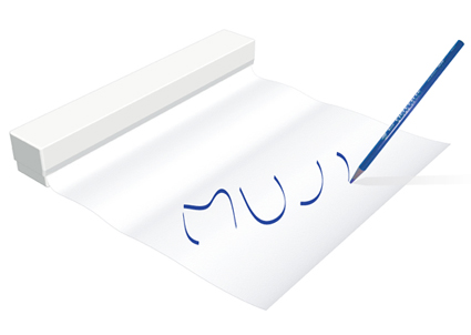
A Paper Roll – Think of your kitchen aluminum foil, except it’s paper. For drawing, writing, etc.

A Cable Extension – Conceals your power cables neatly out of sight.

The full results are here.


Digital Drawing

powerdraw_by_diamonster_small

An amazing picture huh? The reflections on the water, the warm glow of the windows, the serenity of the gondolas… isn’t it incredible what digital art can do? Well, if by this point, your mind goes “Pfft! I could render that ten times better in 3D Max or Maya”, you are probably very correct.

But try doing it the way this was done. In MS Paint. Yes, the crappy software that came shipping with Windows 95 even.  And then you’d see the sheer madness in this picture. According to Diamonster, the creator, he spent more than 500 hours on it, having to work line by line and pixel by pixel.

Diamonster on DeviantArt

Funny English Analogies

Judy Rose posted a list of hilarious analogies used by high school students in their essays. I wish I was this brilliant in English. I never seemed to be so creative. Some of my favorites:

1. Her face was a perfect oval, like a circle that had its two sides gently compressed by a ThighMaster.

3. He spoke with the wisdom that can only come from experience, like a guy who went blind because he looked at a solar eclipse without one of those boxes with a pinhole in it and now goes around the country speaking at high schools about the dangers of looking at a solar eclipse without one of those boxes with a pinhole in it.

4. She grew on him like she was a colony of E. Coli, and he was room-temperature Canadian beef.

16. John and Mary had never met. They were like two hummingbirds who had also never met.

22. He was as lame as a duck. Not the metaphorical lame duck, either, but a real duck that was actually lame, maybe from stepping on a land mine or something.

Head on here to see what else you’re missing!

Apple’s Patent – Mechanical Overlay

mechanical-overlay-apple-patent

“A user can have several different mechanical overlays, each one with controls for a specific application,” the company said. “For example, the user may have one mechanical overlay for video editing, another one for sound editing, another one for gaming, another one for data entry, another one for navigation, etc”.

Apple filed for a patent on a ‘mechanical overlay’ – you can place removable, haptic control interfaces on a sensitive zone on a computer. The computer can then interpret the actions on those interfaces, like buttons, sliders and what-have-yous, and translate this into electronic input.

It opens up a whole lot of possibilities in converting the computer into an efficient and enjoyable interface to work in, especially for those who work on a specific program for long hours – the professionals. It also gives a much more immerse and enjoyable interface environment – manually sliding the tuner up is definitely notches above doing the same with a mouse and an icon on iTunes.

As much as I’m delighted by the possibilities from this design, I must say I’m equally impressed with Apple’s patent lawyers (bunch of folks who perhaps contributed at least as much to Apple’s success as their designers, though probably less glorified).

Patents are intentionally drafted to cover as much base as possible – so that you can enforce or license it across as much application as possible. In this case, Apple had a far greater vision than folks at Creative (with their Prodikeys Keyboard) and gaming keyboard makers. Those have narrowly focused on their own sector, and they made physical and specific peripherals to that regard.

Apple’s patent had the wisdom to see the bigger picture – it is claiming the right to anything placed on top of a sensing surface. This patent would potentially be applicable across gaming, music, finance, basically any electronic interface that can be enhanced with a haptic input – and everybody would owe something to Apple.

Genius (if this patent was granted)!

*On a side note, could we be seeing keyboard-less laptop in the days to come? Buy the MacBookPro 3, and you can purchase the optional iType upgrade at US$199 only! I suppose that would really make the Apple’s iconic clean design even cleaner.]