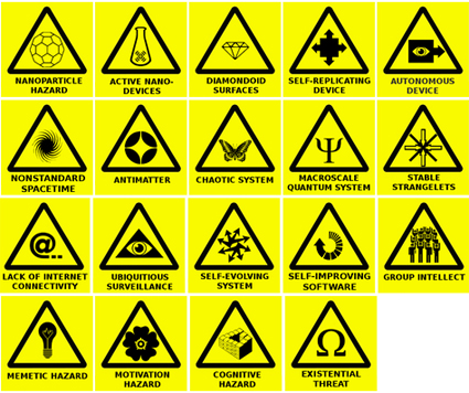
Anders Sandberg conceived of possible warning signs from the future, and explains the rationale for it in his blog. Scarily though, some of these symbols are actually rather conceivable in the near future.

Anders Sandberg conceived of possible warning signs from the future, and explains the rationale for it in his blog. Scarily though, some of these symbols are actually rather conceivable in the near future.
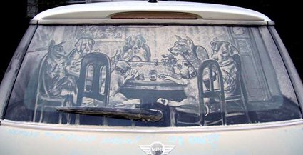
Dust on cars have always been an invitation for passer-by to vandalize: whether it’s some expletives or more well-meaning “Wash your car now!”, it’s always a canvas for creative expression. And that is exactly what Scott Wade did using dirty cars to create some rather detailed art.
Though I still wonder, exactly how do you accumulate that much dust on a car?
More pictures at his site.
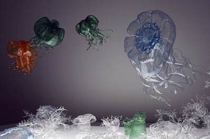
If you didn’t have enough of poetic underwater sea animals, here’s more! Artist Miwa Koizumi creates a world of underwater wonder with discarded PET bottles.
In another project, he created some extremely organic and effusive forms, apparently by suddenly freezing liquid plaster.
Visit his site here!
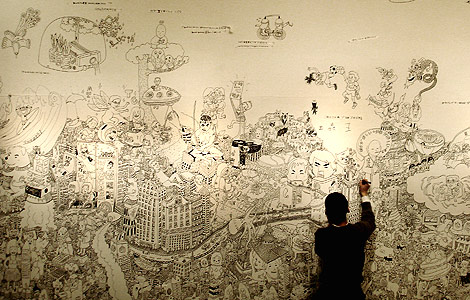
While there are some artist who’d meticulously plan the layout of their drawings, Nobumasa is not one of them when he works on the Japanese Graffiti project at Space Force, Japan. He allows his drawing to crawl and sprawl across the wall as his imagination takes him. Drawing inspiration from the Japanese Sumie drawings, his work is testament to a wealth of fascinating and sometimes absurd imagination. Drawings that do not need to follow logic – spacemen, candies, machines, buildings, superheroes all mingle among one another as if they were already in their most natural habitats. The public is sometimes invited to contribute ideas of what they want drawn on the wall too.
Talk about bringing the art to the masses!
While art galleries often project the image of catering only to a select group of (rich) connoisseurs, one in Helsinki has chosen to go on directly the opposite route. Housed in a former supermarket, art pieces are displayed exactly like the typical mart – on the shelves, counters, etc. – with all the shopping trolleys and baskets. Inheriting the traits of a supermarket, art here start from just a few euros, and they even had a promotion to give away 100 art pieces to the first 100 (it was wildly successful – lines over 100 meters were formed on the opening day).
Choose your art like how you’d choose your meat:
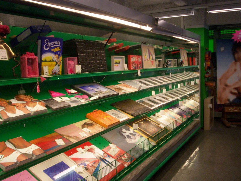
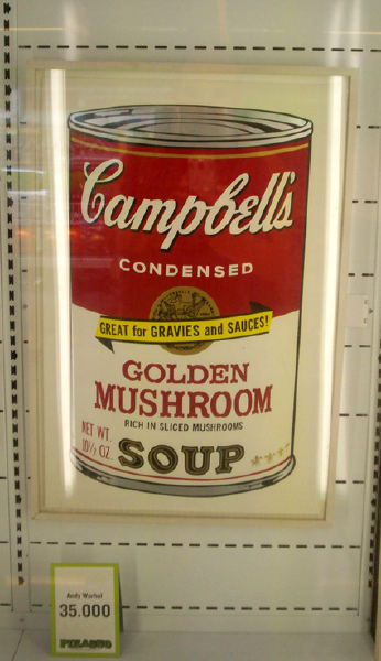
And of course, nothing is more surreal than seeing Andy Warhol’s “Campbell Soup” graphic selling right here.
[via Design Finland]
Jeni Wightman asked about 2000 Cornell University staff the following question:”Of the many charts (graph, map, diagram, table and ‘other’) you have seen in your life, which has been the most important, remarkable, meaningful or valuable?”. Then they were asked to attach a copy of it and are collated.
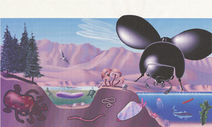
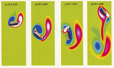
1) Vorticity field created by idealised 2-dimensional dragonfly wing. 2) Proportional representation of bioscape on Earth: fungi, birds, insect, etc. (notice the small elephant representing mammals). 3) Moore’s Law.
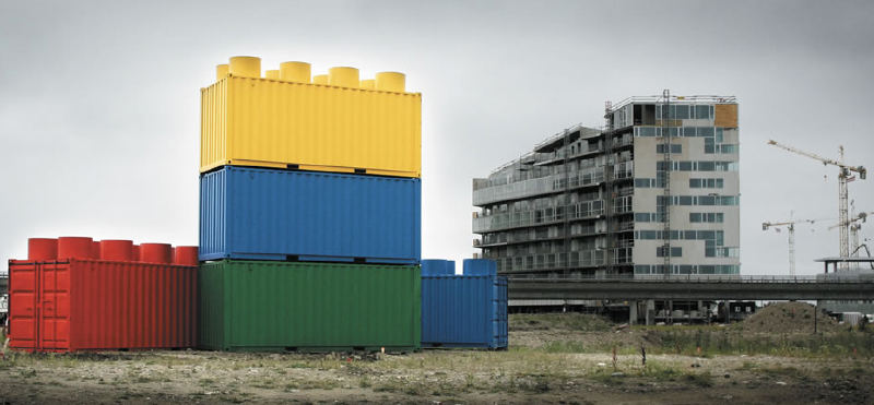
Someone at Lego had a bright idea for a low budget ad. Lego placed containers that were transformed to Lego blocks at real constructions sites. I think it was quite effective since the shape is so iconic.
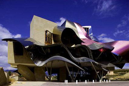
When I first saw the Hotel Marqués De Riscal architecture, the thought of a Gehry-copycat came to my mind. Turned out that it was Gehry who did this. Brutally put, I think Gehry has lost his touch. Guggenheim Bilbao was great because it was a breakthrough against the literally brick-and-mortar architecture mold. The curves were elegant and flowing – unlike this jumbled mess-tangle. While certainly iconic – I love the purple – it doesn’t quite remind one of the beautiful vineyard, the rolling hills that it sites in.
Maybe I’m just not geared to see the beauty in Gehry’s imagined slimy fish scales in his architecture. And I don’t dig his chair either.

Icaro Doria is a Brazilian artist who has used the national flags of some countries to put an interesting twist to national statistics. While I’m not sure if the statistics are in fact accurate/proportional to the areas in the flag, this does smack one back in the head – behind the flag (often only flown in glorious masts) are true people living in what are often much worse conditions than us.
Here for more examples.
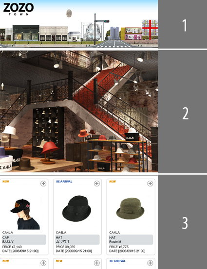
Zozo Town is a concept retailing environment that mimics real life retail environment – it has virtual shopfronts whose architecture is somewhat reflective of the brand (or so I assume). Given that these virtual architecture are not going to be limited by real-life constraints like costs, municipal rules (perhaps there are some in ZoZo, not sure), the virtual architects could really express what the shop brand’s essence and vision through daring and creative architecture.
And so I envisioned myself zipping in and out of these virtual shops – but alas, beauty is skin deep in this site. While you do enter a “lobby” or shop space (a beautiful space indeed!), you can’t move around in that. To browse/buy any items, you revert to the standard boring style where grids of products are lined up, prices underneath. What a letdown after the anticipation!
And that brings me to wonder, now that architecture, industrial design, interior design etc. all uses 3D CAD models, I’m sure it’d be a rather interesting project to create a virtual city based on such 3d virtual files. An architecture professor may commission a zone to be developed, while individual students chooses a site/building within that master plan. At the end of semester when work is completed, all the 3d models are imported into the grand master plan site – mmm. A city built with raw vision. Ambitious indeed, but certainly not impossible, especially since we see the possibility of immerse experiences in virtual architecture enabled by gaming engines like Half-Life – Walkthrough of Fallingwater.