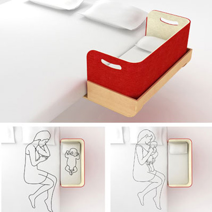
Ah, one of those things that make me go “why didn’t I think of that?” – by Busetti and Garuti.
[via swisssmiss]

Ah, one of those things that make me go “why didn’t I think of that?” – by Busetti and Garuti.
[via swisssmiss]
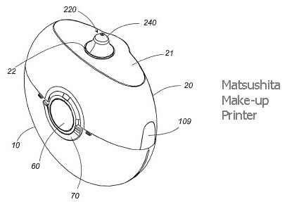
Matsushita has filed a patent on this idea of “printing” make-up onto faces. Imagine having downloadable templates of make-up that has exactly the right colors at the right place. Or simply just the idea that make-up is done within seconds instead of minutes or hours (as perceived by the guys anyway).
Battery-powered, hand-held and armed with a liquid cosmetic cartridge:
The device ionises the liquid allowing an electric field to accelerate it through a nozzle to form a jet. The result is a make-up spray that can be turned on and off at the flick of a switch. But if that doesn’t do the trick, the device has a drip mode which can dribble liquid onto the skin instead. Perhaps it could be upgraded to print family snapshots onto your eyelids too…
[via New Scientist Invention]
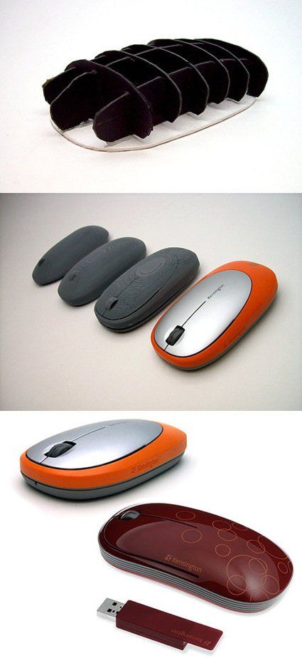
Business Week has a very interesting article on Kensington’s design approach to designing a new collection of computer mice. Kensington, being the number 3 computer peripheral maker was likened to Nintendo – both companies are trailing behind market leaders and behemoths (Microsoft and Sony for Nintendo; Microsoft and Logitech for Kensington). The peripherals market is indeed very tough: on the low end, you’re flooded with anonymous but cheap offerings, while on the high-tech end, it’s like David vs Goliath taking on the big companies with deep financial resources.
But, like in the case of David vs Goliath, there is still hope. For Kensington, the leverage was in a strategic, design-led thinking: the technological race in peripherals are ruthless and yet the consumers appreciate very little of it – they don’t see what’s under the shell. So why not define a new turf? For them, they engaged the design consultancy One & Co.
Having product designers instead of dedicated researchers conduct the study gave the designers a head start in thinking about the creative problems they’d be facing—and strengthened the research because designers asked questions and noticed details that might have gone overlooked by someone else. “There’s an emotional connection that people have to products,” Becker told me. As a product designer observing users firsthand, “you’re just more in tune to how people interact with the product. You notice how someone holds it, notice all these different subtle interactions,” Becker said.
I’d probably have to copy-and-paste the entire article to depict how they engaged in the design process – so you might as well head on and read the entire BW article – for me it’s a great case study in strategic-design-led venture. Designers have, or are trained, with a sharpened sense of intuition, observation and connection with users, which are a markedly different view from marketers who may be more quantitative and “big picture” inclined. In Kensington’s case, it was about the emotion and product experience.
As markets become more saturated and products more undifferentiated, you’d need more than a “we need a new collection of mice for Spring 2008 that is better than our competitors” kind of attitude. What is the X-factor that would set your product line apart, and perhaps as (if not more) importantly, how do you get to the “X-factor”? And do it consistently?
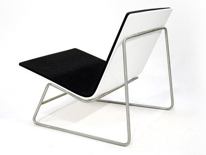
This is the ulo chair by Ian Walton. I liked it for its refined simplicity – striking a balance of clarity, elegance and modernity. Another good design execution – this isn’t that uncommon – or so I thought. Until I saw this video, which left me absolutely floored in awe:
Wow, the way it converts is just so organic, simple and elegant: if there was a user-interface award in furniture, this would definitely win my vote. And it’s not just a blind show-off of mechanical solutions either:
The chair has two configurations; an “Upright” configuration for more demanding applications such as working, studying or eating, and a “Lounge” configuration for leisure based activities and general relaxed postures.
The ulo chair was designed in response to the growing movement towards compact living spaces for sustainability. Prefabricated compact homes such as Alchemy Architects “WeeHouse”, Andy Thompsons “MiniHome” and Michelle Kaufmanns “Glidehouse” are all inherently sustainable due to both their size and the methods used in their construction.
Extremely thoughtful architecture and space design is being applied to such homes in order to make them feel less diminutive and consequently more sustainable. However I felt that this thoughtful approach was not reflected by the products within.
The changeover between each configuration involves one swift movement in which the rear legs “bend” and the seat shell pivots about its front connection point. This simplistic movement was designed in response to the plethora of poor multifunctional products which currently exist. These products are always difficult to reconfigure, and often perform poorly in one/more position.
The rear legs are locked straight internally via 8mm PTFE coated, hardened steel shafts. In order to unlock the flexible sections in these legs the user presses down on the horizontal bar at the rear of the chair with their foot.
Head on to Ian’s portfolio site (many other great works there too)!
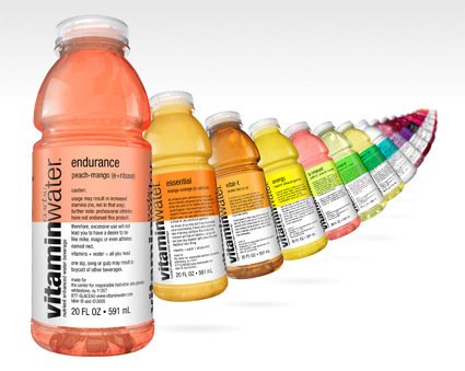
Hot on the heels of beverages that sell more of the packaging than the drink (like the previous post) – here’s a series of vitaminwater that comes from a company with as audacious a tag-line as “Hydrate Responsibly” – gulping normal water down now seems like the greatest gaffe you could commit. Of course, though, the actual fluid in the bottle is probably the last thing that matters.
People who are attracted to it are probably much more attracted to the overall product experience and presentation (I am). From the color schemes, to the packaging and design of the label – they all connote a sense of freshness and clearness that often escapes other mineral/flavored water bottles.
The label copies are great too – instead of the usual boring “raspberry flavored” or “peach-orange flavor”, they are endowed with imaginative names like “endurance”, “focus” and “balance”, with equally witty accompanying copy rather than the boring ingredient’s list, or promotion-heavy marketing text. For example, check out the teasing copy on “power-c”:
power-c
dragonfruit (c + taurine)legally, we are prohibited from making exaggerated claims about the potency of the nutrients in this bottle. therefore, legally we wouldn’t tell you that after drinking this, Eugene from Kansas started using horseshoes as a Thighmaster or that this drink gave Agnes from Delaware enough strength to bench press llamas. heck, we can’t even tell you this drink gives you the power to do a thousand pinkie pushups… just ask mike in queens.
legally, we can’t say stuff like that — ’cause that would be wrong, you know?
vitamins + water = all you need. for best results, stick it in the fridge. the inside is natural. the outside is plastic.
Or take “essential”:
essential
orange-orange (c + calcium)ah, orange juice commercials. funny stuff. mom cheerily prepares some huge breakfast while the rest of her family sleeps. sure, this could happen. but every morning? please. maybe if mom were heavily medicated, in which case, we wouldn’t condone operating a stove or any electrical appliance.
for those of us who don’t live in an orange juice commercial, there’s still a way to get your morning nutrition. this product has calcium and lots of vitamin c, so you can get your day started right, minus the whole Stepford mom thing.
vitamins + water = all you need. for best results, stick it in the fridge. the inside is natural. the outside is plastic.
Since when can you expect a hearty chuckle from a beverage packaging?
[More on their (nicely-done) website.]
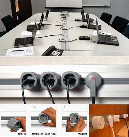
Recently the Eubiq (hey, it’s a Singaporean company!) power tracks and plugs were featured on quite a few design and gadget websites, touting to solve most of the common problems associated with current plugs. The most obvious benefit would be the fact that you can place your plug anywhere within the rail – up to 12 plugs per meter of track.
Design wise, it is unobtrusive and versatile, fitting into home and office interiors very well. The grey rubber strip effectively prevents water from splashes (e.g. in the kitchen). They claim it is virtually impossible to get an electrical shock because of the design – if you poke your finger through the grey rubber sleeves, all you touch is the earth contact – which is grounded and current-free. It has adapters so you can work with current plugs. You can order the system by the meter. You can integrate the system together with LAN data cables. Even the plugs themselves look sleek and modern. It almost seems too good to be true!
There are some clear advantages of the Eubiq system over current conventional sockets, and I am sure they’d be able to find buyers who’d adopt these plugs. Would it be a revolution in the world of plugs and sockets – like what CD did to the cassette tapes? I think not – it’d probably remain a product for a niche market where discreet appearance weighs heavily, but it does not seem like a candidate that will replace our plugs-and-sockets. Here’s why:
Firstly, it is a proprietary, patented standard. The fact that I’m naturally allergic to closed, proprietary (and almost by definition more expensive) standards aside, having a protected standard creates barriers to purchase and adoption. While it protects intellectual property and profits, it also at the same time prevents mass adoption, especially since the company is a relatively small one without much clout. Yes, there are adapters that lets your conventional plugs fit their track system, but unless some miracle switches all the plugs in the house to their Eubiq plugs, you’d find the appeal of Eubiq diminishing very quickly as you purchase 30 adapters for the plugs in your house.

“So listen to me you boys and girls,
If design is your thing,
And you’ve got some zing,
Then take a fling it’d be no bee stingDon’t matter if you’re name is Ling, Singh or Bling,
Or if you’re a left wing or a right wing
This challenge’s still awaiting.”
Don’t blame me if you didn’t like the little (cheesy?) “rap” above – it aint from me, it’s from Electrolux’s official Youtube video to promote their Design Lab 2007. It does seem like they’ve taken an entirely different tack in promoting this year’s design competition, what with the whimsical promotion video that is a clear attempt to engage and get closer to the target audience – young design students.
If you’re the serious type, here’s the beef:
For this 5th year of the Electrolux Design Lab competition they are seeking submissions for household appliances that are environmentally sound, commercially-viable and enable people to better live in harmony with the environment. The goal is to get the applicants to go above and beyond simple energy and water efficiency and suggest ways to foster sustainable behavior and product usage.
Electrolux Design Lab, over the previous years, has attracted thousands of applicants from over 80 countries and some of those concepts submitted are now actually in the early stages of development. The grand prize is 5,000 Euros and a six-month internship at one of Electrolux’s design centers. This year the gala dinner and award ceremony will take place at the end of November in Paris!
I particularly liked the brief this year – “to go above and beyond simple energy and water efficiency and suggest ways to foster sustainable behavior and product usage”. Green is a definite priority on everybody’s agenda these few years, rising in status as an “afterthought” to a conscious choice of conscience. And that sentence in particular I think captured the attitude very well. It’s no longer enough to be more efficient, save a little here and there. Green has become an attitude to be identified with, and to market with – the attitude towards environmental protection is shifting from a passive “damage-reduction” mode to an active lifestyle preference for many.
I’d definitely anticipate seeing concepts that go beyond simple, mechanical means to reduce consumption, but more to influence our conscious behaviour, which is all the more difficult for a white-goods company like Electrolux whose core offerings are still very much rooted in the consumption of water and electricity currently.
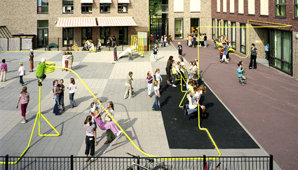
This is as much an art installation as a out-of-the-box playground design. If I knew more Dutch (is it Dutch?) I’d probably be able to give you more information, but as for now, you can simply head on to the artist’s site.
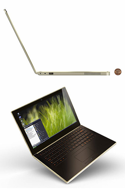
Wow. That’s a really thin and cool laptop. Designed by ZIBA with Intel’s engineers, it is what most people would ask for in their dream laptops. Name it: 0.7 inches thick, 1kg weight, Flash drive (no more scary spinning hard disk – they’re much more stable), 14 hours battery life (Flash drive requires much less power than hard disks), and a folder for the laptop that is also its charger.
For now it’s still a prototype, but let’s hope it’d come true. Quickly. And cheaply.
[Business Week has more detail]
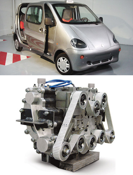
India’s largest automaker is set to start producing the world’s first commercial air-powered vehicle. The Air Car, developed by ex-Formula One engineer Guy Nègre for Luxembourg-based MDI, uses compressed air, as opposed to the gas-and-oxygen explosions of internal-combustion models, to push its engine’s pistons. Some 6000 zero-emissions Air Cars are scheduled to hit Indian streets in August of 2008.
With a top speed of 68mph and a 125 mile range, this car might be a little shabby for a full-fledged family car, but they are decent enough for urban transit, especially considering the cost: 340 liters of air compressed at 4350 psi can be refilled in a few minutes, at only $2.
I have always wondered about the validity of an “air-car” though. While it certainly sounds very green – powered by air, does no harmful emissions at all – physics tells me that the work required to compress the air would have to involve some sort of energy input somewhere, whether it be at the car’s compressor, or the delivery pump. What do these pumps run on? Oil? Electricity? Is the compressed-air engine more efficient than the combustion engine?