
A USB rechargeable AA battery. By USBCell.
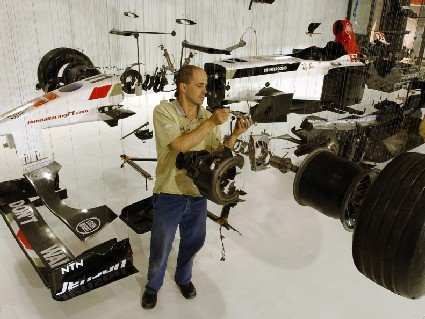
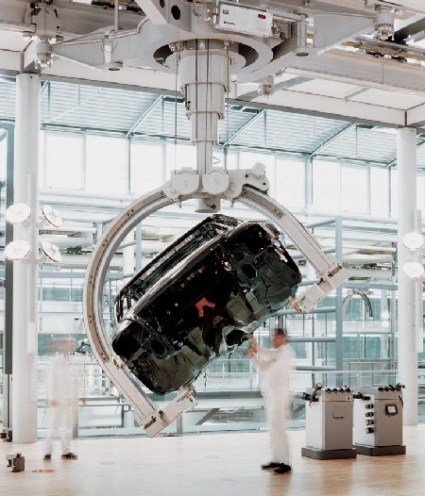
A friend asked me something about hanging installations & displays, and I got reminded of these two fine examples of hanging cars. Both are demonstrations of technical engineering feat that has combined spectacularly with design aesthetics.
The first is the suspended Honda F1 car, exploded view. The idea is not new, but I guess from the reaction these pictures garnered online, every time something like this appears it still captures imagination and still awes.
[More pictures at Uêba]
The second one, a more permanent fixture, is the Volkswagen Glass Factory in Dresden. Manufacturing the high-end VW model Phaeton, the factory is dedicated to showcasing its manufacturing processes and the amount of engineering that goes into each car. It’s probably only the Germans who can keep the place so clean and well-presented.
[Check out this forum posting – more information and pictures]
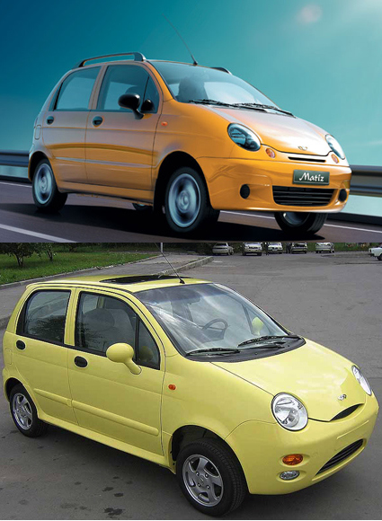
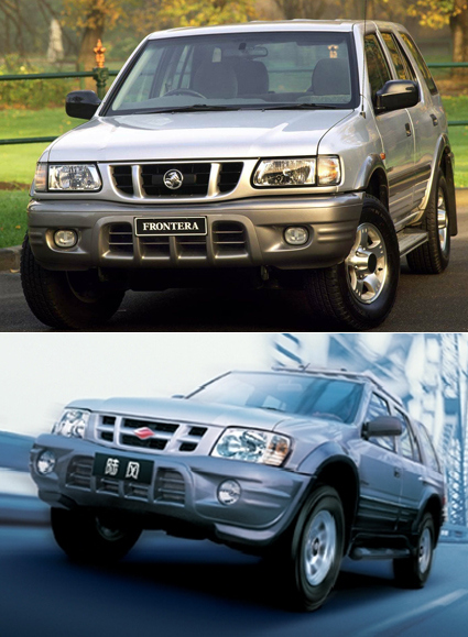
As they say, imitation is the sincerest form of flattery. I’ve gathered 10 cases of ultimate flattery in autos here, where the industrial design of one is blatantly copied onto another. Here you go, the showdown of the look-alike cars (and a bus):
1. Daewoo Matiz vs Chery QQ
This one was so extreme, some parts of one car fit into the other (e.g. door panel, bonnet etc).
2. Vauxhall Frontera vs Landwind
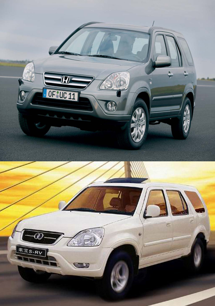
3. Honda CRV vs Laibao SRV
Check out the semi-Audi front logo too!
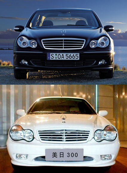
4. Mercedes C vs Geely Merrie 300
The Geely was shown in an auto exhibition. I don’t think it was eventually produced looking like this though.
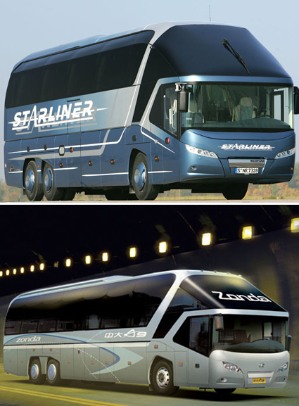
5. Neoplan Starliner vs Zonda A9
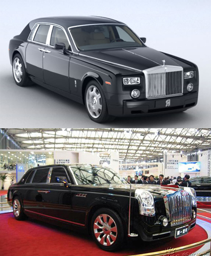
6. Rolls-Royce Phantom vs Hongqi HQD
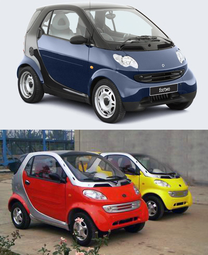
7. Smart vs er. Chinese Smart
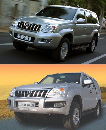
8. Toyota Prado vs Dadi Shuttle
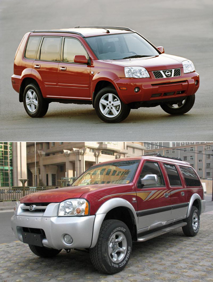
9. Nissan XTrail vs Greatwall Sing
10. BMW 7 vs BYD F6
For this, the copying is not so drastic except the lights, but it does get brownie points for imitating the badge as well.


11. Bonus! Toyota Logo vs Geely Logo

Toyota sued and won though.
Digital data and interfaces have certainly become more prevalent, even though to some it’s still a somewhat nebulous, intangible and hard-to-conceive abstract notion. There have been some efforts in making digital gestures more tangible, analog or personal, and the Slurp digital eyedropper is another very interesting concept. Here’s the description:
In this video I demonstrate how slurp can be used to move digital files between machines over the network. Rather than plug a usb drive into the port that corresponds with a specific file seen on a screen, just suck the file directly off the screen itself. Slurp is used like an eyedropper, it vibrates and displays light to indicate it’s state to the user.
Slurp is tangible interface for manipulating abstract digital information as if it were water. Taking the form of an eyedropper, Slurp can extract (slurp up) and inject (squirt out) pointers to digital objects. We have created Slurp to explore the use of physical metaphor, feedback, and affordances in tangible interface design when working with abstract digital media types. Our goal is to privilege spatial relationships between devices and people while providing new physical manipulation techniques for ubiquitous computing environments.
I have a personal interest in tangible media interfaces, especially in the balance between intuitiveness and “tangible-for-tangible’s-sake”, which we often see when some designers turn digital bits into some arbitrary physical objects for little additional benefits/interests. This uncanny valley between the two requires a delicate sense of what’s appropriate and resonant, and I think Slurp has managed this very well indeed.
Slurp is made by Jamie Zigelbaum, Adam Kumpf, Alejandro Vazquez, and Hiroshi Ishii, and you can see more of such works at MIT Media Lab’s Tangible Media Group.